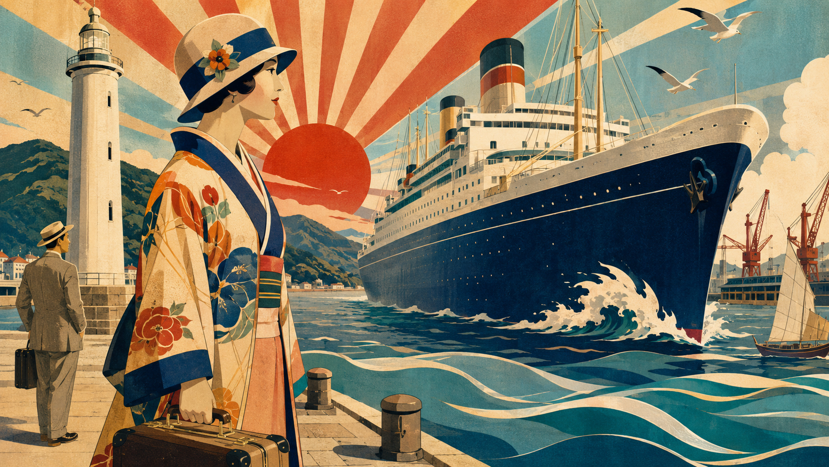
One edition, one visual tide
Today’s Marine Day edition moves from thirty-eight mikoshi entering the surf at Chigasaki to an Antarctic expedition ship dressed in flags, from a dolphin appointed Coast Guard chief for a day to teenagers confronting marine waste. The subjects are scattered across Japan and wildly different in scale. The art needed to make them feel like chapters of one national story without pretending that unrelated events took place in the same physical world.
The editorial answer was a shared poster language: broad fields of vermilion, navy, turquoise and warm cream; simplified silhouettes; steep diagonals; waves treated as rhythm rather than fluid simulation; and figures positioned not as evidence but as invitations. Fifteen event illustrations and this art-choice image belong to the same family.
We call the choice “Sugiura Hisui maritime travel posters” as a concise editorial label. It is not a catalogue raisonné title, an art-historical school or a claim that Hisui designed the particular historical shipping posters most familiar online. Hisui’s relationship to ships is real. So is his large body of travel design. But the bridge between the two must be built from records, not resemblance.
The important attribution warning
Hisui became a design consultant to Osaka Shosen Kaisha in November 1902 and left around January 1904. A circa-1902 O.S.K. Lines Picture Postcard, now held by the Mie Prefectural Art Museum, has appeared in major museum exhibitions of his work. Those are firm points.
After that, certainty narrows. Design historian Hisao Miyajima’s peer-reviewed study reconstructs Hisui’s Osaka period from surviving publications and correspondence. When the design office at Sanwa Printing was dissolved around February 1903, Osaka Shosen became his remaining commission. Miyajima then states plainly that the contents of the Osaka Shosen work are unknown. The absence matters because attractive shipping posters circulate online with loose or missing attribution, and period likeness is not proof of authorship.
The National Museum of Modern Art, Tokyo’s exhibition worklist supplies a corrective. The celebrated 1913 Japan Mail Steamship poster showing a woman holding a calendar aboard ship is by Hashiguchi Goyō. Osaka Shosen’s circa-1917 yokozuna poster and its 1918–19 woman driving five white horses are by Machida Ryūyō. Other liner posters are catalogued as anonymous or assigned to Yoshida Hatsusaburō, Harry H. Rodmell, Gösta Georgii-Hemming and additional artists.
The real maritime beginning: Osaka, 1902
Hisui arrived in Osaka at twenty-six. Kuroda Seiki, the Western-style painter who had become an important mentor, recommended him for the post of design-department chief at Sanwa Printing. The firm was preparing for the Fifth National Industrial Exhibition of 1903, and Hisui designed covers and advertisements for the magazine Sanjūrokunen (“Year Thirty-Six”). In November he added the Osaka Shosen consultancy.
This was a formative encounter between a young artist, lithographic print culture and an industry selling movement. Osaka Shosen, founded in 1884, belonged to a new transport system in which steamship companies competed through routes, timetables, passenger comfort and imagery. The poster was not a picture hung after a voyage. It helped create the desire to voyage.
Yet Hisui’s Osaka work also shows why influence should not be reduced to ornament. Miyajima traces a rapid change across the ten Sanjūrokunen covers. Early issues use the sinuous lines, dense vegetation and circular framing associated with European Art Nouveau. By later issues, Hisui had opened space around a simplified, often symmetrical lower motif. He was moving from copying a fashionable surface toward a system of selection and compression.
That system began with observation. Hisui had trained in Japanese-style painting; he did not merely paste imported whiplash curves around a ship. He sketched, then transformed observed forms into repeatable, legible design. The sea in today’s illustration is therefore built as a set of bands. The liner is a mass, not an engineering elevation. The sun is an organizing disc. Each element has a job in the composition.
How Japan learned to advertise a voyage
The ocean-liner poster grew with the infrastructure it promoted. A University of Southern California scholarly exhibition notes that after nineteenth-century sea routes and rail networks expanded, tourism accelerated worldwide, especially after the First World War. Mechanized transport could be marketed as safer, faster, more comfortable and more luxurious. Japanese steamship companies used strong color, hybrid painting styles, several languages, calendars, maps and route diagrams to compete for attention.
Images frequently joined two kinds of promise. The steamship stood for scale, technology and access to the wider world; a kimono, shrine, mountain, beauty or historic motif stood for a Japan that could be recognized and consumed at a glance. The result was not documentary realism. It was a visual contract: modern machinery would deliver the passenger to an apparently timeless culture.
The Japan Travel and Tourism Association’s historical review places this commercial art inside a larger institution-building project. The Japan Tourist Bureau was established in 1912. Foreign sea routes made passenger travel to Japan practical, while a growing rail network made destinations reachable after arrival. The International Tourism Bureau followed in 1930 and the Board of Tourist Industry in 1931, promoting an image of Japan abroad through posters, books and magazines.
Those pages changed the scale of design. A harbor poster had to arrest a passerby. A magazine cover had to make the next issue desirable. A timetable or itinerary guide had to remain clear in the hand. Hisui worked across all three conditions, which is one reason his visual grammar adapts so readily to a digital news edition.
Hisui’s documented travel portfolio is extensive
If the details of the Osaka Shosen commission are elusive, Hisui’s later tourism work is not. The National Museum of Modern Art exhibition list identifies a 1916 Japan Tourist Bureau poster and a 1923 gouache poster design. It also records covers or back covers for the bureau’s journal The Tourist in 1915, 1918, 1920, 1921, 1928 and 1931, together with itinerary-and-cost pamphlets, tourist maps and destination guides.
The National Crafts Museum collection expands the itinerary: Japon, Japan, Present-Day Japan, a Tourist Map of Tokyo, train timetables, The Travel Bulletin, a 1923 original for the Japan Tourist Bureau, a Shantung Railway pamphlet and a circa-1920s–30s Taiwan design. The 2016 museum worklist adds a 1931 hot-spring guide, a 1913 map of Seoul and 1915 guides to Mount Kumgang.
These are travel artifacts, but not all are posters and not all are maritime. The distinction is part of the story. Hisui’s relevance to today’s edition comes from the way he made movement legible across formats—not from an imaginary shelf containing dozens of authenticated liner posters.
| What the record supports | What it does not support |
|---|---|
| Hisui served as an Osaka Shosen design consultant from late 1902 to about January 1904. | That every Osaka Shosen poster of the 1910s or 1920s is by Hisui. |
| A circa-1902 O.S.K. Lines picture postcard is catalogued in museum exhibitions of his work. | That the larger Osaka Shosen commission can be reconstructed from visual similarity. |
| Hisui made documented Japan Tourist Bureau posters, journal covers, maps and travel publications. | That “Sugiura Hisui maritime travel posters” is a formal museum category. |
| Hisui’s design moved through Art Nouveau and later geometric modernism. | That every flat-color Japanese travel poster with a modern woman is his. |
| Today’s images use selected design principles as editorial inspiration. | That the images are originals, reproductions, historical documents or endorsed museum works. |
From nihonga observation to Art Nouveau line
Hisui was born Shiraishi Tsutomu in Matsuyama on May 15, 1876, and was adopted into the Sugiura family at ten. He studied locally before moving to Tokyo in 1897, entering the Japanese-painting course at the Tokyo Fine Arts School under Kawabata Gyokushō. That education gave him close attention to contour, seasonal plants and the expressive value of empty space.
A meeting with Kuroda Seiki redirected the course of his career. After returning from Europe in 1901, Kuroda possessed books, photographs, reproductions and magazines showing new decorative art. Hisui studied and copied the material, including work associated with Alphonse Mucha, Eugène Grasset and Henri Rivière. European Art Nouveau had itself absorbed lessons from Japanese art; Hisui encountered a foreign modernity in which something familiar had been transformed and returned.
His breakthrough was not simply adding European curves to Japanese motifs. Miyajima describes how Hisui moved from observation to benka—the simplification or transformation of natural form into design. Flowers, leaves, birds, insects and waves became structural units. His twenty-part Hisui Hyakkafu, first published from 1920 to 1922, demonstrates the depth of this botanical looking. Nature was not filler. It was an archive from which modern form could be built.
Mitsukoshi made design a public environment
In 1908, while still at the Chūō Shimbun, Hisui began night work as a design consultant for the Mitsukoshi kimono store. In 1909 he took over covers for Mitsukoshi Times; from 1910 he also designed the new magazine Mitsukoshi. When the store’s design section became independent in 1911, he became its chief. For thirteen years the two magazines and the wider publicity program made his images part of everyday urban life.
The 1914 Spring New-Pattern Exhibition was his first full-scale poster, according to the Ehime Museum of Art chronology. A second major poster announced the completion of Mitsukoshi’s new building that October. The store did not ask design merely to label products. Covers, posters, packaging, architecture, exhibition culture and fashion together defined what “modern” felt like.
Hisui’s women are central to that history and should be read critically. Poster House describes how his advertising moved from flowing Art Nouveau figures toward bobbed hair, cloche hats, sharper geometry and the active urban woman of the 1920s. These images could picture mobility beyond the home while also turning modern femininity into a commercial sign. Today’s hero deliberately presents a traveler, not a portrait of a named historical woman. Her kimono, hat and suitcase form an editorial symbol of transit; they are not evidence of how all Japanese women traveled.
Europe, Affiches and the speed of the underground
Hisui left for Europe in November 1922 to study painting and historic art. In France, with help from Fujita Tsuguharu, he worked on Calpis advertising and a design competition. The Great Kantō Earthquake reached him as news in Berlin in September 1923 and shortened his plans. When he returned in January 1924, he brought a collection of roughly 300 posters.
He converted collecting into institutions. In 1925 he formed Shichininsha with seven former students to research and create design. In July 1927 he launched the poster journal Affiches. That December, the opening of Japan’s first subway between Ueno and Asakusa gave him a perfect modern subject.
The resulting poster, Tokyo Subway Starts the Service between Ueno and Asakusa, is documented by both the Ehime Museum and National Crafts Museum. A sharply receding platform, compressed crowd and strong directional geometry make speed visible before a train moves. Clothing mixes kimono and Western fashion. The poster does not explain every technical fact; it turns a new transport system into social anticipation.
This is the aspect of Hisui that matters most for Marine Day. Travel graphics are machines for converting infrastructure into feeling. A ship becomes departure. A wake becomes acceleration. A horizon becomes permission to imagine the next place.
Six design decisions borrowed for today
| Design decision | Historical basis | Use in the 2026 image system |
|---|---|---|
| Large flat masses | Hisui simplified observed forms into immediately readable areas. | Hulls, sails, mikoshi and aquarium tanks remain legible at headline size. |
| Limited high-contrast palette | Commercial printing rewarded clear, economical separation of color. | Vermilion, navy, turquoise and cream bind unrelated locations together. |
| Curves meeting geometry | Art Nouveau line gradually met the sharper structures of 1920s modernism. | Waves and flags move around geometric ships, cranes, windows and piers. |
| Nature as structure | Botanical and animal observation supplied Hisui with transformable motifs. | Coral, dolphins, gulls and water become compositional rhythm, not decoration pasted on top. |
| The traveler as invitation | Tourism and department-store graphics pictured modern life through poised figures. | People orient the reader toward the event rather than impersonating a photographed attendee. |
| One decisive emblem | Sun, circle, flower, wing or wheel could organize a whole poster. | Each hero privileges one memorable sign: a sail, mikoshi, dolphin, ship or coral branch. |
How to read today’s hero image
The contemporary hero is a compressed argument about travel advertising. The ocean liner dominates the right half as a dark wedge, making scale emotional rather than measurable. Its bow and the cream wake point into the frame. A lighthouse fixes the opposite edge. Between them stands a traveler whose hat, kimono and suitcase combine tradition, fashion and movement in the way early commercial art often did.
The central vermilion disc and radiating bands are graphic devices, not a weather report or a flag flying over a documented harbor. The waves are layered ribbons. Gulls repeat the curve of the sky. Cranes signal the working port, while the small sailboat provides a counter-scale to the invented liner. Paper grain softens digital perfection and recalls, without copying, the material presence of lithography and offset printing.
The ship is intentionally unnamed. It does not represent Sōya, Kaiwō Maru, Lazulite Ace, Ryōfū Maru or any vessel in the edition. The lighthouse, port and travelers are also inventions. Captioning those limits is not a footnote to the art; it is part of responsible editorial design.
How the visual system crosses today’s stories
The shared language changes with the reporting. It does not flatten every story into nostalgia. The national event guide uses breadth and invitation; Hamaori and Shiogama use diagonal human force; Kaiwō Maru uses the geometry of sails; AOAO Sapporo and the Okinawa dolphin story trade monumental shipping scale for animal form. The youth forum shifts the emphasis to faces, discussion and the ocean as a common field.
| Editorial movement | Marine Day examples |
|---|---|
| Sea as ritual space | Chigasaki’s 38 mikoshi and Shiogama’s maritime procession. |
| Ship as public classroom | Tokyo’s weather ship and car carrier, Takamatsu’s working ships and Toyohashi’s car carrier. |
| Historic vessel as living stage | Sōya in full dress and Kaiwō Maru under every sail. |
| Port as civic theater | Nagoya’s 80th festival and the 38-page national guide. |
| Ocean as science and responsibility | Ocean Nation awards, Ishigaki coral conservation and Tokyo’s youth forum. |
| Access, play and discovery | Muku the dolphin, AOAO Sapporo at three and children sailing free nationwide. |
The beauty carried historical freight
Vintage travel graphics cannot be treated as an innocent color library. Ocean liners, railways, department stores and tourism bureaus were commercial and political institutions. They taught viewers what was modern, who could consume it and which places could be packaged as destinations.
Hisui’s documented travel materials include a map of Seoul, Mount Kumgang guides, a Shantung Railway pamphlet and designs titled Taiwan. They were produced in a period when Japanese travel networks crossed territories under colonial rule or imperial influence. The museum catalogue establishes the objects; their geography establishes the context. Admiring their formal intelligence should not turn empire into picturesque background.
Shipping posters also used gender as shorthand. A beautiful woman could signify luxury, national tradition, cosmopolitan freedom or the pleasure supposedly awaiting a passenger. Some images widened the visible space for mobile, fashionable women; the same images sold that modernity back to consumers. Our editorial illustrations inherit the problem if they reproduce the pose without naming the history.
Finally, the ocean-liner promise depended on class. Grand public rooms and round-the-world routes represented travel for a minority even as posters addressed a mass gaze. Marine Day in 2026 is broader: working vessels, ferries, science, festivals, education and conservation. The shared aesthetic should connect those subjects, not imply that the story of the sea belongs only to first-class decks.
Hisui made a profession, not just a look
Reducing Hisui to a palette misses his larger achievement. He published design books, organized practitioners, edited a journal and taught. After forming Shichininsha and launching Affiches, he became a professor and design-department head at the Imperial Art School in 1929. He left amid an institutional dispute in 1935 and helped found Tama Teikoku Art School, now Tama Art University, serving as principal and head of design.
In 1936, twenty-two groups came together as the All-Japan Commercial Art Federation with Hisui as chair. In 1941 he became president of the newly established Japan Designers Association. He later led Tama’s postwar institutions, received the Imperial Art Academy’s Onshi Prize in 1955 and the Medal with Purple Ribbon in 1958. He died on August 18, 1965, aged eighty-nine.
The Ehime Museum of Art now holds about 7,000 related objects—posters, packages, bindings, design books, sketches and personal materials—and has made a large searchable archive available online. The National Crafts Museum also catalogs a substantial body of work. Together these collections replace the vague idea of “vintage Japanese style” with names, dates, formats and evidence.
A short chronology of an expanding visual field
| Year | Documented turning point | Why it matters today |
|---|---|---|
| 1876 | Born in Matsuyama on May 15. | The artist later identified with metropolitan modernity began in a regional city facing the Seto Inland Sea. |
| 1897–1901 | Studies Japanese painting at Tokyo Fine Arts School; encounters Kuroda Seiki and European decorative-art material. | Observation, Japanese line and imported modern design enter the same workshop. |
| 1902–04 | Leads design at Sanwa Printing and consults for Osaka Shosen; circa-1902 O.S.K. postcard survives. | A real maritime connection, with strict limits on what can be attributed. |
| 1908–14 | Joins Mitsukoshi as consultant, leads the independent design section from 1911 and makes his first full-scale poster in 1914. | Graphic design becomes a coordinated public environment. |
| 1915–31 | Produces documented Japan Tourist Bureau posters, The Tourist covers and travel publications. | Hisui’s travel credentials rest on catalogued objects, not internet resemblance. |
| 1922–24 | Studies in Europe and returns with about 300 posters. | Looking, collecting and comparing become part of professional method. |
| 1925–27 | Founds Shichininsha, launches Affiches and designs the Ueno–Asakusa subway poster. | Modern transport is translated into geometry, pace and social anticipation. |
| 1935–41 | Helps found Tama Teikoku Art School and leads national design organizations. | The legacy is education and professional infrastructure as much as individual objects. |
| 1965–today | Hisui dies; museum collections preserve and digitize thousands of materials. | Better access makes better attribution possible—and makes careless attribution less excusable. |
What “inspired by” must mean
For this edition, “inspired by” describes a method of editorial synthesis. It means studying documented principles—simplification, flat color, decisive contour, rhythmic natural forms, travel as invitation—and building new compositions for current reporting. It does not mean tracing a particular Hisui work, removing a signature, attaching his name to an anonymous poster or presenting generated imagery as archive material.
Every image caption should keep three categories separate. A photograph records light at a particular scene. An archival reproduction shows a historical object whose maker, date, owner and permissions must be identified. An editorial illustration interprets a reported subject. Today’s heroes are in the third category.
The distinction is especially important in an edition published before many July 20 events occur. An illustration can responsibly preview a scheduled festival if the article labels the schedule and verifies the facts. It cannot show invented visual detail and let readers infer that the detail has already been witnessed. Style does not reduce the obligation to be precise; it makes the obligation visible.
Why this language belongs to Marine Day
Marine Day asks Japan to consider the sea as benefit, route, workplace, habitat, ritual space and shared responsibility. Hisui’s career crossed many of the modern systems that turned those abstractions into public life: printing, retail, tourism, rail, shipping, education and mass communication.
Hisui did not make today’s events. He did not see a 200-meter car carrier, an aquarium night program or a youth forum on microplastics. But he understood the design problem beneath them: how to reduce a complicated modern experience without draining it of desire.
That is why the edition’s sea is not photographic blue. It is a set of shapes carrying attention from ritual to research, from vessel to child, from one prefecture to the next. The choice is historical, but not nostalgic. It treats the poster as Hisui did—less as a frame for the past than as a public instrument aimed at the next departure.
Primary research and attribution sources
- Ehime Museum of Art, Sugiura Hisui Digital Archive and English chronology: biography, career dates, major works and the museum’s approximately 7,000-item collection.
- Hisao Miyajima, “Design Methods of Artist and Designer Sugiura Hisui,” Design Theory 64 (2014): Sanwa Printing, the Osaka period, Art Nouveau study, simplification method and the explicit limit on knowledge of the Osaka Shosen commission.
- Mie Prefectural Art Museum, Sugiura Hisui: Design That Opened an Era, worklist: the circa-1902 O.S.K. Lines Picture Postcard and cross-museum ownership data.
- National Museum of Modern Art, Tokyo, Welcome to Japan: Tourism and Design in the 1920s–30s, worklist: exact artists, dates, formats and owners for shipping posters and Hisui’s tourism graphics.
- National Crafts Museum, Sugiura Hisui collection index and 1927 Ueno–Asakusa subway poster record: catalogued travel, map, timetable, design and poster holdings.
- Japan Travel and Tourism Association, history of prewar tourism design: the 1912 Japan Tourist Bureau, foreign sea routes, the rail network and Hisui’s The Tourist covers.
- USC Libraries, “The Rise of Tourism and the Era of Ocean Liners” and “Arrival of Modern Commercial Design”: the commercial, technological and imperial context of liner posters and formal analysis of Hisui’s clear, flat, stylized design.
- NYK Maritime Museum, “Beauty Posters”: the shipping-company context and Hashiguchi Goyō attribution for the 1913 woman-with-calendar work.
- Poster House, “Hisui Sugiura and the New Woman in Japan”: Mitsukoshi, women in commercial modernity, the Art Nouveau-to-Art Deco shift and the subway poster.
- Tokyo National Research Institute for Cultural Properties, Sugiura Hisui obituary archive: posthumous biographical record and professional history.
Editorial note: Research and link checks were completed July 18, 2026 at 6:00 a.m. JST. The title uses “Sugiura Hisui maritime travel posters” as the name of this edition’s art direction, not as a formal catalogue category. No historical image has been reproduced on this page. The hero and the event images it discusses are contemporary editorial illustrations; invented ships, people, clothing, harbors and environmental details must not be used as factual evidence. Romanization follows the wording used by the cited institutions where practical.