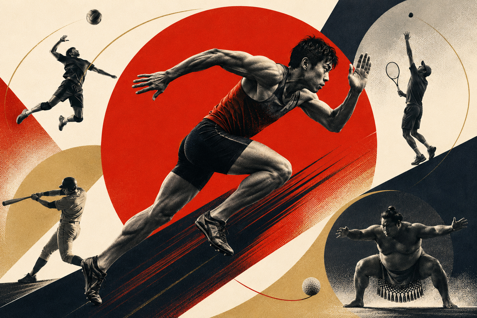
The red disc is motionless, yet it feels fast.
It can be read as the Japanese sun, a ball, a target or stadium light. The central runner appears to break through it. At upper left, a volleyball player opens his body in the air; below, a batter completes a swing. At right, a tennis player reaches the top of a serve, a sumo wrestler plants himself above the ring, and a golf ball skims near the bottom edge. Even without a caption, the direction of a body and the outline of an implement identify each sport.
Japan.co.jp’s August 2 edition follows Japan’s men in the Volleyball Nations League semifinal, Shohei Ohtani’s sore knee, the Summer Koshien field, Kei Nishikori after announcing his retirement, Naomi Osaka’s progress in Washington, Kazuma Okamoto and Munetaka Murakami in Major League Baseball, seventeen Japanese women at the Women’s Open, Ukrainian-born sumo champion Aonishiki, the Hanshin–Yomiuri pennant race and the J.League’s first season spanning autumn and spring. Ten stories, ten competitive spaces, several generations. Giving them the appearance of one edition requires more than lining up recognizable faces.
The chosen language comes from Yusaku Kamekura (1915–1997), the designer who gave Japanese sport one of its most enduring public forms. The purpose is not to copy his surfaces. Kamekura’s power did not come merely from using red, black and gold. It came from choosing the one form that carried most clearly, then forcing photography, type, printing and empty space to obey the same discipline.
What appears first is not “Japan,” but movement
Today’s hero does not draw a flag. The red disc inevitably recalls the Hinomaru, but it overlaps gold circles, black arcs and the trajectories of balls until a national sign becomes an engine of motion. The real center is not the runner’s face. It is the diagonal between his extended left arm and the leg pushing off the ground. His body does not sink into the red background; it accelerates along a black incline.
That double action—read it instantly, discover its construction later—connects the picture to Kamekura. His first official Tokyo 1964 poster placed a huge red disc on white, with the Olympic rings and “TOKYO 1964” in gold below it. There was very little information. Yet host country, world event and year could be understood from a distance. The scale of the circle and the tension of unprinted space produced memory in place of explanation.
Our picture does not recreate that poster. It contains neither Olympic rings nor the Tokyo 1964 wording. Instead, the disc becomes a variable form binding ten sports. In the baseball pictures it is sun and ball. Behind a tennis serve it becomes a target. In sumo it gives frontal weight to the wrestler and echoes the ring. One element changes meaning as it repeats, allowing ten images to become a family.
From Niigata to the problem of showing Japan to the world
Kamekura was born in Niigata Prefecture on April 6, 1915. He studied at the Institute of New Architecture and Industrial Arts before joining Nippon Kobo. Architect and educator Renshichiro Kawakita had established the institute in 1932 as a Japanese conduit for Bauhaus ideas. Geometry, composition, photography and typography were not treated as separate crafts, but as parts of a system connecting modern life and industry. The school trained Kamekura to see structure before ornament.
At Nippon Kobo, he art-directed international propaganda magazines including NIPPON. That history carries a difficult context: sophisticated modern photography and layout were being used for prewar state communication. Design is never neutral form. It speaks with the purposes and institutions that commission it. The experience would pass, with all its contradictions, into the postwar question of how Japan should present itself to the outside world.
After defeat, Japanese designers stood between physical scarcity and a sudden flow of American and European magazines, advertisements and packaging. Kamekura mounted a solo show at the Museum of Modern Art, Kamakura, in 1953 and joined the landmark Graphic ’55 exhibition. In 1960 he helped establish the Nippon Design Center; in 1962 he opened his own office. He occupied the center of a period in which graphic design was becoming not decorative service but a profession that built the face of companies and public institutions.
His work was not a simple importation of Western modernism. Kamekura absorbed geometric clarity while reorganizing Japanese uses of open space, crests, seals, vertical paper formats and printing precision. That is why the Tokyo 1964 sun can resemble an old emblem and a space-age signal at the same time. Tradition and the future are not arranged on opposite sides. They are compressed onto the same plane.
In 1964, Japan appeared before the world as a circle
Tokyo 1964 was the first Olympic Games held in Asia. For Japan, only nineteen years after the war, it was also a stage for international rehabilitation and for demonstrating the order and engineering of rapid economic growth. The Tokaido Shinkansen, expressways, satellite broadcasting and Kenzo Tange’s Yoyogi National Gymnasium turned the city itself into an exhibition of a new Japan.
The entrance to that vast project was a circle printed on paper. After considering a number of proposals, the Organizing Committee selected Kamekura’s design in June 1960. The first official poster appeared in February 1961: red disc, gold rings, gold sans-serif type. Official records put its print run at about 100,000. Three elements joined city and competition without picturesque inventory.
Reading the disc as Japan’s flag is natural. Kamekura also opened it into a more universal sun: morning, heat, life and the beginning of a race. His internationalism did not erase culture in pursuit of anonymity. It distilled a culturally specific form until other viewers could share it without instruction.
The first poster’s stillness became bodies in the following three: sprinters launching from their marks, a butterfly swimmer and an Olympic torch runner. Kamekura’s art direction, Osamu Hayasaki’s photography and Jo Murakoshi’s photographic direction made the camera the protagonist. Released in May 1962, the sprint poster was an unusually ambitious large-format color photogravure for its time. It did not ask viewers to study faces. It showed a compressed mass of bodies tipping forward just after the gun.
The photograph was not a lucky moment found on a roll. Starts were repeated as the team shaped composition, light, muscular tension and the figures’ edges against black. Photography was not treated passively as evidence of something that had happened; it became material to be designed. Modern sports cameras select from long bursts. Kamekura’s team designed the conditions under which the decisive frame could exist.
A public language made by a team, not a solitary genius
The visual history of Tokyo 1964 is often compressed into the phrase “Kamekura’s design.” His authorship of the emblem and official posters makes his central position deserved. But the Games-wide system was collective. Masaru Katsumie led the design program, and the sports and facilities pictograms were developed under his direction with Yoshiro Yamashita and others. Hiromu Hara, Takashi Kono, Ikko Tanaka and many more designers took part across the program.
Twenty sports symbols and thirty-nine general-information symbols guided visitors who could not read Japanese toward venues, restaurants, telephones, first aid and other services. Each athletic body was reduced to outline: the angle of an arm, position of a ball or shape of an implement had to carry identification. The visual language now taken for granted in airports, stations, toilets and emergency routes was demonstrated at Tokyo 1964 as a coordinated system for a vast international public.
Kamekura should not be incorrectly credited for all those pictograms. His symbolic and photographic work and Katsumie’s information design were distinct achievements that supported each other. The red disc made the Games unforgettable; pictograms kept people from getting lost; coordinated color and typography told a visitor that poster, ticket, program and sign belonged to one event.
That is the method today’s Art Choice seeks to inherit. The task is not to produce one “Kamekura-style poster,” but to send the same questions through ten articles. What must remain for a sport to be recognized? What can be removed so an image travels beyond portraiture? How much should be standardized, and where must the particular story break the pattern? We borrow the logic of a system, not ownership of a style.
Ten stories translated into one visual grammar
The images avoid exact reproduction of athletes’ faces, uniforms and team marks. They communicate through the minimum units of action, equipment and space. A red circle is the edition’s common sign. Black and warm ivory organize the field, while muted gold supplies ceremony and historical distance. Diagonals indicate velocity, arcs describe a ball’s path, and grain recalls photogravure and halftone printing.
| Story | The chosen split second | Its role in the composition |
|---|---|---|
| Japan’s men reach the VNL semifinal | A jump over the block | The net is a horizontal axis; arms and legs become diagonals, making airborne decision the subject. |
| Shohei Ohtani and a sore left knee | The twist of a pitching motion | A giant ball and orbiting lines suggest the cycle of two-way play and the load placed on one body. |
| The 49-school Summer Koshien field | One line from mound to catcher | Stadium rays open like a rising sun, giving the national tournament the character of ritual. |
| Kei Nishikori’s final Washington run | A forehand at full lateral reach | Racket, ball and arm form one trajectory—the body of a career still trying to reach one more shot. |
| Naomi Osaka reaches the last eight | A serve looking upward to the toss | The red circle becomes sun and target, linking Washington and a return to Tokyo through one rising motion. |
| Okamoto and Murakami reset a rookie mark | Two swings crossing | Mirrored batters and twin balls make a comparison story feel like resonance instead of confrontation. |
| Seventeen Japanese women at the Open | A follow-through in coastal wind | Coast and fairway become abstract planes, while distant players keep the collective challenge visible. |
| Aonishiki wins a three-way playoff | Stillness before the charge | Frontal symmetry and the circular ring maximize pressure immediately before movement. |
| Hanshin and Yomiuri level at the top | Two runners converging on home | Black and gold figures distinguish the traditional rivals without using trademarks. |
| J.League enters autumn-to-spring | A kick passing from summer into winter | Warm and cold halves divide the frame; one ball crosses the calendar’s border. |
The runner at the center of the hero does not correspond to one of the ten headlines. That is deliberate. He is not a news subject but the verb of the edition. Running crosses ball sports, combat and racket games; it is sport’s common movement toward time and record. If the five surrounding disciplines are nouns, the central athlete supplies the grammar: forward.
Photography, printing and AI: the tool changes, the editorial question remains
In 1962, Kamekura used staged photography and photogravure printing to reproduce at scale a moment the naked eye could not hold. In 2026, Japan.co.jp gives article context to language and image models, which construct a scene that did not happen but can express the subject of a report. The technologies are fundamentally different. The editorial question is not.
What must an image retain for the story’s force to stand up? For volleyball, not the result table but the opening above the net. For sumo, not the throw but the charged stillness before the tachiai. For Nishikori after announcing retirement, not an old trophy ceremony but a body still reaching for a ball. Translating an article into an image does not mean illustrating every paragraph. It means selecting its central verb.
AI does not make that choice reliably by itself. An unfocused prompt produces spectacle without distinction, incorrect equipment, garbled logos and faces uncomfortably close to real people. Editorial direction must define researched history, authentic posture, palette, composition, prohibited elements and variation within the series. Generated results still require inspection for hands, rackets, balls, playing surfaces and uniforms.
The ten pictures do not ask a model to output Kamekura’s completed works. They apply observable principles—red disc, clear negative space, geometric fields, the tension of photographic collage, restricted color and printed grain—to different events in 2026. Respect for history begins less with visual similarity than with naming who made what and making the border between historical work and new editorial image visible to readers.
- The article comes first: Read beyond the headline for the central verb, location and tension.
- Research the method: Study composition, printing, photography and social context—not color alone.
- Do not reproduce originals: Avoid tracing famous posters, emblems, logos or athlete photographs.
- Disclose provenance: State that an image is AI-assisted editorial art, not a historical artist’s work or endorsement.
- Design the series: Protect both visual unity and story-specific information.
Japanese identity is not an ornament
A superficial imitation of Kamekura adds a red circle, gold and a paper texture and calls the result a “Japan look.” That returns to the picturesque explanation he rejected. Tokyo 1964 was powerful because it did not inventory fans, Fuji, cherry blossoms and samurai. It expressed Japan in a minimum form, then opened the rest of the page to the world.
Mount Fuji appears in one of today’s baseball images, but not as a repeatable decoration. It is a distant measure of the Pacific crossed by two Japanese hitters rewriting a Major League record. The Koshien picture’s radiating light is not national wallpaper; it visualizes forty-nine regional champions converging on one stadium. The red disc is not stamped onto every image as a national brand. Its job changes from ball to sun, target, ring and season.
Nor should a sports body be frozen into uncomplicated heroism. The Ohtani article concerns pain and uncertainty around two-way recovery. Nishikori’s victory carries an ending inside it. The J.League’s new calendar promises international alignment while imposing costs on snow-country clubs. Powerful poses alone would erase these tensions. That is why the images retain open space, divisions, pauses and distance. Modernist clarity is not the same as simple celebration.
Kamekura left a professional standard, not a finished style
After Tokyo 1964, Kamekura continued designing posters and identities for companies, cultural organizations, international conferences and sport. In 1978 he helped found the Japan Graphic Designers Association and became its first president. It was institution-building: treating designers not as isolated image-makers but as professionals with social responsibility, rights and a culture of criticism.
He entered the halls of fame of both the New York and Tokyo Art Directors Clubs in 1993, stepped down as JAGDA president in 1994 and died on May 11, 1997, aged eighty-two. Funded by a donation from his family, the Yusaku Kamekura Design Award was established in 1999. It recognizes work with universality and innovation regardless of the designer’s age or discipline. The twenty-eighth selection took place in 2026. His name survives not merely as a museum label but as a test applied to current design.
Seen again through sport, his legacy is more demanding than the appearance of a muscular poster. It asks whether people speaking different languages can find their way; whether information carries from a distance; whether a limitation in printing can be turned into expression; whether a national symbol can be opened instead of sealed; whether a masterpiece and a restroom sign deserve to be considered parts of the same public design problem.
Those standards become more important in an AI era. The speed of image production has risen dramatically. Human editing must therefore become more explicit about what not to make, whose work is whose and why a visual belongs beside a particular article. The ability to manufacture volume is not the same thing as having a system.
What comes after the red disc
Return to the hero image. First comes the circle. Then the runner. Hold the eye a little longer and the upper-left leap, upper-right serve, lower-left swing, lower-right sumo stance and small golf ball near the ground emerge. Vision travels from center to edge and returns.
That sequence resembles the reading of a news edition. A lead image stops the reader. Individual reports carry the eye into different worlds. Together they return to the outline of Japan on one particular day. The Art Choice does not make ten stories alike. It gives simultaneous events the shape of an edition.
In 1964, Kamekura’s circle was an entrance through which a Japan nineteen years removed from war appeared before the world. Reusing that shape in 2026 requires more than recycling confidence. It must also hold the complexity of the present: baseball players moving outward, a tennis player promising to return, a Ukrainian-born wrestler remaking sumo history, a football league moving its calendar toward Asia and Europe. Japanese sport is no longer a border between inside and outside. It is made of trajectories crossing that border.
The red circle does not move. The athletes do. Between the still form and the moving body, the picture acquires time. That may be the freshest lesson left by Kamekura’s sports modernism. Clarity is not the act of making the world simple. It is the making of an unforgettable entrance into a complicated world.
Reporting notes and principal sources
Kamekura’s career, the allocation of Tokyo 1964 design work, the posters, pictograms and collection records were checked against JAGDA, IOC-related archives, public art databases, museum records and the Organizing Committee’s official report. Interpretations of the works and analysis of today’s images are by the Japan.co.jp editorial team.
- JAGDA: About Yusaku Kamekura
- JAGDA: Yusaku Kamekura Design Award
- JAGDA: Selection of the 28th Yusaku Kamekura Design Award
- Museum of Modern Art: Yusaku Kamekura works
- Museum of Modern Art: Tokyo 1964 (1962)
- Museum of Modern Art: Tokyo 1964 design guide sheets
- British Museum: The Rising Sun and the Olympic Emblem
- British Museum: Tokyo 1964 official poster series
- Olympic Museum: Tokyo 1964 official poster record
- Tokyo Organizing Committee: Official Report of the XVIII Olympiad
- Art Platform Japan: Official Poster for the 18th Olympic Games
- Art Platform Japan: Official Poster No. 4
- Government of Japan: Tokyo 1964 and pictograms
- Government of Japan: Kenzo Tange and Yoyogi National Gymnasium
- Japan Design Committee: Kamekura centenary symposium
- Ginza Graphic Gallery: Yusaku Kamekura Design Award exhibition