Some days in the news demand hard edges. July 9, 2026, did not. The Japan.co.jp story basket was a strange summer tray: a Senkaku confrontation told through competing coast-guard narratives; an AI boom pushing Japanese companies toward a sixth year of record profits; aging business owners wondering who will inherit their shops; a possible twenty-fold jump in permanent-residency fees; four Hokkaido climbers waiting above a bear; cat stationmasters selling the romance of rural rail; Sanae Takaichi receiving a jewelry award; a human washing machine edging toward public sale; a giant Tokyo Pokémon stamp rally; a Kiki’s Delivery Service object that looks like a book but is not a book; an old Shinkansen car reborn as a library; and two remaining Tokyo barley-tea makers keeping summer roasted and brown.
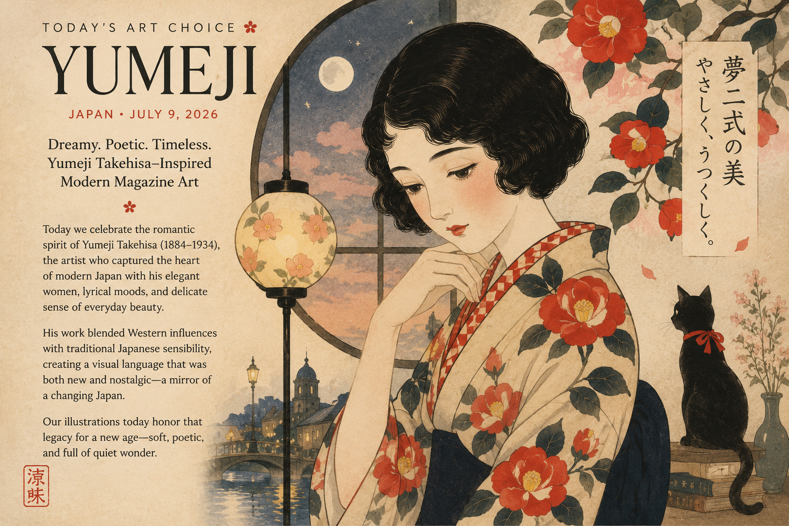
That mix could have been treated as satire, as cyberpunk, as newspaper realism, or as retro Showa commerce. But the edition asked for something softer. It needed an art direction that could hold diplomacy, business, bureaucracy, animals, pop culture, memory, and craft without breaking the page into incompatible worlds. So today’s art choice is “Yumeji-inspired modern magazine art” — not a copy of Takehisa Yumeji, not an attempt to reproduce his hand, but a contemporary editorial language that borrows from the atmosphere he helped make possible: lyrical line, melancholy grace, decorative economy, modern print culture, and the idea that ordinary life can be newsworthy when seen with tenderness.
Why Yumeji, and why now?
Takehisa Yumeji was born in 1884 and died in 1934. Museums and art historians describe him as a poet, painter, illustrator, and designer whose work became inseparable from the mood later called Taisho Roman: a blend of Japanese tradition, imported modernity, romantic feeling, print culture, women’s magazines, music covers, postcards, stationery, book design, and urban longing. MOMAT describes him as an artist who helped define his era through “Yumeji-style” beauties and retro-modern design; the Yumeji Art Museum calls him a central figure in the cultural phenomenon of Taisho Roman, where modern European romanticism and Japanese tradition met.
The key for Japan.co.jp is not the costume of the period. It is the editorial intelligence of the style. Yumeji’s world was modern Japan learning to package feeling: a picture on a book cover, a sheet-music design, a magazine illustration, a postcard, a commercial object that carried private emotion. That is remarkably close to what a daily visual newspaper must do in 2026. We take hard news and soft news, official facts and human texture, and decide what emotional temperature will let readers enter the story.
The edition needed a visual bridge
The July 9 lineup is not a single-topic special. It is a collage of Japan at a particular moment. The Senkaku story is tense and strategic. The AI profits story is market-facing and corporate. The succession story is demographic and quietly devastating. The permanent-residency story is legal and personal. The Hokkaido bear rescue is wilderness drama. The cat stationmaster story is adorable but also economic development. The human washing machine is Expo futurism. The Shinkansen library is rail nostalgia. The barley tea article is almost aggressively ordinary — and therefore beautiful.
A darker art style would flatten the gentle stories. A purely cute style would trivialize the security and immigration stories. Hard corporate futurism would make barley tea and Kiki’s object-design story feel silly. Ukiyo-e could work, but it would push the edition too far into historical Japan. Showa retro could also work, but it would make the page brighter, louder, more poster-like. The Yumeji-inspired modern magazine choice gives the paper a quieter middle path.
It allows the Senkaku image to be a sea chart and a night horizon rather than a war poster. It allows AI profits to be rendered as light in an office window rather than a glowing robot. It lets business succession become hands over a ledger. It turns immigration fees into a desk, a stamp, a waiting room, a life paused by paperwork. It lets the bear story remain frightening without becoming horror. It lets cats, Pokémon, Kiki, Shinkansen memory, and mugicha glow with summer nostalgia.
What we borrowed — safely
For today’s images, the instruction was not to imitate a living artist, and Yumeji himself is long out of copyright chronology in the biographical sense. Still, Japan.co.jp’s visual goal was not reproduction. We used a safer art-direction vocabulary: Taisho-Roman atmosphere, modern magazine composition, gentle ink-like lines, soft mineral colors, floral or paper-texture motifs, asymmetrical layout, and a restrained emotional register.
That distinction matters. “Inspired by” should not mean “make a fake Yumeji.” It should mean studying the broad cultural logic behind a style and translating it into a new editorial purpose. The July 9 images are not museum pastiches. They are contemporary news illustrations with a Japanese literary-magazine softness: dreamlike, poetic, but still legible as journalism.
| Visual choice | Editorial purpose |
|---|---|
| Soft linework | Gives ordinary scenes dignity without making them photorealistic. |
| Muted warm palette | Unifies sea, office, mountain, station, shop, and summer drink stories. |
| Magazine-cover composition | Keeps each story readable as a standalone feature image. |
| Poetic atmosphere | Lets strange items feel thoughtful rather than merely gimmicky. |
| Modern restraint | Avoids direct historical copying while preserving a Taisho-Roman mood. |
The historical root: Taisho Roman as media culture
Taisho Roman is often summarized as nostalgia, but it was once modern. The Taisho period, from 1912 to 1926, was a time when urban consumption, women’s magazines, cafes, department stores, imported design, film, music, and new print technologies changed the way people saw daily life. The “modern girl” and the illustrated magazine were not side details; they were cultural engines. Yumeji understood that the page itself could be a stage.
Exhibition materials at the Tokyo Metropolitan Teien Art Museum and related design-history summaries emphasize the breadth of Yumeji’s practice: paintings, drawings, sketchbooks, cover designs, stationery, postcards, and sheet-music covers. He moved across fine art and commercial art with little anxiety. That is precisely why he is useful for a newspaper like Japan.co.jp. We are not choosing between art and publishing. We are using art as publishing.
There is also a deeper reason. Yumeji’s women often carry a faraway expression. His design language suggests interior life. That interiority is what a news illustration can restore when a story is at risk of becoming merely factual. A permanent-residency fee hike is not only a rule change; it is a person waiting. A family-business succession crisis is not only an M&A opportunity; it is a shop sign, a father’s ledger, a daughter’s decision, a town’s memory. A barley-tea maker is not only a production facility; it is a smell, a summer glass, a craft that survives because someone keeps roasting.
How the style maps to today’s twelve stories
The later stories benefit even more. The human washing machine becomes a dream of Expo futurism rather than a gadget joke. The Pokémon stamp rally becomes a citywide summer quest without reproducing specific characters. The Kiki object becomes a literary still life without leaning on direct Ghibli imagery. The Shinkansen library becomes a memory machine. The mugicha story becomes the purest use case of all: a humble craft elevated by illustration.
Modern magazine art, not nostalgia alone
The “modern magazine” half of the phrase is as important as the Yumeji half. Japan.co.jp is a digital newspaper, but it is also trying to behave like a visual magazine from an alternate history — a place where every story gets a cover, every edition has a mood, and the day’s news becomes a collectible visual record. That is why art direction is not decoration. It is editorial architecture.
In a feed, stories fight for attention by getting louder. In a magazine, stories gain meaning by sitting next to one another. Today’s art choice helps the twelve stories feel like one edition. It tells the reader: this is not a pile of links. This is a day in Japan, with all its contradictions intact.
Japan.co.jp view
Today’s visual decision says something about what this publication wants to be. Japan.co.jp is covering AI profits and Senkaku tensions, but it is also covering barley tea, cat stationmasters, a book-shaped object, and a retired Shinkansen library. That editorial mixture could look unserious if handled poorly. The answer is not to make every story hard. The answer is to make every story cared for.
Yumeji-inspired modern magazine art gives us that care. It is dreamy without being evasive. It is nostalgic without being antique. It is Japanese without becoming a cliché. It is soft enough for cats and mugicha, but disciplined enough for diplomacy and business. Above all, it treats the small story as worthy of a large feeling.
That may be the real art choice of July 9: not a style, but a stance. The ordinary deserves composition. The strange deserves context. The serious deserves humanity. And a newspaper, even on the web, can still have a soul.
Reader takeaways
| Question | Answer |
|---|---|
| Why this style? | Because July 9’s edition combines security, business, bureaucracy, animals, pop culture, nostalgia, and craft. |
| Why Yumeji? | His legacy sits between fine art, illustration, book design, postcards, commercial culture, and the emotional print world of Taisho modernity. |
| What did Japan.co.jp avoid? | Direct copying, overly dark historical drama, and cartoonish cuteness that would weaken serious stories. |
| What is the final effect? | A dreamy but readable modern magazine edition that lets every story feel part of the same July day. |
Sources and references
This article draws on museum biographies, exhibition materials, design-history summaries, and Japan.co.jp’s July 9 visual package.
- MOMAT: Takehisa Yumeji — An Artist Who Defined His Era
- Kanazawa Yuwaku Yumeji-kan: Biography of Takehisa Yumeji
- Yumeji Art Museum: English introduction to Yumeji Takehisa and Taisho Roman
- Tokyo Metropolitan Teien Art Museum: Takehisa Yumeji: Taisho Romanticism and the New World
- SHIFT: Takehisa Yumeji: Taisho Romanticism and the New World
- Go Tokyo: Takehisa Yumeji Museum
- Haibara Museum: The secret of the designs by Yumeji Takehisa
- Japan.co.jp: July 9 visual package and article lineup