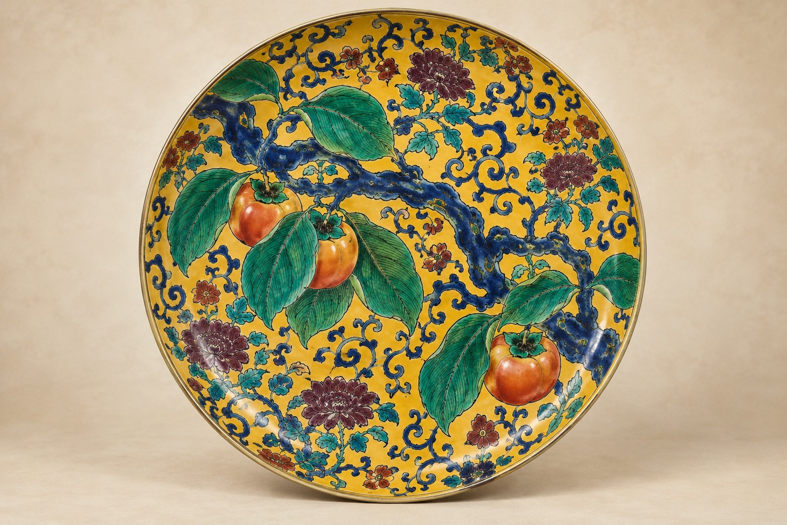
A dark blue-black branch enters from the lower left and bends across a field of yellow. Large green leaves spread from it, each ribbed in black. Behind them, dense scrolling linework refuses emptiness. At a distance the ground glows; close up it becomes a record of repeated hand movement.
Large Dish with Persimmon Branch—officially also titled 色絵柿の枝図平鉢—was made in Japan in the mid- to late 1600s. The Cleveland Museum of Art records it as porcelain with underglaze black and overglaze enamel, classifying it as “Hizen ware, Ko-Kutani style.” It measures 33.4 centimeters across and 6.2 centimeters high.
The museum considers this particular plate a Kyushu product. That sentence is essential. “Ko-Kutani” was long treated primarily as the output of an early kiln at Kutani village in today's Ishikawa Prefecture; archaeological and technical research has moved many objects into the orbit of Hizen and Arita. The name survives here as a style, not a guaranteed kiln address.
Autumn Without the Fruit
The museum notes that persimmons ripen in autumn and are closely associated with the season. Yet the plate does not depend on orange fruit as an obvious emblem. Branch, leaf mass and downward weight suggest a tree moving toward ripeness. Autumn appears as anticipation.
The circular vessel functions as frame and useful object. The branch refuses to sit politely at the center: it enters from outside, touches the rim and seems to continue beyond it. The composition behaves like a close view cut from a larger tree, not a botanical diagram reduced to fit a plate.
Observation here is not the same as naturalism. Leaves become saturated green planes; the branch approaches a dark ribbon. The artist preserves enough structure for recognition, then transforms the plant to suit curved porcelain and enamel color.
Aode Does Not Mean a Blue Monochrome
The museum places the dish in the palette called aode, literally “blue-green hand.” The term does not describe an object painted only blue. Deep blue, green, purple and yellow enamels cover nearly the entire surface of aode works. Here, yellow ground, green leaves, blue-black branch and purple details suppress most of the porcelain's visible white.
Color is not merely attached to things. Green identifies foliage while also making the leaves leap from yellow. Black contours control boundaries among enamels and create their own rhythm. Tiny background scrolls operate at a different scale from the monumental branch, producing depth without conventional perspective.
A Surface That Refuses Emptiness
Some porcelain aesthetics celebrate uncovered white body. This dish saturates it. The yellow ground's scrollwork reads from afar as luminosity and at close range as labor. The persimmon does not become a quiet plant study because the field behind it never stops moving.
The branch also rejects symmetry. It rises diagonally; leaves balance without repeating. The rim crops the design, while rotating the plate reveals new alignments. There is a principal view but not a single inert one.
At 6.2 centimeters high, the shallow bowl is not simply a round painting. Its decorated plane bends upward toward the rim. The design submits to a three-dimensional form and, at the same time, makes that form feel wider than its physical boundary.
How Ko-Kutani Became a Style Name
Regional history in Ishikawa traces early Kutani to a kiln begun in Kutani village under the Daishoji domain in the 17th century and abandoned after roughly half a century. In 1824, merchant Yoshidaya Den'emon attempted revival at the old kiln site. An Ishikawa prefectural training institute explains that the term “Ko-Kutani”—old Kutani—came into use as revival wares created a need to distinguish the earlier objects.
Excavations and scientific study later complicated the map. Kiln material in Hizen and analysis of bodies and glazes led museums to assign many works formerly called Ko-Kutani to Arita-area production. Tokyo National Museum now uses labels such as “Imari (Ko-Kutani aode)” and “Imari (Ko-Kutani five-color type).”
Cleveland's “Hizen ware, Ko-Kutani style” holds both histories together. The term no longer has to function as a certain place of manufacture. It can identify a visual language of dense enamels, powerful contour and bold design. That distinction allows the plate's connection to Kutani aesthetics to remain meaningful without misplacing its kiln.
| Term | Meaning here | Editorial limit |
|---|---|---|
| Hizen ware | Museum's production-region classification | Centered on areas of modern Saga and Nagasaki |
| Ko-Kutani style | Visual and enamel tradition | Does not automatically mean made at Kutani village |
| Aode | Dense green, yellow, purple and blue palette | Not a blue monochrome |
| Overglaze enamel | Color applied after the porcelain body was fired | The museum also records underglaze black |
Inside Hizen's Porcelain Revolution
Japan's sustained porcelain production developed in Hizen in the early 17th century. White bodies, cobalt decoration and overglaze enamels diversified rapidly, serving domestic demand and, later, overseas trade. Ko-Kutani-style color emerged from this period of experiment, responding to Chinese overglaze traditions while pushing thick contours, asymmetry and saturated fields in distinctive directions.
Technology alone does not explain the persimmon plate. The ability to fire enamel and the decision to erase almost all white space are different achievements. Enlarging one branch against restless yellow was an act of design, not an inevitable result of improved kilns.
No maker, workshop or patron is recorded. Anonymity should not be confused with spontaneity. A regular porcelain body, multiple firings, controlled enamels and intricate pattern demanded specialized knowledge and coordinated labor.
Tradition Built Through Interruption
The Kutani story is not a seamless chain. Early production stopped; about a century passed before revival kilns in Kaga studied and reactivated the old language. Yoshidaya ware deliberately recovered dense aode color. Miyamotoya developed fine red painting, and other kilns added further identities.
Tradition can therefore mean more than uninterrupted repetition. It can be the conscious study, selection and reconstruction of something lost. The name Ko-Kutani itself became more necessary because revival made the past newly active.
Early 1600s — Sustained Japanese porcelain production develops in Hizen
Mid- to late 1600s — The Cleveland persimmon dish is made
Early 1700s — The early Kutani-village kiln is traditionally said to have ceased
1824 — Yoshidaya Den'emon begins revival work at the old Kutani site
1958 — The Millikins acquire the plate from K. H. Hewett in London
1964 — They give it to the Cleveland Museum of Art
The Dish's Modern Journey
The museum places a question mark before the plate's provenance up to 1958. That year, London dealer K. H. Hewett sold it to Severance A. and Greta Millikin. The couple gave it to the Cleveland Museum in 1964. Roughly three centuries between manufacture and its documented modern appearance remain unfilled.
Such gaps are common in decorative arts. Vessels are used, inherited, separated from sets and moved across borders; names of makers, patrons and owners disappear. A museum's question mark is not an embarrassment. It distinguishes evidence from an attractive story.
The work has appeared in exhibitions since at least 1961, including presentations in Chicago, St. Louis and Kansas City, and a 2023–2024 Cleveland installation. It is currently listed as not on view, so anyone traveling specifically to see it should confirm its status first.
Open Access Extends the Act of Looking
Cleveland makes the artwork's image and data available through its Open Access initiative, permitting copying, modification and distribution without advance permission. A student in Japan can enlarge a leaf rib or background spiral that a visitor might struggle to inspect through glass.
Open use does not make every historical claim final. The object page itself warns that information, including provenance, may be revised. Openness is valuable precisely because it separates shared evidence from provisional interpretation and makes correction possible.
At the beginning of September, a branch without ripe fruit feels especially exact. Autumn does not arrive as a completed tableau. Thickness of leaf, angle of light and weight of branch change first; the viewer recognizes a season before it declares itself. A 17th-century decorator fired that anticipation not into white space, but into the pressure of yellow, green, purple and blue-black.