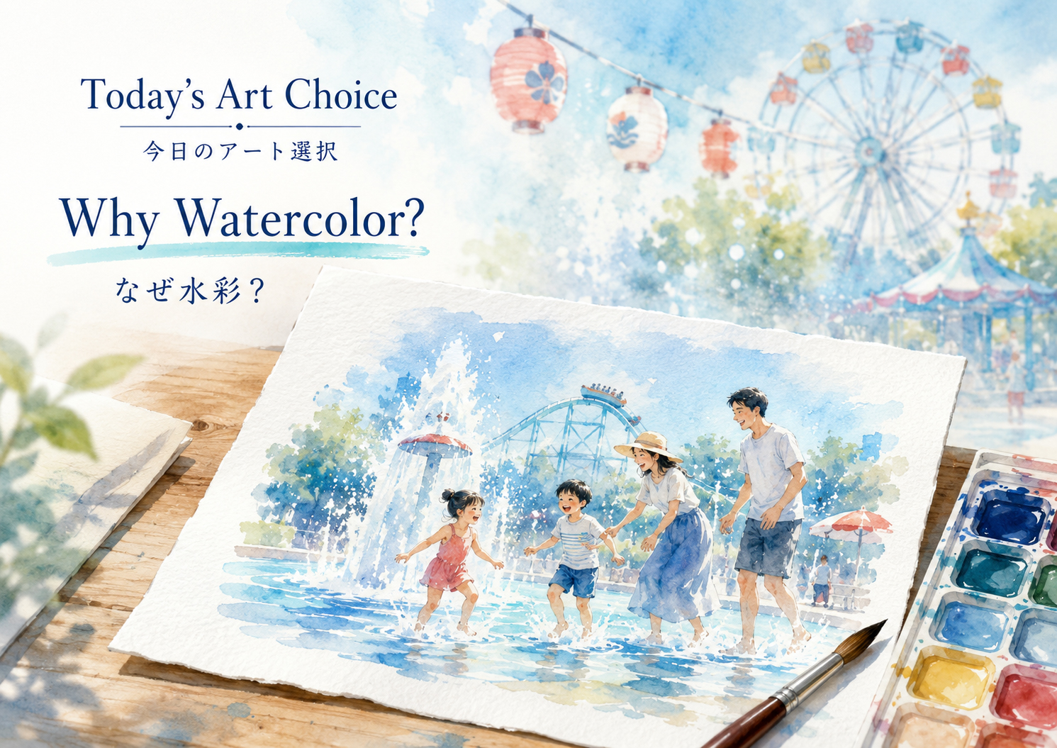
For the June 30 summer amusement park edition, Japan.co.jp made a deliberate visual choice: watercolor. That choice was not a filter. It was an editorial decision. The stories were full of water: pool openings, splash zones, mist, fountains, seaside rides, bubbles, night shows, summer heat and the family memory of getting joyfully soaked. Watercolor gave the whole issue a cooler emotional temperature.
The simplest explanation is this: a photograph says, “this happened.” A watercolor says, “this is how it felt.” For amusement parks, especially in summer, feeling matters. The spray is never perfectly sharp. The sky is too bright. Children run through fountains. Parents hold towels. Roller coasters blur in the heat. Lanterns glow at night. Watercolor is the language of that blur.
The plain-spoken version: AI is a visual translator
AI image generation is easiest to understand as translation. The publisher gives a sentence, mood and structure. The image model translates that instruction into visual relationships: sky, water, people, colors, composition, light, texture and style. OpenAI’s image tools are designed to generate and edit images from text prompts, and current GPT Image models can work from text and image inputs to produce or modify images. That does not mean the model has a hand, a brush or a private memory of summer. It means it can convert language into an image-shaped answer.
For this issue, the prompt did not simply say “make art.” It said, in effect: make Japan, summer, amusement parks, water, families, joy, travel-poster composition and watercolor all belong together. The model responded by building a visual world: Ferris wheels, roller coasters, fountains, pools, mist, crowds, summer flags, paper grain and transparent blue washes.
What a style really is
A style is not only a look. It is a reading instruction. “Watercolor” tells the reader to expect softness, transparency, atmosphere, light, paper texture and memory. “Noir photography” would tell the reader to expect shadows, tension and suspicion. “Ukiyo-e” would tell the reader to expect flat color, line, pattern, theater and history. “Technical blueprint” would tell the reader to study structure.
That is why future Japan.co.jp editions can use different art genres. A drone-industry issue might use cinematic technical illustration. A food issue might use warm gouache. A historical crime issue might use ink wash or woodblock-inspired art. A hotel issue might use architectural watercolor. The style is part of the editorial voice.
How the machine makes an image, in human words
Modern AI image systems are often explained through the idea of diffusion. In a simplified version, a model learns how images can be gradually corrupted by noise and how that process can be reversed. IBM describes diffusion models as systems that add random noise to training data and learn to reverse that process so they can generate new samples by denoising. In image generation, that denoising process can be guided by text: “watercolor,” “summer park,” “families,” “Japan,” “mist,” “Ferris wheel.”
Imagine starting with visual static. The model repeatedly asks: if the instruction is “a watercolor summer amusement park,” what kind of shapes should become slightly more likely? A blue wash may become sky. Circular lines may become a Ferris wheel. Pale splashes may become fountains. Human shapes may become families. The result is not found in one place. It is assembled through learned visual relationships.
Now a little more technical: latent space
Many modern image systems do not work only by pushing raw pixels around. Research on latent diffusion showed that image generation can be made more efficient by working in a compressed “latent” representation rather than directly in full pixel space. The 2022 latent diffusion paper describes using pretrained autoencoders and cross-attention mechanisms so diffusion models can be guided by inputs such as text while reducing computational cost compared with pixel-based diffusion.
A useful metaphor: instead of painting every drop of water at full resolution from the first second, the system first works with a compressed sketch of meaning. In that compressed space, “watercolor amusement park” is not a sentence anymore. It becomes a set of relationships among color, shape, texture, object, perspective and mood. Later, the system turns that compressed visual plan into a detailed image.
The prompt is not magic. It is direction.
People sometimes call prompting magic because the results can feel sudden. But strong prompting is closer to art direction, editing and stage management. It says what matters, what does not, what should be in the foreground, what should be avoided, what the emotional temperature should be, and how the reader should feel.
For this edition, the art direction asked for no logos and no copyrighted characters, because the point was not to impersonate any park’s official material. The point was to create an editorial visual system for Japan.co.jp: a shared watercolor language for a set of real reports about real summer attractions.
Why the publisher still matters
The machine generated the images, but the publication chose the meaning. The publisher chose the theme, the lineup, the filenames, the tone, the story hierarchy and the art genre. That matters because AI can produce endless visual possibilities, but it cannot decide what Japan.co.jp is trying to become. A publication needs taste, restraint, context, ethics and continuity.
AI is powerful at making variations. Publishers are responsible for selection. That is the editorial act: not simply generating, but choosing. A good editor knows when an image fits the story, when it is too flashy, when it is misleading, when it feels generic, and when it suddenly makes the issue come alive.
Teaching readers to see AI clearly
This recurring “Today’s Art Choice” feature can help readers learn AI by watching real editorial decisions. Instead of teaching AI as an abstract machine, Japan.co.jp can teach it through daily choices: why watercolor today, why ink tomorrow, why noir next week, why architectural rendering for hotels, why manga for pop culture, why documentary realism for serious news.
That teaching method matters. People understand AI better when they can connect it to a concrete decision. A style is not a decoration. It is a hypothesis: this visual language will help this story become clearer. If the style works, the reader understands faster. If it fails, the publisher learns something.
Ethics: labeling, provenance and honesty
AI art should not pretend to be field photography. When a reader sees an AI-generated watercolor on Japan.co.jp, the page should make clear that it is editorial illustration, not documentary evidence. OpenAI has also described provenance signals such as C2PA metadata and SynthID as ways to help people understand whether an image may have been generated with OpenAI tools. Those technical signals are useful, but editorial honesty is still essential.
For Japan.co.jp, the rule can be simple: generated illustration is allowed when it helps readers understand a theme, but it should not fake an event photo, impersonate a real person, or mislead the reader about what was witnessed. The watercolor amusement park series works because it is clearly interpretive. It shows the feeling of the edition, not a claim that a particular photograph was taken at a particular minute.
Future editions: a visual curriculum
| Edition theme | Possible art direction | What readers learn |
|---|---|---|
| Water parks and summer travel | Watercolor | Style can echo subject matter. |
| Historic mysteries | Ink wash or woodblock-inspired illustration | Visual genre can place a story in time. |
| AI business and semiconductors | Clean futuristic editorial illustration | Abstraction can make systems readable. |
| Food and regional flavor | Gouache or warm still-life illustration | Texture can make taste feel visible. |
| Disaster and safety reporting | Restrained documentary-style graphics | Serious subjects need visual restraint. |
Japan.co.jp’s view
Today’s art choice is part of the journalism. It tells the reader how to enter the issue. The June 30 edition was about summer heat, amusement parks and water. Watercolor made the page feel cooler before the reader finished the headline. It gave the issue one atmosphere instead of ten unrelated images.
That is what AI can do well when directed carefully. It can help a small publisher build visual unity at the speed of daily publishing. It can turn a theme into a world. It can help readers feel the difference between one edition and the next. But the tool does not replace the publisher. The tool needs a person asking: what is today about?
For June 30, the answer was water. So the art became watercolor.
Sources and references
This report uses public sources about image generation, diffusion models, prompting and provenance. It is written as an educational publisher’s note, not a technical manual.
- OpenAI Developers: Image generation guide.
- OpenAI Help Center: Image Generation help collection.
- IBM Think: What are diffusion models?
- Rombach et al.: High-Resolution Image Synthesis with Latent Diffusion Models.
- OpenAI Help Center: C2PA and SynthID in OpenAI-generated images.