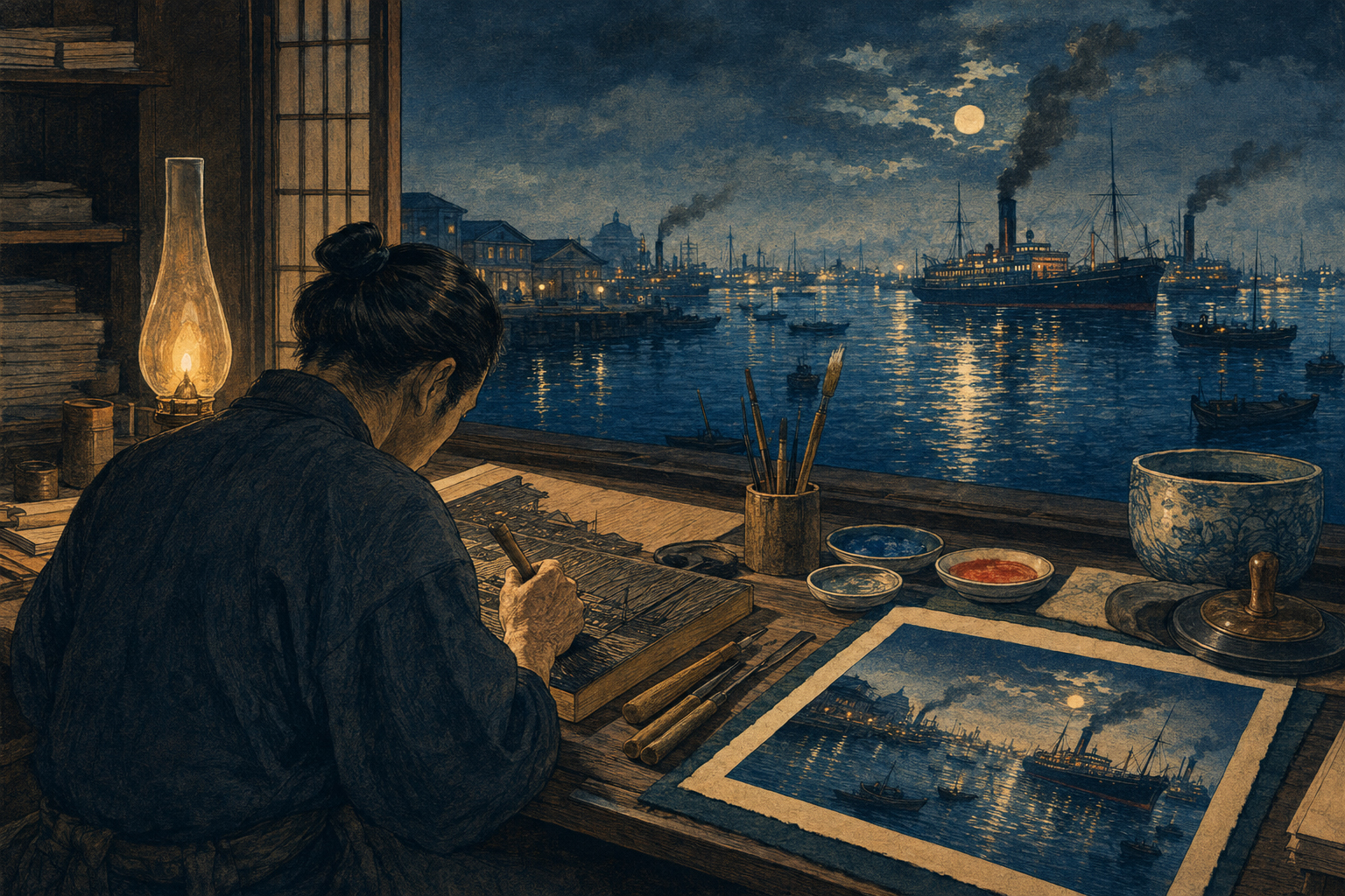
Today’s choice is a syntax of light, not a copy of an artist
This special issue places microscopic hitchhikers, Antarctic diving, a fishing port, the lightless ocean, a fault cutaway, plastic injury, Cretaceous reconstruction, modern ships, artificial intelligence, Arctic observation and space logistics on neighboring pages. A single photographic look would make undocumented futures and extinct animals resemble fake photographs. A new style for every subject would make the issue visually incoherent. Kiyochika’s value lies less in a list of things he drew than in a method for making unlike things inhabit one atmosphere.
In his Tokyo, moonlight, sunset, fireworks, lanterns, gas lamps, locomotive headlights and urban fires connect bridges, rivers, stations, telegraph wires and human silhouettes. In this issue, submersible lamps, bridge lights, tugboat reflections, blue light beneath ice and dawn behind a recovery ship can perform the same compositional work. We are borrowing no one identifiable composition. We are adapting a syntax: let darkness carry information, then use a primary source of light to organize both the viewer’s eye and the story’s meaning.
What kōsen-ga means—and what it does not
Kōsen-ga (光線画), often translated as “light-ray pictures,” is a name used for Kiyochika’s landscape prints centered on the behavior of illumination and shadow. The Metropolitan Museum of Art says his works have been called kōsenga because of that preoccupation. It was not a licensed school, a manifesto with fixed membership or a precise category covering everything Kiyochika produced. Museum catalogues and scholars do not always draw its boundaries in exactly the same place.
“Meiji kōsen-ga style” therefore does not mean every woodblock print made during the Meiji era. Bright “civilization and enlightenment” pictures, newspaper illustration, satire and war triptychs all belong to the period and to Kiyochika’s wider career. Our center of gravity is narrower: night, rain, dawn, reflections, backlight, silhouettes and atmospheric recession. Nor should kōsen be reduced to laser-like rays. Kiyochika’s light also exists as a pinprick, a reflection, a wet road, a break in clouds or a contour that disappears with distance.
Born in Edo in 1847, formed by a city that vanished
Art Platform Japan records Kobayashi Kiyochika’s birth on September 10, 1847, in Honjo, Edo, and his death in Tokyo on November 28, 1915; his field was printmaking. According to the Smithsonian’s National Museum of Asian Art, he was a minor retainer of the Tokugawa shogunate who followed his deposed master into exile after the political transformation of 1868. When he returned to his birthplace in 1874, Edo had become Tokyo, and railroads, steamships, gaslights, telegraph lines and large brick buildings had entered its view.
His artistic training must be described carefully. Secondary accounts connect him to figures including the British illustrator Charles Wirgman, the painter Kawanabe Kyōsai and the photographer Shimooka Renjō, but the extent of formal instruction is not securely documented. The Smithsonian calls him self-trained or largely self-taught. What the prints do establish is a working fusion: photographic cropping, copperplate-like hatching, a Western awareness of directional light and the colored planes of Japanese woodblock printing. “A ukiyo-e artist who learned Western technique” is less useful than “an experimental print designer testing several visual media in the workshop.”
From 1876 to 1881, ninety-three Tokyos at the edge of night
Kiyochika began publishing his Tokyo views in 1876. The Smithsonian describes an intended hundred-image project effectively ended by a devastating city fire in 1881, with 93 designs completed. Japan’s first railway had opened in 1872 and Tokyo’s gasworks in 1874. The series began precisely as innovations moved from spectacle toward the texture of ordinary urban life.
Many kaika-e, or “enlightenment pictures,” celebrated new stations, Western buildings, fashionable dress and vehicles in emphatic color. Kiyochika let the station sink into rain and shadow. A gas lamp failed to conquer the entire street. Telegraph wires became perspective lines. People often appear as black silhouettes—not triumphant agents of progress, but spectators learning how to look at their altered city. When Tokyo intellectuals revived interest in the series in the 1910s, some read this suspension between celebration and loss as a critique of modernity.
The night is not simply nostalgic. New gaslight reveals the quality of an older darkness; locomotive fire makes moonlight feel cold. Rather than isolate a machine as a gleaming hero, Kiyochika measured its arrival through humidity, reflection, silence and human distance. That is why this issue places autonomous navigation and generative AI inside weather, water, port work and human oversight instead of picturing technology as disembodied light.
Moon, fireworks, gas and locomotive fire do different jobs
| Kiyochika’s light | Historical function | Translation for the 2026 ocean |
|---|---|---|
| Moon and twilight | Preserve partial contours; locate time, scale and quiet | Ambient light beneath ice, in the abyss and around an Arctic ship |
| Fireworks and fire | Gather attention through an instant of light and reflected color | Dawn or warning accents—never disaster converted into spectacle |
| Gas lamps and lanterns | Compare old and new illumination on the same street | Ship lights, port lights, sensors and observation lamps at different scales |
| Locomotives and steamships | Place machines of modernity inside shadow, smoke and weather | Electric tug, autonomous ferry and research ship as parts of an environment |
| Water reflections | Double a light source and give distance a tremor | Join key light to sea surface, wet deck, bubbles or underside of ice |
In Fireworks at Ikenohata, viewers become dark shapes while the pond provides a second stage of reflected illumination. At Shinbashi Station, interior lights, lanterns, oil-paper umbrellas and rain-soaked ground make a complex “polyphony” of luminosity. In View of Ushimachi in Takanawa by Hazy Moonlight, a coastal locomotive competes with the moon, smoke and its own lamps. Our one-key-light rule does not pretend these historical works were simple. It is an editorial discipline that keeps a web hero legible at thumbnail scale. A weaker second source may exist, but it cannot overthrow the hierarchy.
For Kiyochika, water was an enormous plate for testing light
The closest historical bridge to this Marine Special is Moonlit Sea at Kawasaki. The British Museum catalogues the circa-1880 woodblock as moonlight over the sea with four ships, two firing a salute. The Smithsonian notes that the scene is imaginary and was probably influenced by a Currier & Ives lithograph. A print associated with a named place is not automatically an eyewitness document.
In Fireworks at Ryōgoku, the viewpoint falls near water level; boats and spectators are silhouettes, and a fireball is repeated in the moving river. The 1879 Takanawa design refers to the railway opened seven years earlier, but the Smithsonian says its locomotive appears to derive from a foreign print and may represent a type not yet used in Japan. Observation, photographs, imported imagery and invention could occupy the same design.
The lesson is not that historical prints are unreliable and modern images are superior. It is that atmospheric light can make a synthesis feel witnessed. The stronger that persuasive power becomes, the stronger the caption must be: “editorial illustration,” “scientific cutaway,” “reconstruction” or “concept image”—never documentary evidence where none exists.
A woodblock print is not one person’s hand
Commercial Japanese prints were collaborative objects. A publisher organized and financed a project; a designer supplied the image; block cutters carved the key and color blocks; printers controlled paper moisture, pigment, pressure, registration and sequence. The British Museum’s process guide explains the kentō registration system: a corner notch and a long-edge mark allow each sheet to return to the same position for every color. A baren rubs the back of the paper by hand; greater pressure can produce a darker transfer.
Bokashi is printed gradation made with water, pigment and brush. For Kiyochika’s Night at Kudanzaka in the Fifth Month, the Smithsonian explains that pigment was applied in a gradient to a moistened block, yielding more nuanced darkness than a single flat value. This is not identical to a perfect digital gradient. Water, pressure, paper and the state of the block introduce variation from impression to impression.
The visible woodgrain and warm handmade-paper texture in our master direction remember that material collaboration. They do not prove a block was carved or a sheet hand-printed. Every caption identifies the result as a digital editorial illustration.
Indigo and Prussian blue are not one historical “blue”
The issue’s principal colors are deep indigo and Prussian blue. Imported Prussian blue became widely available to Japan’s print market around 1830 and helped define Hokusai’s Thirty-six Views of Mount Fuji. Conservation research at the Metropolitan Museum of Art notes that the series was advertised around New Year 1831 for its newly available foreign pigment; layered printing increased its depth. By Kiyochika’s generation, blue already carried histories of chemistry, trade and print innovation.
Yet “indigo” in this production brief is also a visual color instruction; it does not claim every pixel simulates natural ai pigment. Nor should we assign a specific pigment to a particular Kiyochika print without technical analysis. Deep indigo holds the largest shadows. Prussian-blue tones articulate the transparent middle distance of sky and water. Muted vermilion marks danger, life or a mechanical focal point. Warm gold is reserved for the source of illumination or a small hopeful counterweight. Historical color names are guides—not certificates of material authenticity.
The fire of 1881 unsettles the border between record and staging
The great fire of 1881 effectively ended the Tokyo series. Kiyochika witnessed and represented urban fire and its aftermath with extraordinary force. Yet the Smithsonian’s object commentary also identifies a design in which flames were added to a sketch originally made on a clear day. Even a work carrying the authority of “drawn from nature” is not the equivalent of one camera exposure.
The Noto Peninsula seafloor-deformation image in this issue requires the strictest version of that lesson. A cutaway is a scientific editorial device that makes an unseen structure visible; nobody looked through the ocean from that viewpoint. Kōsen-ga drama may clarify the reading order of a fault plane, uplift, subsidence and water displacement. It must not add fire, a monstrous wave or terrified victims for impact. Text and caption state what the model shows and what remains uncertain.
Do not leave the war prints in the shadows
Kiyochika’s command of light later served the illumination of war. The Metropolitan Museum’s Use of Electricity during the Siege of Pyongyang (1894) is a propagandistic triptych in which Japanese troops direct electric searchlights toward Chinese forces while the city burns behind them. During the Sino-Japanese War and, a decade later, the Russo-Japanese War, inexpensive woodblock prints carried military spectacle and claims of imperial modernization to a mass audience. The series Long Live Japan: One Hundred Victories, One Hundred Laughs includes mockery and racialized depictions of an enemy.
To reduce this history to “his later style changed” would let us extract dramatic light as innocent decoration. MIT’s Visualizing Cultures project examines how Kiyochika rapidly produced numerous war triptychs spanning lyrical night scenes, gruesome violence and dehumanizing caricature. Technical brilliance does not detach those works from imperialism, war or racism.
This issue does not borrow the war prints’ battle formations, flags, medals, enemy types, victory fires or exaggerated suffering. Ships and technology are treated as questions of operation, safety, labor and environmental cost—not emblems of national supremacy. “Inspired by” is not blanket praise. It is a contract to say which historical principles we carry forward and which uses of those principles we reject.
Sixteen images, organized by four kinds of light
| Story family | Subjects | How the light language works | Facts that remain non-negotiable |
|---|---|---|---|
| Life and ecosystems | Bottle-cap community; penguins and krill; bluefin; crab in a bottle; Cretaceous giant octopus | Rim light, graded schools and strong foreground silhouettes | Recognizable anatomy, relative scale and behavior; no romanticizing injury or predation |
| Deep ocean and Earth science | Thirty-eight new species; 108 trench forms and a mystery animal; Noto seafloor deformation | A submersible or lander beam becomes the modern equivalent of a gas lamp | Depth, terrain, specimen versus reconstruction and the status of a cutaway |
| Ships and operating systems | Aquaculture; autonomous ferry; electric tug; shipping AI; rocket recovery; Oshoro Maru | Navigation lights, dawn, reflection and wake join machinery to water | Recognizable hull and equipment within available evidence; no invented engineering or sensor readout |
| Ocean economy and this story | Japan’s investment roadmap; the issue’s art direction | A common horizon and key light organize many activities | A concept panorama is not a built project, investment commitment or geographic plan |
The illumination can change by family. In deep-ocean scenes, black is habitat, not empty space. Wildlife keeps the eye, fin and body landmarks needed for identification. Ships retain waterline, bow, superstructure and towing relationship. A future panorama places possible technologies on one horizon without pretending to predict a single outcome. Unity comes from a shared set of decisions, not from applying the same blue filter.
The master direction, translated into production rules
Master style direction: Meiji-era Japanese kōsen-ga woodblock print, dramatic marine light, deep indigo and Prussian-blue palette, muted vermilion and warm-gold highlights, crisp black contours, simplified but factually recognizable subjects, atmospheric depth, visible woodgrain, warm handmade-paper texture, elegant horizontal editorial composition, no text, no border, no logos.
| Phrase in the brief | Production meaning | Failure to avoid |
|---|---|---|
| Meiji kōsen-ga | Build narrative through key light, shadow, reflection and twilight | Add kimono, torii or Mount Fuji merely to signal “Japan” |
| Indigo and Prussian blue | Separate foreground, middle distance and horizon by blue temperature and density | Wash everything in one blue until species and machines disappear |
| Muted vermilion and gold | Reserve for life, danger, a lamp or the operational focus | Let accents expand into advertising color |
| Crisp black contours | Identify the central species, ship or device at editorial scale | Turn unknown details into hard-line assertions |
| Atmospheric depth and bokashi | Grade water, mist, bubbles, smoke, cloud and the light cone | Hide an important scientific structure under texture |
| Woodgrain and paper | Add the irregularity of handwork after the facts are clear | Use damage, yellowing and seals to fake an antique object |
| Horizontal composition | Work at 1536 × 1024 with a subject and negative space safe for responsive crops | Place indispensable anatomy at an edge that will be cut |
| No text, border or logos | Put title, explanation and source in HTML and the caption | Generate false title slips, signatures, seals or trademarks inside the art |
A composition ratio: 60 dark, 30 subject, 10 spark
This is a working proportion, not a pixel audit. Atmosphere and shadow may occupy roughly 60 percent; the factually recognizable subject about 30 percent; vermilion and gold sparks less than 10. Darkness gives the hero room to breathe without placing a web headline inside the image. The subject sits near a third-line intersection; the key light lies ahead of or behind it; a reflection, wake or diagonal returns the eye.
A horizontal design should not rely only on a left-to-right time sequence. The same picture serves Japanese and English pages, and an encoded “correct” reading direction can feel reversed in one. Light, horizon and diagonals should make a circulating path. If the responsive page trims the composition on a phone, subject, light source and environmental context must remain together.
What “simplified but factually recognizable” demands
Woodblock language removes detail. Editorial judgment determines which details survive. An Adélie penguin keeps the white eye ring, body proportions and flipper shape; krill do not become an amorphous red cloud. Bluefin retains a streamlined body, narrow caudal peduncle and identifying fin structure. Deep-sea animals begin with verifiable specimen form; invented glow or color appears only when observation supports it.
For ships, bow and stern, waterline, superstructure and propulsion or towing relationship remain legible. “Autonomous” must not be treated as a synonym for “unmanned.” Generative AI is shown not as glowing words floating above the ocean, but as an abstract connection among weather, route, alerts and human decisions; those lines are not claimed to be real operational data or a product screen. Prehistoric life is a reconstruction, not a photograph. The Noto section is an editorial cutaway and one representation of geological interpretation.
Before generation, each story receives three columns: features that must be correct; features unknown and therefore left ambiguous; features open to dramatic treatment. Style acts strongly in the third column, cannot damage the first and cannot fill the second with false precision.
Plastic harm and disaster should not be over-lit
The community on a bottle cap and the crab confined in a bottle tell different stories about the same material. One concerns rafting and long-distance biological transport; the other concerns entrapment and survival. If gold light turns either into an enchanted miniature kingdom, pollution becomes magical nature. Scratches, confinement and the intrusive quality of the object must survive the beauty of the image.
The same restraint applies to a tsunami mechanism, a quota conflict and changing wildlife foraging. A sinking sun, giant wave or suffering animal can trigger emotion, but it cannot stand in for the article’s causal evidence. Light helps explanation; it is not an instrument for maximizing fear or pity. Do not invent victims or death. Visualize the structure, environment and difficult choice.
Label it Kiyochika-inspired; never label it a Kiyochika
Kiyochika died in 1915, so copyright in his works has generally expired. But museum photography, downloads, databases and credit requirements may carry their own terms. Even where a collection marks an image “Public Domain,” its source data should travel with it. Our heroes do not remix one museum file. They study light, color planes, reflection and silhouette across many works, then build new compositions.
Do not simulate Kiyochika’s signature, a publisher’s seal, a censor mark or an antique title cartouche. Do not insert a false period date or distress the paper so aggressively that the file claims antique provenance. The caption should say “a contemporary digital editorial illustration in a Meiji woodblock idiom inspired by Kobayashi Kiyochika’s kōsen-ga.” It should not say “a Kiyochika print,” “a restored woodblock” or “an 1880s illustration.” Correct attribution is a deeper form of respect than conspicuous name-dropping.
The ten-point editorial inspection
| Check | Passing condition |
|---|---|
| Subject | The article’s central object is identifiable at thumbnail size |
| Light | One dominant source; secondary illumination remains subordinate |
| Fact | Essential species, hull, equipment or terrain features agree with evidence |
| Uncertainty | Unknown features have not been rendered with deceptive precision |
| History | The image recomposes principles rather than tracing one historical work |
| Material surface | Woodgrain and paper remain visible without hiding information |
| Color | Indigo and blue dominate; vermilion and gold remain scarce |
| Ethics | Disaster, animal suffering, war and pollution are not spectacle |
| Clean image | No text, frame, logo, false signature or seal |
| Caption | Editorial status, reconstruction limits and non-documentary nature are explicit |
This is not a beauty score. It checks whether article and image tell the same facts, whether historical reference causes misidentification, and whether visual drama hides uncertainty. Once all 16 are assembled, the issue also compares blue density, subject scale, accent color and grain across the full sequence. Art direction is the rhythm of the edition as well as the finish of each picture.
Why this light language belongs to the ocean of 2026
Marine reporting occupies the border between the visible and the inferred. Fish and ships can be seen; quotas, AI decisions and investment policy cannot. A deep-sea animal appears only inside a lamp’s reach. A fault becomes legible through a cutaway. Climate change appears not in one day’s sky but as a difference across long data series. Kiyochika also withheld complete illumination and asked a limited source of light to make modernity readable.
That makes the style useful for more than giving the ocean a nostalgic Japanese atmosphere. It can show technological brightness and the uncertainty outside it at once. An electric tug may reduce direct emissions, but its electricity, battery and operations still matter. Aquaculture can supply food, but feed, disease and local ecology remain in view. Autonomy and AI can support decisions without removing accountability or human supervision. Leaving part of the scene dark can be a form of critical description.
Not one color of sea, but one question across it
Kiyochika’s Tokyo of the 1870s was never simply “old Edo” or “new capital.” Moon and gas lamp, wooden and stone bridge, kimono and Western dress, quiet river and industrial fire coexist at twilight. That is the unifying principle for this edition. Nature versus technology, traditional fishing versus advanced shipping, conservation versus investment cannot be sorted into clean moral pairs; they interact within one ocean.
The 15 reported stories are not posters placed on an identical blue background. From the microscopic community on a cap to a trench, Tokyo Bay, the Arctic and an offshore rocket recovery, each asks where evidence reaches and what remains dark. This sixteenth image is the plan that makes the question visible.
Sources and further reading
- Art Platform Japan, “KOBAYASHI Kiyochika”: birth and death dates, birthplace and field.
- Smithsonian National Museum of Asian Art, “Kiyochika: Master of the Night”: the 1874 return, 93 Tokyo views, sources of light, bokashi, individual works and the 1881 fire.
- Smithsonian exhibition press release: the intended 100, completed 93, and the synthesis of photography, engraving, oil painting and woodblock technique.
- The Metropolitan Museum of Art, “Fireworks at Ikenohata”: the name kōsen-ga, the 1876–81 views and light amid modernization.
- British Museum, “Moonlit Sea at Kawasaki”: circa 1880, moonlight, four vessels and a salute.
- British Museum, “View of Ushimachi in Takanawa by Hazy Moonlight”: the 1879 moonlit coastal locomotive and Western light/shading.
- British Museum, “Fireworks at Ryōgoku”: the 1880 Sumida River scene of boats and fireworks.
- British Museum, “How to make a woodblock print like Hiroshige”: kentō, baren, color blocks, layered printing and bokashi.
- British Museum, “Hiroshige large print guide”: collaboration among designer, publisher, block cutter and printer.
- The Metropolitan Museum of Art, “The Great Wave: Anatomy of an Icon”: Prussian blue around 1831 and layered color.
- National Diet Library, “Kobayashi Kiyochika’s Nihon Meisho Zue”: the later 1896–97 landmark series, useful for avoiding confusion with the early Tokyo views.
- National Diet Library, “One Hundred Views of Musashi”: the 1884–85 series and the lineage of famous-place prints.
- The Metropolitan Museum of Art, “Use of Electricity during the Siege of Pyongyang”: the 1894 searchlight and Sino-Japanese War propaganda.
- The Metropolitan Museum of Art, “Long Live Japan: One Hundred Victories, One Hundred Laughs”: 1904–05 woodblock propaganda during the Russo-Japanese War.
- MIT Visualizing Cultures, “Throwing Off Asia II”: critical study of Sino-Japanese War imagery, mass production, violence and racial representation.
- Smithsonian National Museum of Asian Art, “The Navy Attacking Urashioko Harbor”: a 1904 naval-war print.
- Tokyo Museum Collection, “Kiyochika Punch”: an 1881 satirical print and the breadth of Kiyochika’s work.
Editor’s note: This article draws primarily on museum, public cultural-institution and university research available through July 17, 2026. Because usage varies, kōsen-ga is not treated as a rigid formal school. Claims about Kiyochika’s training remain qualified where documentation is uncertain. The Prussian-blue discussion concerns the history of pigment in Japanese woodblock printing and does not assign a specific pigment to an untested Kiyochika impression. The hero and related Marine Special images are contemporary digital editorial illustrations inspired by Kiyochika’s treatment of light; they are not reproductions, antique woodblocks or documentary photographs. The exchange-rate display uses this edition’s supplied value: “1 US Dollar = 162.39 Japanese Yen.”