The most powerful object in a crowded boardroom is often the one nobody can stop looking at. A red chart line. A prototype chip. A single automobile under factory light. A portrait at the head of the table. Corporate power is built from sprawling systems—capital, labor, regulation, technology and ambition—but it is remembered through symbols.
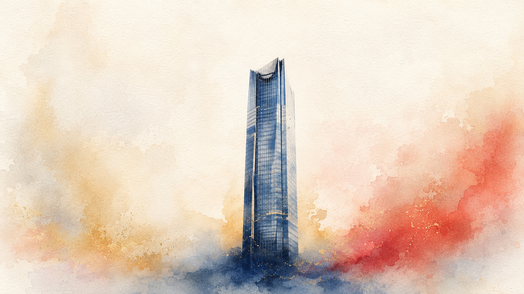
That tension shaped the art direction for Japan.co.jp’s July 28 Corporate Power Edition. The day’s stories move from SoftBank and OpenAI to Japan’s megabanks, Toyota, Sony, Kioxia, Hitachi, Uniqlo, trading houses, insurers and energy security. Each subject could invite an illustration packed with logos, executives, factories, stock charts and national flags. Instead, the edition chooses the opposite: watercolor washes, restrained detail and one dominant focal point.
The rule is simple. Every image must answer one question before it answers any other: What is this story really about? Once that answer is found, everything competing with it is softened, reduced or removed.
Why watercolor suits power
Watercolor looks delicate, but it is unforgiving. Transparent pigment allows the brightness of the paper to pass through. A wash can create atmosphere in seconds; an unnecessary stroke can muddy the entire passage. Unlike opaque paint, watercolor offers fewer places to hide indecision. The artist must decide what to preserve, where to let color pool and when to stop.
That makes it unexpectedly appropriate for corporate reporting. A balance sheet, industrial alliance or supply-chain strategy contains too much information to reproduce literally. Editorial illustration is not a diagram of every fact. It is an act of selection. Watercolor makes that selection visible: saturated color carries emphasis, pale washes provide context, and untouched paper lets the image breathe.
The Victoria and Albert Museum describes watercolor broadly as pigment carried in a water-soluble binder and notes that the category includes transparent watercolor, opaque bodycolor or gouache, and water-based drawing media. The familiar idea of watercolor as a purely transparent British medium is therefore only one chapter in a much wider history.
Before watercolor became “watercolor”
Human beings mixed color with water long before museums separated art into modern categories. Illuminated manuscripts, botanical studies, maps and preparatory drawings all relied on water-based color. The medium was portable, quick-drying and capable of both exact description and atmospheric suggestion.
In Europe, watercolor gained new status between the eighteenth and nineteenth centuries. It moved beyond its supporting role in sketches, topographical records and studies to become an independent exhibition medium. British artists were central to that change. J.M.W. Turner pushed transparent layers, wet passages and brilliant reserved paper toward images in which light itself seemed to become the subject.
That history matters because it overturned an old hierarchy. Oil paint had scale, prestige and permanence; watercolor was associated with travel, observation and preparation. Its champions demonstrated that immediacy could be profound and that a small sheet could contain weather, distance and emotional force.
Japan already understood the expressive power of water
Japan’s relationship with water-based painting did not begin with Western watercolor. Ink painting, or suibokuga, developed from Chinese traditions and became deeply rooted in Japanese visual culture. Sumi ink could move from dense black to the faintest gray, making mist, rock, bamboo, robes and empty air with one material. Tonal restraint did not reduce meaning; it concentrated it.
Japanese painters also worked with mineral and organic pigments, shell white and ink on paper and silk. The boundaries between “ink painting,” “color painting” and what an English speaker calls watercolor do not align neatly. What connects them is the active role of absorbent surfaces, fluid media, brush pressure and unpainted space.
In many East Asian works, blank paper is not unfinished background. It can become fog, water, sky, distance or spiritual interval. The eye completes what the brush withholds. That principle is essential to today’s images. The surrounding wash does not merely decorate the focal subject; it creates the visual silence that makes the subject authoritative.
Ukiyo-e taught the West how to crop
The single focal point in this edition also owes a debt to Japanese print design. When ukiyo-e reached European artists in large quantities in the nineteenth century, its influence went far beyond exotic subject matter. Western artists studied its flattened space, asymmetry, silhouettes, strong contours, abrupt cropping and unusual viewpoints.
The Metropolitan Museum of Art traces how artists including Mary Cassatt, Edgar Degas, Vincent van Gogh, Toulouse-Lautrec and the Nabis absorbed Japanese compositional ideas. Lautrec’s posters, for example, used cropped figures, oblique angles and broad shapes to seize attention in the modern street. Japanese prints showed that an image did not need a centered Renaissance stage filled with complete objects. A partial form at the edge could make the scene feel more immediate.
That legacy survives in photography, cinema, posters, magazine covers and digital thumbnails. A strong image often works not because it contains more, but because it organizes less with greater conviction.
One subject is not the same as a simple story
A single focal point does not claim that corporate Japan is simple. SoftBank’s profit involves valuation, venture risk and OpenAI. MUFG’s rise involves interest rates, regulation, capital markets and confidence. Toyota’s Texas investment contains trade policy, labor, logistics and product strategy. The illustrations do not erase those layers; the articles explain them.
The focal subject performs a different job. It provides an entry point—a bridge between a reader scanning a page and a reader willing to spend ten minutes with an argument. The giant data-center core, the bank tower, the assembly-line vehicle, the vision sensor or the oil tanker becomes a visual verb: compute, finance, manufacture, see, move.
| Editorial problem | Watercolor response | Reader effect |
|---|---|---|
| Too many facts | Choose one symbolic subject | Immediate recognition |
| Competing corporate identities | Suppress decorative logos | Focus on the underlying action |
| Technical complexity | Use atmospheric context | Curiosity before explanation |
| Fifteen unrelated stories | Repeat one visual grammar | A coherent daily edition |
| AI-generated excess | Restrain detail and palette | A calmer, more intentional image |
The focal point is an editorial decision
Artists create emphasis through contrast: light against dark, sharp against soft, warm against cool, large against small, isolated against crowded. Placement matters, but the focal point need not sit at the geometric center. An off-center subject can feel more alive, especially when surrounding washes lead the eye toward it.
For this edition, “single focal point” means one dominant reading at thumbnail size. Secondary marks may describe place, motion or scale, but they cannot compete. The image should remain legible on a phone, in a social feed and beside a headline. If the viewer has to search for the subject, the art direction has failed.
This discipline is particularly useful in AI-assisted image making. Generative systems are often eager to add: extra buildings, repeated objects, decorative circuitry, crowds, signs and cinematic effects. A precise editorial instruction must establish hierarchy. One subject. Restrained detail. Open space. No collage. No visual committee meeting.
Fifteen companies, one visual grammar
The edition’s corporations operate in radically different worlds. SoftBank’s value can appear as an illuminated AI core. MUFG’s market leadership can be carried by one monumental financial tower. Toyota’s investment becomes one vehicle emerging from a Texas assembly line. Sony and Mitsubishi Electric converge in a single seeing sensor. Kioxia’s recovery condenses into one crystalline memory stack.
Hitachi’s physical AI can be represented by one machine acting in real infrastructure. Uniqlo’s global scale becomes one unmistakable garment or storefront. Mitsubishi Corporation’s energy bet becomes one shale well; Mitsui’s mobility ambition, one automobile; Tokio Marine’s partnership, one protective umbrella; ENEOS’s diversification, one tanker on an open route.
The repetition does not flatten the stories. It makes their differences comparable. When the grammar stays stable, changes in subject carry more meaning—like portraits hung at equal height in a gallery.
Water, paper and the ethics of imperfection
Watercolor edges bloom. Pigment granulates. One wash meets another and forms a tide mark. Traditional artists learn to anticipate these events without controlling them completely. The finished image records a negotiation between intention, material and time.
That visible uncertainty is valuable in an edition about corporate power. Companies like to present strategy as inevitable: the investment will create growth, the alliance will unlock synergy, the acquisition will transform the market. Journalism has a different obligation. It must show direction without pretending outcomes are guaranteed.
A watercolor can look resolved while preserving contingency. Its subject is clear; its edges remain alive. That balance mirrors responsible business reporting—firm about known facts, explicit about risk, and open about what has not yet happened.
From hand-painted page to generated image
Japan.co.jp uses article context to guide its daily visual system. The goal is not to imitate one historical master or to suggest that a generated file is a handmade artifact. The goal is to learn from artistic history: Turner’s light, ink painting’s economy, ukiyo-e’s cropping, poster art’s immediacy and editorial illustration’s symbolic compression.
AI changes production speed, but it does not remove the need for editorial judgment. Someone must choose the subject, reject clichés, check whether the picture misstates the story and maintain consistency across the edition. A beautiful image that implies the wrong factory, technology or transaction is still a reporting failure.
- Can the subject be identified immediately?
- Does it express the article’s central action rather than a decorative theme?
- Is there only one dominant focal point?
- Do watercolor washes support rather than obscure the subject?
- Does the image avoid unsupported factual specificity?
- Does it belong to the same visual family as the other stories?
Restraint as a form of confidence
Corporate power often communicates through abundance: larger headquarters, denser presentations, more metrics, more claims. The visual language chosen here refuses that reflex. It gives each company one stage and one decisive object. The empty paper around it is not weakness. It is confidence that the selected idea can hold the space.
The result is an edition that can be scanned quickly but rewards a slower look. At first glance, the reader sees a tanker, tower, chip, car or garment. On entering the story, the object opens into finance, policy, industrial history and risk. The image is a door, not the room.
That is today’s art choice: watercolor with a single focal point. Water supplies atmosphere. Pigment supplies emphasis. Empty paper supplies silence. The focal subject supplies the promise that every complicated corporate story begins with one intelligible idea.
Sources and further reading
- Victoria and Albert Museum: What is watercolour?
- The Metropolitan Museum of Art: Japonisme
- The Metropolitan Museum of Art: Van Gogh and Japanese influence
- The Metropolitan Museum of Art: Chinese handscrolls and the dialogue of word and image
- British Museum: Japanese block-ready drawings and the discipline of line