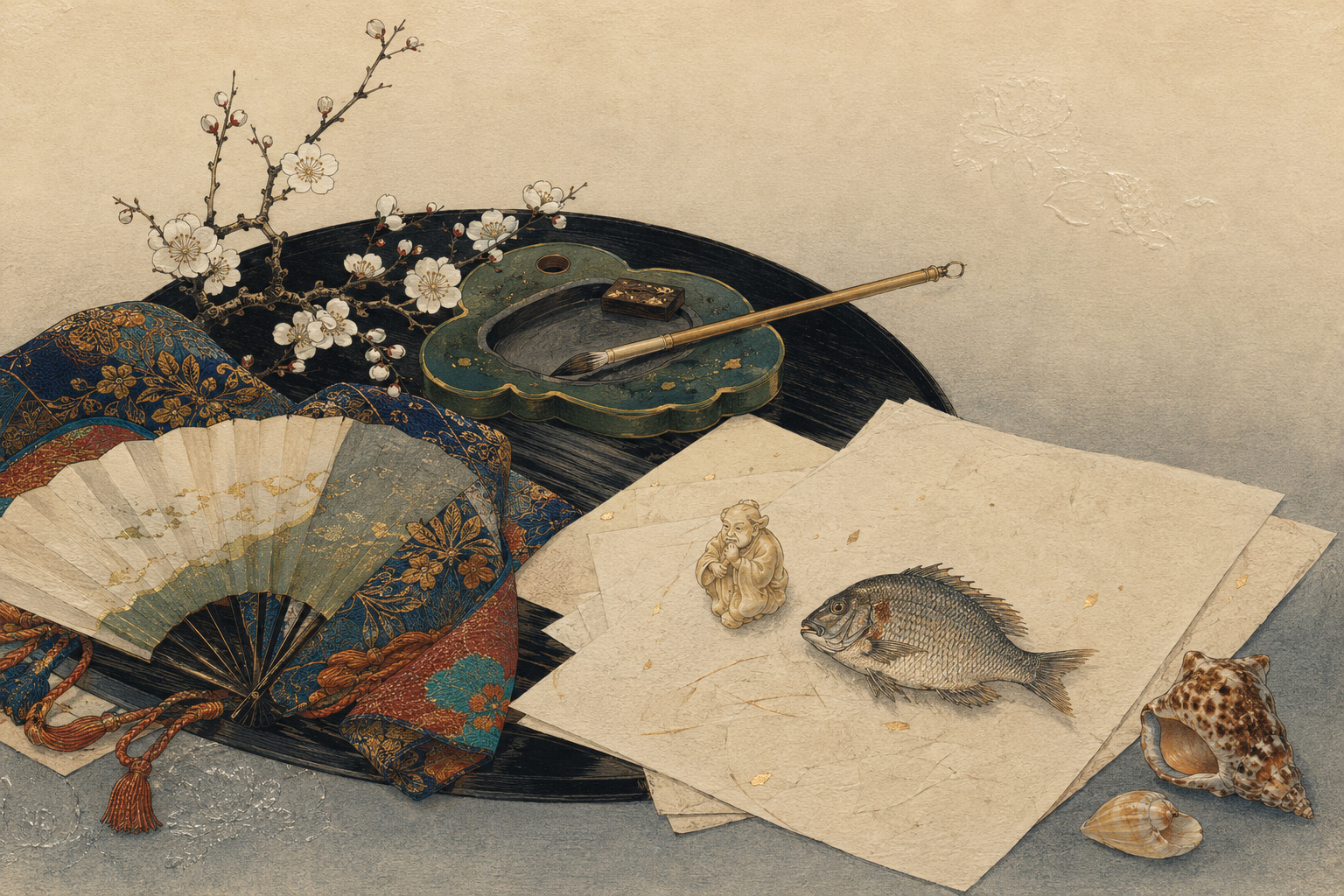
The first instruction for looking at a surimono is almost embarrassingly simple: do not keep it still. Tilt the sheet. Let light travel across it. A robe pattern that appeared to be unprinted rises from the paper. Silver-gray water flashes and disappears. A lacquered surface darkens into depth. The fibers of a thick sheet accept the pressure of a carved block and remember it.
Totoya Hokkei understood that a print could contain a second image that was not made of color. It could be made of pressure, sheen and the expectation that the recipient would come close. On a museum website, his work can look like a small, restrained illustration with poems occupying inconvenient space. In the hand, a fine impression behaves differently. It discloses itself by degrees.
This is the intimacy in today’s choice. It does not mean private confession in the modern sense. It means a work calibrated to a small circle, a learned joke, a seasonal exchange and a viewing distance measured in centimeters. Surimono—literally “printed things”—were privately commissioned prints. They served as New Year greetings, poetry-club keepsakes, invitations, performance announcements and commemorative gifts. They were not designed primarily for anonymous retail sale.
Hokkei became one of the form’s great designers during the 1820s and early 1830s. The Rijksmuseum calls him one of the most prolific surimono artists of those years and notes his many illustrations for collections of kyōka, the witty thirty-one-syllable verse that often accompanies the image. Yet productivity is not what makes him distinctive. His distinction is concentration: the ability to make material facts—fish skin, paper, lacquer, cloth, smoke, snow, metal—carry several layers of thought without losing their thingness.
Who was Totoya Hokkei?
Hokkei was born in Edo in 1780, two decades after Hokusai. Museum biographies agree that he first studied in the Kanō painting tradition, the long-established school that served elite and official patrons, before entering Hokusai’s orbit. He used several art names, including Kyōsai and Aoigaoka. A late print of 1835 is signed “Aoigaoka rōjin”—Old Man Aoigaoka—and the Metropolitan Museum of Art notes that the same designation appears on his gravestone.
Later biographies identify him as Iwakubo Tatsuyuki and explain “Totoya,” literally suggestive of a fish dealer, through a family or personal connection to the fish trade. The story is tempting because fish recur so vividly in his prints. But a name is not a documentary photograph of an occupation, and the major collection pages consulted for this article are firmer about his training than his early employment. The prudent formulation is that a fish-trade association is widely repeated, while the surviving works provide the strongest evidence of what he knew how to see.
Being Hokusai’s pupil placed Hokkei within an astonishingly inventive network. It did not make him a small Hokusai. The master’s reputation now bends the history around him: wave, mountain, manga, old age and ceaseless reinvention. Hokkei’s achievement occupies a quieter register. He was a designer of private prints, illustrated books and paintings whose line could move between Kanō discipline, ukiyo-e observation, Chinese legend, Japanese classic, contemporary fashion and the tabletop.
A British Museum note on a painted hanging scroll from about 1820 considered Hokkei an exceptionally skilled pupil and praised his brushwork. The work—a courtesan turning toward a child drawing on the misted surface of a metal mirror—also shows that his art was not confined to woodblock prints. The Metropolitan Museum preserves his 1829 album of Suikoden portraits with kyōka and a 1833 illustrated book of humorous poems on cherry blossoms and maple leaves. Prints made him multiple; books made him sequential; painting allowed the brush to remain singular.
1780 — Born in Edo; later museum records use the name Totoya Hokkei.
Early training — Studies in the Kanō tradition, then becomes a pupil of Hokusai.
1810s — Produces illustrated poetry work and sophisticated surimono; Preparations for the New Year is dated 1817.
1820s–early 1830s — Peak period of prolific surimono design, including shells, legends, landscapes and still lifes.
1829 — Album of Suikoden Portraits with Kyōka Poems.
1832–35 — Writing desk, sake barrels, dragons and the “Old Man Aoigaoka” flowering-branch print.
1850 — Dies near the end of the Edo period, one year after Hokusai.
Not mass media: a print moving through a network
The standard history of ukiyo-e emphasizes multiplication. A publisher commissioned a design; a carver cut blocks; a printer pulled impressions; shops sold images of actors, courtesans, landscapes and fashions to an urban public. Surimono used the same family of technologies for a different social circuit.
They were commissioned by individuals, actors, musicians and, above all, poetry circles. They marked a New Year, a name change, a theatrical event, a concert, a journey or another occasion. Many were exchanged among members and friends rather than offered to strangers in shops. The Museum of Fine Arts, Boston describes them as private luxury prints whose patrons were not held to the same commercial economy as ordinary publishers and were less constrained by the sumptuary rules intended to restrain extravagance.
“Private,” however, should not be romanticized into “free.” Tokugawa regulation was complex, uneven and changeable. A small edition did not place its makers outside society or power. It changed the economics and the audience. The commissioner could spend on thick paper, additional blocks, metallic powders, embossing and expert printing because the purpose was not to recover costs from thousands of buyers. Cost itself became part of the message.
The recipient also mattered. A commercial print could work across a shop at a glance. A surimono could assume that its reader knew a poem, a classical episode, a place-name, a homophone, a poetry-group emblem or the zodiac animal of the year. The sheet performed membership. To understand it was to recognize oneself as part of the circle.
That makes surimono an art of social precision. The maker did not simply add details. The team selected details that a particular network would notice. A barrel label could name the poet. A fan crest could identify the sponsoring group. A goat in a hanging scroll could date the New Year. A frog below a willow could activate a story of perseverance.
Kyōka: classical form with an Edo grin
Kyōka is often translated as “mad verse” or “crazy poetry.” Its structure is classical: thirty-one syllables in a 5–7–5–7–7 pattern, the same architecture as waka. Its permission is comic. A kyōka can parody a canonical poem, turn a dignified seasonal word toward daily life, exploit a double meaning or place high culture beside a pipe, a food, a shop sign or a fashionable object.
That mixture was central to Edo urban culture. The Ashmolean Museum notes that kyōka flourished among samurai and townspeople, including wealthy merchants. From the 1780s, poetry groups increasingly commissioned artists to illustrate poems. The poem was not a caption attached after the image. In the classic form, text and picture were conceived as partners.
Reading therefore moves sideways. A pictured object suggests a word. The word has a second sound or literary association. The poem directs the eye back toward an embossed motif. A zodiac reference turns a still life into a dated greeting. The joke may be impossible to translate without explanation because it is built not only from language but from a shared library of allusions.
Hokkei excelled at this compound intelligence. He did not illustrate poetry as if providing a diagram. He made room for the poem to complete the image. Empty paper was not empty; it was the field in which calligraphy, verse and pictorial weight achieved balance.
Precision was produced by a team
The modern museum label begins with the artist, but a color woodblock print is a coordinated object. A designer supplied the drawing. A skilled carver translated its lines into cherrywood. A printer controlled pigment, moisture, alignment and pressure. A patron or poetry group set the occasion and financed the work. Poets supplied language. In commercial production a publisher usually orchestrated the quartet; in a private commission, the social arrangement could differ, but collaboration remained fundamental.
The key drawing was pasted face down to the wood and cut through, usually destroying the original. A key block carried the outlines. Separate blocks carried colors. Registration notches, or kentō, allowed the printer to place the dampened paper in the same position repeatedly. A baren rubbed the reverse so the paper received ink from the relief surface. A privately commissioned sheet could use extraordinary complexity: the British Museum notes that such a print might employ thirty colors and about fifteen blocks carved on both sides.
Surimono added effects that demand physical control. Metallic pigments could suggest silver, gold, iron, lacquer or reflected water. Mica created a particulate shimmer. Blind printing—karazuri—pressed an uninked design into the paper, raising or depressing fibers. Burnishing—tsuyazuri—made a surface shine without ordinary color. Delicate gradation could turn pigment into atmosphere.
Thick, high-quality paper was not merely a prestigious support. It was an active medium. It had to hold multiple printings without losing registration, accept embossing deeply enough to catch light, and preserve fine carved lines. The approximately square shikishiban format—around 20.5 by 18.5 centimeters in one museum summary—was small enough to hold, large enough for poem and image, and historically associated with writing poetry.
| Term or material | What it does | What a screen tends to erase |
|---|---|---|
| Shikishiban | Compact, near-square format suited to poem and image | The bodily scale of an object held close |
| Kyōka | Witty 31-syllable poem in classical 5–7–5–7–7 form | Calligraphic rhythm, wordplay and social authorship |
| Karazuri | Blind embossing with an uninked block | Relief that appears only under changing light |
| Metallic pigment | Simulates metal, sparkle, reflection or luxurious surface | Flashes that collapse into flat gray or yellow |
| Mica | Adds mineral shimmer to selected passages | Particle-by-particle response to movement |
| Tsuyazuri | Burnishes paper to create gloss | A dark shine that photography can confuse with ink |
| Kentō | Registration notches align repeated impressions | The labor behind apparently effortless precision |
| Baren | Hand pressure transfers pigment and controls density | The printer’s decisions inside every impression |
For this reason, “by Hokkei” is necessary but incomplete. The line may be his design; the final object records many hands. A sharply embossed original and a tired later impression from the same blocks do not deliver identical art. The printer is present in the quality.
A salmon head becomes an event
Consider Hokkei’s Head of a Salmon, dated by the Rijksmuseum to about 1815–20. The subject is not an idealized landscape or famous beauty. It is a severed fish head. Metallic pigments and blind printing give the skin and structure a material insistence. The object occupies the sheet like an offering, a specimen and a visual pun waiting for the accompanying poem.
Hokkei’s fish are often discussed through the “Totoya” name, and the connection is irresistible. More important than biography is the quality of attention. He does not treat food as low subject matter rescued by elegance. He treats it as already full of seasonal, mercantile, linguistic and sensory meaning. Scales, gill, eye, cut flesh and reflected skin belong to the life of Edo, not outside culture.
A series such as A Set of Shells, represented by the 1821 Shell Hunting at Harvard Art Museums, extends the principle. Shells are things collected at the margin between land and water. They invite taxonomy, memory, poetry and touch. Their shapes are naturally suited to the precise, isolated arrangements of surimono, and their surfaces reward metallic and embossed effects.
Still life in Hokkei is never merely still. It is an occasion compressed into objects. The person may be absent, but use remains: a knife has cut, a cup has been lifted, a pipe will be smoked, a desk has been left, a fan folded. The viewer reconstructs the human being from what has been placed.
The writing desk and the company of the dead
One of Hokkei’s most affecting works is Writing Table by the Light of a Lantern, around 1832. A desk, books, a lamp, peacock feathers and a brazier occupy a quiet room. The series invokes Essays in Idleness, the fourteenth-century reflections of Yoshida Kenkō. The Rijksmuseum explains that the cited passage considers solitude among open books and the companionship of people no longer living.
The image performs the idea without illustrating a ghost. Books are the dead who still speak. Possessions outlast their owners. The lamp marks the reader’s temporary circle of life. A brazier holds fading heat. Peacock feathers introduce splendor that is already a remnant. Hokkei gives each object enough specificity to resist becoming a generic symbol, then lets the arrangement produce transience.
This is where his precision becomes emotional. Detail is often praised as virtuosity: look how accurately the artist can describe a thing. Hokkei’s detail works differently. Accuracy allows the thing to maintain its independence. Because the book remains a book and the brazier remains a brazier, their survival beyond a person feels real.
The poems do not simply repeat Kenkō. The Rijksmuseum’s catalog records one poet turning the flowers of language on the desk into a sign of spring, while another moves from remembered snow toward entering light. The print becomes a conversation across centuries: medieval prose, Edo kyōka, Hokkei’s room and the recipient’s own absent friends.
Six barrels, one merchant-poet, a dragon year
In Brazier and Piled Up Sake Barrels of 1832, six large barrels rise behind a table with a brazier, pipe case and tobacco pouch. It is a New Year arrangement, but also a social portrait without a face.
The labels on the barrels contain the poetry name Hakujuen. The Rijksmuseum catalog identifies the poet as Hakujuen Hiroyoshi, associated with Noda in Shimōsa Province, and notes that the treatment of one character as a shop sign may indicate he was a sake merchant. The dragon on the brazier points to the new Year of the Dragon.
Everything does double work. The barrels are inventory and abundance. Their labels are branding and signature. The brazier warms a room and announces calendrical time. Tobacco implements imply sociability, rest and a body just outside the picture. Poetry-group identity enters the commercial object; the merchant’s business enters the literary gift.
This is not an escape from trade into pure art. It is the conversion of trade into cultured self-presentation. The sheet says: this is what I sell, what I read, whom I know and how finely I can afford to print a greeting. Hokkei’s tact lies in making the declaration pleasurable rather than loud.
Frogs, gods, bridges and a world larger than the tabletop
Hokkei’s intimacy did not confine him to still life. He ranged across Japanese and Chinese literature, religion, history, landscape and the pleasure quarters. The Metropolitan Museum’s Ono no Tōfū Watching a Frog, around 1825, depicts the court calligrapher who considers leaving office, then sees a frog repeatedly fail and finally reach a willow branch. The animal’s persistence restores the man’s resolve.
The legend is perfectly suited to surimono. A New Year greeting can wish perseverance without stating it solemnly. The frog supplies movement; the willow, difficulty; the famous viewer, cultural recognition. The recipient completes the moral.
In a five-sheet composition on the cave of spring, Hokkei turned the myth of the sun goddess Amaterasu’s concealment into a procession of gods, music, dance and returning light. The Rijksmuseum notes an especially direct relationship between figures in the series and images in volume five of Hokusai Manga. Influence here is visible, but Hokkei adapts it to a coordinated poetry-club object and a calendrical theme.
His 1820s Monkey Bridge landscape, preserved by the British Museum, places travelers on the celebrated Saruhashi in Kai Province beneath poems. His 1827 mountainous landscape at the Art Institute of Chicago expands into a wider horizontal format. His subject range argues against the notion that surimono precision means miniaturist retreat. It means that myth, terrain and history are reorganized for close reading.
A foreign blue enters an Edo spring
Hokkei’s 1835 surimono commonly titled Courtesan with Branch of Plum Blossoms offers a late refinement of the form. The woman arranges a flowering branch and turns toward a hanging scroll of a goat, fixing the print to a spring in the Year of the Goat. Three kyōka accompany her. An embossed fan emblem on her sash identifies the poetry group.
The Metropolitan Museum observes that the sash appears to use Prussian blue, a synthetic pigment increasingly used in Japanese prints from about 1829. The color is more than a technical footnote. It places an intimate Edo gift inside a global history of materials. A pigment developed in Europe, carried through trade and adopted by Japanese printers becomes cloth, depth and fashion on a private New Year sheet.
Hokusai’s blue landscapes usually receive the historical spotlight, especially the imported pigment’s role in the Thirty-six Views of Mount Fuji. Hokkei shows the same modernity at a quieter scale. Global exchange can enter history not only as a ship, treaty or panorama, but as a saturated fold in an obi.
The print also helps scholars disentangle names. It is signed “Old Man Aoigaoka.” The Met records that the name once created uncertainty because a Hokkei pupil also used Aoigaoka. Comparison with another 1836 signature and the wording on Hokkei’s gravestone supported attribution to the master. Precision belongs to art history too: a signature is evidence, not an automatic answer.
Luxury, literacy and the boundary of the circle
Surimono are often described as democratic because merchants and townspeople used an art form that mobilized classical poetry and elite references. That is only half true. Kyōka opened prestigious forms to wit, contemporary speech and the experiences of urban life. Poetry clubs created social spaces across parts of the status order. A merchant could appear under a literary name rather than simply as a buyer of culture.
But the best surimono were luxury objects made by and for limited networks. Thick paper, numerous blocks, expert printers and metallic materials cost money. Education was required to unlock the allusions. Exclusion enhanced the gift’s force: not everyone received it, and not everyone could read it fully.
That tension should remain visible. The objects express cultural participation and cultural distinction at once. They are generous gifts and signs of membership. Their intimacy is warm for the person inside the circle and a locked door for the person outside.
Hokkei’s achievement is not diminished by this social fact. It becomes clearer. He designed for recipients whose attention was part of the commission. The art assumes time, literacy and touch. Its sophistication was distributed among maker, patron and audience.
The artist is not alone on the sheet
Modern art history prefers a stable author. Surimono complicate that preference. The poet’s name may occupy the most honored textual position. A poetry-club emblem may be embossed into clothing. The issuer may appear inside a barrel label. A carver’s or printer’s achievement may be physically decisive but absent from the standard label. The artist’s signature can change, be omitted or be copied.
The RISD Museum’s study of an Osaka surimono album identifies Tani Seikō as a master carver whose seal appears on many sheets and whose role could extend through guidance, cutting and printing. That evidence comes from Osaka rather than a specific Hokkei commission, but it demonstrates the broader error of treating woodblock production as an artist sending an image to a neutral machine.
A surimono is closer to a performance score. Design establishes relations; execution gives them body. The same design in a later, mechanically indifferent impression may preserve iconography while losing the pressure, registration and surface that made the first exchange luxurious.
This collaborative structure is one reason Hokkei feels contemporary. Digital culture often hides teams beneath a single account name. Surimono did something opposite: it placed multiple poetic names visibly on the sheet, even if labor hierarchies still left artisans undercredited. The image was social before it was collectible.
Private gifts become public collections—and copies
Small private editions create scarcity, and scarcity creates afterlives. As Japanese prints became coveted abroad in the late nineteenth century, popular surimono designs were reproduced. Rijksmuseum records identify numerous Meiji-era facsimiles after earlier prints. Some examples retain embossing and metallic pigments; technique alone does not prove an Edo impression.
This matters because the market can compress “a Hokkei image,” “a print from Hokkei’s blocks,” “a later facsimile after Hokkei” and “a design once attributed to Hokkei” into one attractive label. They are not the same historical object. Paper, block wear, color, inscriptions, provenance and comparison with known impressions all matter.
Collection history also changes meaning. The Metropolitan Museum’s Spring Rain albums belong to a set of more than four hundred surimono assembled by Hayashi Tadamasa, the influential Japanese art dealer in Paris. He arranged sheets on facing pages by theme and visual compatibility. That act preserved extraordinary material, but it also created new relationships and separated prints from some original exchanges.
Another album, given to geologist Raphael Pumpelly as he left Japan in 1863 and later donated to the RISD Museum, preserves unusual evidence of Osaka poets and printmakers. It is also a record of the moment when private Japanese sheets entered foreign biographies and institutions.
The museum is therefore not a neutral final destination. It protects the paper, studies the inscriptions and makes public-domain images accessible. It also reframes a greeting among friends as an isolated masterpiece under glass—or as pixels cropped from thickness, reverse and touch.
How to look at Hokkei
Begin with scale. If you are viewing online, resize the image until the sheet is roughly the size of a page held in your hands. Do not make it wall-sized immediately. Hokkei organized visual weight for closeness.
Then find the seam between object and word. Which depicted thing could generate a pun? Which motif marks New Year, spring or zodiac time? Is a shop name hiding in the picture? Does a crest belong to a poetry group? The poem may not describe the image; it may rotate it.
Look for surfaces that the photograph cannot explain. A white-on-white robe pattern may be embossing. A dull gray may originally flash as metal. A black tabletop may be burnished. Compare several museum photographs when possible; lighting can reveal different prints inside the same sheet.
Read the catalog skeptically but gratefully. Note the qualifiers “about,” “probably,” “attributed to” and “after.” Check whether the museum calls the work an original, a facsimile or a later edition. A changed title is not necessarily an error; many English titles are descriptive conveniences rather than original names.
- Minute one: describe only physical things—shape, weight, texture, placement—without interpreting them.
- Minute two: identify seasonal, zodiac, religious, literary or occupational signs.
- Minute three: trace the movement between the poems and the pictured objects.
- Minute four: imagine the printer’s sequence: outline, colors, embossing, metal, burnish and registration.
- Minute five: ask who commissioned the sheet, who received it, what knowledge they shared and who remained outside.
If you can see an original, move rather than touch. Change your viewing angle. Let the museum’s lighting do the handling. Surimono reward the eye for behaving like a hand.
Why choose Hokkei today?
Hokkei stands near one of the largest names in art history, and that proximity has made him both visible and obscured. “Pupil of Hokusai” opens the museum door, then threatens to keep him in the anteroom. His work asks for another arrangement of importance.
He shows that ukiyo-e was not only a mass visual culture of actors, beauties and famous places. It was also a private culture of poems, clubs, trade identities, gifts and painstaking surfaces. He shows that still life in Japan did not need to separate humble objects from intellectual life. A fish head could be food, trade, season, surname, texture and joke at once.
He also corrects a modern misunderstanding of precision. Precision is not maximal resolution. A high-resolution file can enlarge every fiber and still destroy the intended relation between body and sheet. Hokkei’s precision is relational: the right pressure for the paper, the right shimmer for a moving hand, the right allusion for a known recipient, the right amount of empty space for a poem.
That lesson travels beyond printmaking. Much contemporary communication is designed for reach, speed and frictionless comprehension. Surimono were designed for recognition: not millions of viewers, but a smaller group willing to decipher and savor. Their slowness was not inefficiency. It was the medium of friendship, rivalry and cultural memory.
Return, then, to the salmon, the desk and the barrels. None asks to be heroic. Hokkei places each thing carefully enough that its ordinary life becomes inexhaustible. The metallic light waits for movement. The embossed pattern waits for an angle. The poem waits for a mind carrying an older poem.
The print is small because the relationship is close. Its world is large because closeness reveals more than spectacle can hold.
Reporting notes and principal sources
This article synthesizes museum collection records and curatorial materials available through August 11, 2026 at 8:06 AM JST. Dates and titles follow the cited institutions and retain qualifiers where relevant. Biographical claims repeated mainly by later reference works are identified cautiously. Visual interpretations beyond catalog descriptions are Japan.co.jp readings. Short translations or summaries of poems are based on museum catalog explanations rather than presented as complete literary translations. The hero is an original editorial illustration, not a historical Hokkei work.
- Rijksmuseum, Surimono from the Goslings Collection: private circulation, poetry-image puzzles, metallic pigments and blind printing
- Rijksmuseum: Hokkei biography and Writing Table by the Light of a Lantern
- Rijksmuseum: Brazier and Piled Up Sake Barrels, Hakujuen and the Dragon Year
- Rijksmuseum: Head of a Salmon, metallic pigment and blind printing
- Rijksmuseum: God and Cocks, the cave-of-spring series and relation to Hokusai Manga
- Metropolitan Museum of Art: Hokkei’s 1817 Preparations for the New Year and the Spring Rain albums
- Metropolitan Museum of Art: Ono no Tōfū Watching a Frog, about 1825
- Metropolitan Museum of Art: 1835 flowering-branch surimono, Prussian blue and the Aoigaoka attribution
- Metropolitan Museum of Art: Hokkei’s 1833 Book of Humorous Poems
- Metropolitan Museum of Art: 1829 Album of Suikoden Portraits with Kyōka Poems
- British Museum: Hokkei painted hanging scroll, about 1820, and curatorial assessment
- British Museum: Hokkei’s 1820s Monkey Bridge surimono
- British Museum: woodblock design, carving, printing, registration, baren and deluxe color-block complexity
- British Museum: the roles of the block cutter and printer
- Museum of Fine Arts, Boston: private commissioning, luxury materials, New Year exchange and sumptuary context
- RISD Museum: text-image integration, thick paper, embossing and metallic colors
- RISD Museum: shikishiban, kyōka groups, the Pumpelly album and Tani Seikō’s collaborative role
- Ashmolean Museum: kyōka history, poetry clubs and the 5–7–5–7–7 tradition
- Yale University Art Gallery: Edo surimono, East Asian literary allusion and visual wordplay
- Tikotin Museum of Japanese Art: occasions, standard dimensions, small editions and poetry-club commissioning
- Victoria and Albert Museum: the ukiyo-e production quartet, cherrywood and registration
- Harvard Art Museums: Hokkei’s 1821 Shell Hunting with metallic pigment
- Art Institute of Chicago: Hokkei’s 1827 Mountainous Landscape
- Art Platform Japan and Tokyo National Museum: Hokkei’s 1829 Courtesan Posed as Ebisu
- Rijksmuseum: original impressions and Meiji-period surimono facsimiles