Today’s edition is, to put it politely, a lot. On one side of the page: shaved ice, wind chimes, bamboo blinds and the old Japanese art of keeping cool. On the other: AI pets, cyber defense, physical AI, a yen past 162, METI’s trade strategy, a Kyoto startup conference and a Japan-Ukraine foreign ministers’ dinner. It is not a quiet news day. It is a whole summer festival of signals.
That is exactly when art has a job. It does not merely decorate the news. It gives the news a room to stand in. For July 3, we chose a Shōwa-modern summer poster style: elegant, nostalgic, optimistic and clear. The goal was not to pretend the world is simple. The goal was to make a complex day readable.
The image is less a museum painting than a poster that might have lived near a railway station, a department-store entrance, a travel bureau, a shipping counter or the cover of a summer magazine. It waves, gently: come this way. The news is busy, but the door is open.
What was Shōwa Modern?
“Shōwa Modern” is not just a vintage mood board. It refers to the atmosphere of early Shōwa urban modernity, when advertising inherited Taishō-era experimentation and became more international, polished and commercial. The Advertising Museum Tokyo describes early Shōwa advertising expression as becoming more international and refined before the approach of war changed the advertising climate dramatically.
The world of that design included cafés, department stores, railways, cinemas, ocean liners, magazines, cosmetics, beverages, summer resorts and new urban rituals. Posters had to do fast work. They did not ask the viewer to read for five minutes. They used color, figure, landscape, product, lettering and empty space to create desire: go there, try this, cool off, travel, enter the modern age.
The Shōwa period itself was long and complicated: early modernism, wartime control, postwar reconstruction, high growth, consumer culture, Expo-era optimism, appliances, tourism and urban expansion. A bright poster cannot and should not summarize all of that. Our “Shōwa-modern summer poster” is not historical reenactment. It borrows the advertising poster’s power to make a complicated message feel legible, inviting and human.
Travel, railways, ships and the art of showing Japan
Travel posters are central to Japan’s modern poster history. USC’s study of Japanese posters notes that many works from Taishō and early Shōwa collections were travel posters promoting steamship and railway companies. These posters did not simply sell destinations. They showed Japan to itself and to the world.
Mitsui O.S.K. Lines’ retro poster gallery, featuring posters from predecessor Osaka Shosen Kaisha, shows routes through the Seto Inland Sea and faraway ports. The company frames these posters as a window into an era when ships were the connection to the wider world and into the origins of tourist culture in Japan.
Japan.co.jp is doing a distant digital cousin of that work. We are not selling a steamship ticket, but we are showing Japan in motion: Kyoto’s startup stage, Tokyo’s financial tension, the soft culture of summer cooling, a diplomatic table, a cute AI companion, a cybersecurity shield. Today’s art is a travel poster for a news day.
Why summer?
Summer is one of Japan’s great design seasons. Wind chimes, fans, yukata, bamboo blinds, goldfish, shaved ice, morning glories, thunderheads, sudden showers, verandas and evening light: Japanese summer is hot enough to require culture. You do not simply erase the heat. You shape it with sound, shade, water, sweetness, breeze and color.
That is why today’s lead art needed to feel cool. The first story in the issue is about cooling culture, but the whole issue needed a cooling device. Markets are hot. AI investment is hot. Startup venues are hot. Diplomatic subjects are serious. A summer-poster style does not lower the importance of those stories. It lowers the reader’s visual temperature enough to enter them.
The image says: here is a bowl of kakigōri, here is a wind chime, here is blue sky. Now, behind that, look at the yen chart. Look at the robot. Look at the Kyoto founders. Look at the diplomatic flags. The poster gives the reader a breeze before the briefings begin.
What we put in the image
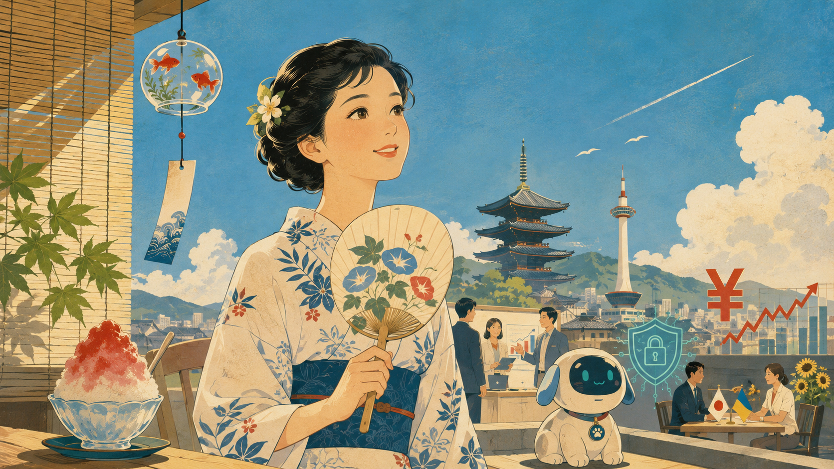
The foreground belongs to summer: a graceful figure, a fan, bamboo blinds, a glass wind chime, shaved ice, bright sky. That is the resting place for the eye. The background carries the news: a Kyoto skyline and conference figures, a friendly AI pet, a cyber shield, a red yen mark and market line, and a small Japan-Ukraine diplomatic table.
The trick was not to make everything the main character. Today’s edition has ten major stories, but the image needs one main figure. The reader first receives the calm of summer. Only after that does the eye wander: what is that little robot? Why is the yen mark there? Are those Japanese and Ukrainian flags? Is that Kyoto? This is how a good poster reads — first as atmosphere, then as discovery.
It is also a small rebellion against the overstuffed AI-image problem. When an image tries to shout every idea at once, the eye gives up. Human attention needs focus and relief. This poster is designed to guide, not overwhelm.
Posters are advertising, and also culture
Posters have sometimes been treated as the less serious cousin of fine art: commercial, temporary, pasted outdoors, made to sell. But that is exactly why they matter. A poster cannot wait for the viewer. It must catch a person walking past a station wall, a shop window, a port terminal or a street corner.
Poster House’s exhibition “Made in Japan” examined how cultural and political shifts in modern Japan influenced the functions and messages of advertising posters. In that sense, a poster is not just a pretty object. It is a record of what a society wanted, feared, consumed, promised and performed.
Postwar Japanese graphic design also developed a language that could synthesize Japanese and Western aesthetics. Cooper Hewitt writes that Ikko Tanaka began designing posters in 1954 and became known for his ability to synthesize both traditions. Our image is not copying Tanaka or any one artist, but it borrows that broader confidence: Japanese motifs and modern graphic clarity can sit in the same frame.
Why it fits today’s issue
Without art direction, today’s ten stories would scatter into ten different rooms. Cooling culture lives on a veranda. Cyber defense lives in a control center. Physical AI lives in a factory. IVS lives in Kyoto’s startup halls. The yen lives on a trading screen. METI’s white paper lives on a policy desk. Japan-Ukraine diplomacy lives in a meeting room. The AI pet lives on the floor at home.
A Shōwa-modern summer poster can invite all of them into the same city. Because it is a poster, time and place can flex a little. A robot can sit beneath a wind chime. A yen chart can rise beyond a bowl of shaved ice. Kyoto founders can talk under a summer sky. A diplomatic table can share the visual weather with a cyber shield. Things that are not physically in the same place become part of the same “Japan today.”
That is why the image is not simply an illustration of the news. It is an editorial decision. Japan is not only old. It is not only new. It is not only cute, and not only serious. It is all of these at once, especially on a day like this. The art helps that contradiction feel like a page, not a pile.
Have a little fun
A serious news site still needs play. In fact, the more serious the daily world becomes, the more a newspaper needs moments of delight. So yes, we gave the AI pet a friendly face. We let goldfish swim in the wind chime. We made the yen sign a little theatrical. We placed a summer flower beside diplomacy. We allowed the page to smile.
That is not triviality. It is hospitality. The world is heavy enough. The news is heavy enough. Japan.co.jp does not want to make heavy things meaningless. It wants to make them readable. If a reader opens the page over coffee, on a train, at lunch or before sleep and thinks, “Today’s Japan is interesting,” the art has done its work.
Japan.co.jp’s view
This art choice says something about what Japan.co.jp is trying to become. Because we use AI, the temptation is always to make images louder. But the better direction is editing: less clutter, stronger focus, more atmosphere, more coherence. The image should not fight the article. The article should not over-explain the image. The reader should enter easily and want to look again after reading.
A Shōwa-modern summer poster is not a boat back to the past. It is a fan for making the future feel closer. AI, cybersecurity, startups, currency markets and diplomacy can feel abstract, massive and remote. Place them near a blue sky, a wind chime and shaved ice, and a reader can take one step closer.
Today’s page looks cool, but its contents are hot. Entrepreneurs gather in Kyoto. Policy moves. Markets shake. Diplomacy continues. Robots enter the home. Culture turns heat into pleasure. The art says: Japan can still become a poster. And today, honestly, it makes a pretty good one.
Reader notes
| Angle | How to read it |
|---|---|
| Style | A contemporary reconstruction of Japanese modern commercial poster language, especially early-to-mid Shōwa summer and travel moods. |
| Foreground | Summer figure, fan, shaved ice, bamboo blinds and wind chime: the eye’s resting place. |
| Background | Kyoto startups, AI pet, cyber shield, yen market pressure and Japan-Ukraine diplomacy as secondary visual signals. |
| Effect | Turns a wide-ranging edition into one readable visual atmosphere. |
| Editorial rule | Do not make everything the hero. Give the reader focus, then discovery. |