At three o’clock on the afternoon of July 24, a public lecture begins in the auditorium of the Museum of Modern Art, Saitama. Its title asks visitors to think about Japan’s “age of the masses” through the work of Komura Settai. One floor away, a vast retrospective makes the same argument without raising its voice. Books, newspaper drawings, painted silk, advertisements, stage plans and film research—roughly 700 works and documents divided across two rotations—reassemble a career that moved through modern Japan’s most reproducible media.
The timing makes Settai a fitting choice for today’s art. Born in Kawagoe in 1887 and dead by 1940, he belongs to neither the floating world of Edo nor the postwar profession of the graphic designer. He stood in the charged interval between them. The woodblock print still shaped visual memory; the newspaper created a daily national audience; department stores and cosmetics companies were teaching consumers to recognize brands; cinema and modern theater were building worlds at architectural scale. Settai understood all of these surfaces.
His art can look almost withholding. A woman turns her head but does not explain why. A room is seen from a steep, unlikely height. A black obi, wall or night sky occupies more space than the human figure. Screens, curtains, fences and eaves interrupt the view. The decisive event appears to have happened a breath before the image—or may happen just after it. What remains is atmosphere held under pressure.
That is the force behind the exhibition’s English subtitle, A Secret Sense of Beauty. “Secret” does not mean coded, national or inaccessible. It describes a beauty that works indirectly: through proportion, pause, concealment and the exact place where a line stops. Settai’s images do not merely show a scene. They arrange how slowly we are permitted to enter it.
Before “Settai”: A Painter Trained by Looking Back
He was born Komura Taisuke on March 22, 1887, in Kawagoe, an old commercial city north of Tokyo. After adoption into the family of the calligrapher Yasunami Kensuke, his legal name became Yasunami Taisuke. The multiplication of names is not incidental. “Settai,” the name by which Japanese visual culture remembers him, came later as a gift from the novelist who transformed his career.
At the Tokyo School of Fine Arts, the future Tokyo University of the Arts, he studied Japanese painting in the circle of Shimomura Kanzan. After completing his studies, he entered the orbit of Matsuoka Eikyū, whose revival of classical yamato-e trained younger artists to treat old pictures not as fossils but as living systems of line, costume and space. Settai also worked for the art journal and reproduction house Kokka, copying historic paintings. A contemporary obituary records that he helped copy portions of the Kitano Tenjin Engi and the Heike Nōkyō.
Copying was serious visual research. It taught him how a sleeve establishes rank, how an architectural bay locates action, how a procession moves across a long format, and how a contour survives translation from precious original to printed reproduction. It also developed the historical knowledge later demanded by publishers, actors and film studios. Settai’s “old Japan” would never be an untouched inheritance. It was an archive rebuilt for modern delivery systems.
Izumi Kyōka Opens the Door
While still a student, Settai became absorbed in the fiction of Izumi Kyōka, the great writer of haunted desire, theatrical coincidence and unstable boundaries between the everyday and the supernatural. Museum research places their meeting in 1909. Five years later, Kyōka entrusted the still little-known artist with the design of his new novel Nihonbashi.
The 1914 book was not simply given a decorated front. Across its cover and endpapers, pale views of warehouses and waterways unfold through the seasons, while a flight of butterflies turns the physical volume into an object of anticipation. The reader crosses into the novel before reaching the first sentence. The design was acclaimed, and Settai went on to work on 28 Kyōka books—more than any other designer in the writer’s circle, according to the Saitama museum.
Kyōka also bestowed the art name “Settai.” The relationship joined reverence to collaboration: the novelist made verbal worlds of fragrance, fabric, water, darkness and apparition; the designer found visual equivalents without reducing them to literal scenes. Covers, title pages, endpapers, paper, color and binding became a sequence. In contemporary language, Settai was not supplying an asset. He was designing the reader’s encounter with the story.
Shiseido and the Invention of a Japanese Corporate Modern
In 1918, Shiseido president Shinzo Fukuhara invited Settai into the company’s newly formed Design Department. Fukuhara, himself a photographer and admirer of the eighteenth-century ukiyo-e artist Suzuki Harunobu, reportedly allowed Settai to continue his outside work. The arrangement mattered: it brought a historically trained painter into the factory of a modern brand without asking him to abandon books, illustration or theater.
Shiseido’s official history says the department’s prevailing visual language was Western and that Settai was responsible for a distinctively Japanese direction. With Sue, also known as Renchō, Yabe, he helped establish the long, controlled forms of what became known as the Shiseido typeface. He illustrated and designed the 1921 publication Ginza, as well as posters and advertisements. Shiseido now describes him as one of the foundational figures behind the Japanese logotype still used by the company.
That wording deserves care. Corporate design is collective and iterative. Settai did not single-handedly invent every letter or the camellia mark. His importance lies in helping to form a durable visual grammar inside a team: Japanese line and spacing made compatible with packaging, display, print schedules and brand consistency. The same artist who could make a Kyōka book feel intimate could make a company recognizable at city scale.
This was not a retreat into tradition against modernity. It was a decision about which past could become modern. Settai’s example showed that a Japanese company did not have to choose between imported cosmopolitan polish and antiquarian imitation. It could transform the elegance of earlier visual culture into a contemporary system.
Learning the Newspaper Page
Settai’s first newspaper-novel illustrations appeared for Satomi Ton’s Tajō Busshin in 1922. Fame did not arrive immediately. The medium imposed a new discipline: monochrome printing, coarse paper, fixed columns, rapid deadlines and a picture that had to share attention with text. Decorative subtlety that worked on silk or a deluxe binding could disappear in ink.
By the early 1930s he had turned those limits into a language. The breakthrough came through novels by Kunieda Kanji, especially Edo Yakusha in 1932 and Osen, serialized in the Tokyo Asahi Shimbun in 1933. Oden Jigoku followed. Women, actors and rogues from the Edo past appeared with tense contours, controlled poses and audacious divisions of black and white. Readers began to recognize the image before they had read the credit.
The phrase “Settai style” names more than slender beauties. It describes control of the whole printed field. A roof may drive diagonally through the composition. A cropped screen can withhold the protagonist. A dense black shape stabilizes fragile line. Empty paper is made active, giving the eye somewhere to wait. The drawing serves the episode but also competes with a noisy newspaper page by becoming quieter than everything around it.
In a 1935 essay, Settai explained that he did not seek strongly individualized faces. He wanted something like the power of a Noh mask: one restrained expression capable of appearing to laugh or grieve according to the action around it. That choice moved psychology out of facial detail and into posture, architecture and interval. Emotion became a property of the composition.
How to Recognize the “Secret” Beauty
| Visual device | What Settai does | What the viewer feels |
|---|---|---|
| High viewpoint | Rooms, roofs and streets are tilted into steep, sometimes almost impossible bird’s-eye structures. | We see more than a participant could, yet remain emotionally outside the scene. |
| Interruption | Screens, curtains, walls, umbrellas and cropped edges hide part of the figure or action. | Concealment makes the unseen event more present. |
| Black and blank | Large dark planes are balanced by unprinted paper or pale color. | The image gains rhythm, silence and immediate legibility in reproduction. |
| Restrained face | Individual expression is minimized; hands, shoulders, fabric and distance carry the drama. | The viewer supplies the missing emotion and becomes a collaborator. |
The celebrated hand-painted work Star Festival makes the method visible. A woman in a bellflower-patterned kimono leans over a black basin of water to look at reflected stars, recalling a Tanabata custom. Pale color surrounds vivid blues, while the basin and obi anchor the surface in black. Her expression does not settle into a single reading. Concentration, longing and reverie remain simultaneously possible.
In Blue Willow, seen from above, architecture and an apparently unoccupied interior hold a human presence without showing a narrative climax. This is one of Settai’s deepest gifts: a fence or storehouse can feel like the extension of a body. Kaburaki Kiyokata once praised precisely that quality, observing that under Settai’s brush black fences, bamboo walls and riverside warehouses seemed like doubles of his graceful women.
His lineage is visible but never simple. Harunobu offered intimate scale, delicate figures and poetic compression; the first Utagawa Kunisada offered theatrical poses and popular immediacy; Eikyū renewed classical narrative painting; Kiyokata demonstrated how Edo subject matter could inhabit modern nihonga. Settai absorbed them all. The nickname “Harunobu of the Shōwa era” captures his refinement, but risks making him sound derivative. His radical contribution was to make those inheritances function in newspapers, corporate typography, proscenium theaters and film studios.
The Stage: An Image Large Enough to Enter
In 1924 Settai designed scenery for Tadanao-kyō Gyōjōki, beginning a stage career that continued until his death. The Saitama museum’s object record credits him with more than 200 assignments; the contemporary 1941 art annual counted more than 300, probably reflecting different definitions of productions and designs. Either number makes the point. Stage art was not a sideline.
His celebrated plan for Hasegawa Shin’s Ippongatana Dohyōiri, first staged at the Tokyo Theatre in July 1931, is only 8.5 by 42.5 centimeters. Yet it had to anticipate a world fifty times larger: carpenters’ construction, painted surfaces, actors’ movement, the audience’s sightlines and the transformation caused by light. Settai traveled to Toride to study the locale. The resulting Abikoya inn scene joined factual observation to loneliness so persuasively that the design was reused in later revivals.
Theater clarifies why architecture matters so much in his drawings. A set is never a neutral background. A doorway delays an entrance; a fence measures social distance; a riverbank determines how long farewell can last. Settai learned to treat space as an actor. Conversely, his newspaper illustrations often resemble stage plans compressed to the hand: a place constructed to make one gesture inevitable.
Cinema and the Total Visual World
In 1935 Settai undertook his first full-scale film art and historical-research role for Shunkinshō: Okoto to Sasuke, adapted from Tanizaki Jun’ichirō. The Saitama museum’s research says he handled sets, costumes and makeup. Unfamiliar with Osaka merchant houses, he traveled there to observe buildings and streets rather than inventing a generic old city. Historical truth, for Settai, was created through specific structure.
His final project brought the career back to Kyōka. For the film Shirasagi, based on the novelist’s tale of a geisha and a young painter, Settai produced more than 100 set and costume drawings. He collapsed at home and died on October 17, 1940, before the work was complete. The film appeared in 1941. A career opened by the physical design of a Kyōka novel closed while building a Kyōka world for the screen.
The arc reveals a figure larger than the occupational labels usually attached to him. “Painter,” “illustrator,” “book designer” and “stage designer” are all accurate, but each isolates one output. Settai’s consistent work was direction: reading a story, identifying its emotional climate, and coordinating every visible element that brought an audience inside it.
Fine Art, Commercial Art—and the False Border Between Them
Modern art history often rewards the unique object: the painting signed by one artist, shown in a gallery and preserved by a museum. Settai’s most influential images were frequently collaborative, commissioned, reproduced and exposed to wear. A newspaper was discarded. A book was handled. A stage set was dismantled. Film scenery vanished when production ended. Corporate work became so familiar that authorship receded into the brand.
This helps explain why his reputation could be both widespread and fragmented. Readers knew Osen; theater professionals knew the sets; bibliophiles treasured Kyōka volumes; Shiseido preserved corporate work. But the categories separated what his practice had joined. The current retrospective restores the simultaneity. Across eight chronological chapters covering about 25 working years, advertisements sit beside paintings, endpapers beside stage plans, and the people who commissioned and collaborated with him reappear as part of the art’s structure.
The result also revises the word “commercial.” Settai did not bring a diluted fine-art manner to mass media. He discovered formal possibilities that existed because of mass media: the turn of a page, the suspense of a serial installment, the high-contrast authority of newsprint, the shared view of an auditorium, the immersive continuity of cinema, the repeated recognition of a typeface. Reproduction was not what happened after the art. It was a condition of the art.
Why the Largest Settai Exhibition Matters Now
Komura Settai in Perspective: A Secret Sense of Beauty runs in Saitama from July 11 through September 23. The museum calls it the largest Settai exhibition by number, with approximately 700 works and documents shown across a first and second half. It reunites masterpieces with collaborators and sources: Kyōka, Kiyokata, Satomi Ton, Eikyū, Harunobu and the first Kunisada. Recently located originals for Sankai Hyōbanki and Edo Yakusha are being shown beyond their home collections for the first time.
On this article’s publication date, July 24, Saitama University professor Sugiura Susumu lectures on the “age of the masses” with Settai’s work as the entrance. The coincidence is more than a calendar hook. Settai poses a question every visual newsroom, platform and image model now confronts: what happens to beauty when images must circulate rapidly, repeatedly and at scale?
His answer was not nostalgia and not speed for its own sake. He designed constraints. He knew exactly what newspaper ink could hold, how a binding delayed revelation, how a proscenium framed space and how corporate lettering accumulated trust through repetition. The medium did not excuse thin thinking. It sharpened the decisions.
- Exhibition: Komura Settai in Perspective: A Secret Sense of Beauty
- Dates: July 11–September 23, 2026. First half through August 16; second half August 18–September 23. Major display changes apply.
- Hours: 10:00 a.m.–5:30 p.m.; last admission 5:00 p.m. Closed Mondays except July 20 and September 21.
- Admission: ¥1,400 general; ¥1,120 college and high-school students; junior-high students and younger free. Other discounts apply.
- Access: In Kita-Urawa Park, about a three-minute walk from the west exit of JR Kita-Urawa Station.
- July 24 lecture: 3:00–4:30 p.m., second-floor auditorium, free, no advance application, first 80 visitors.
Today’s Image: Homage, Disclosure and Distance
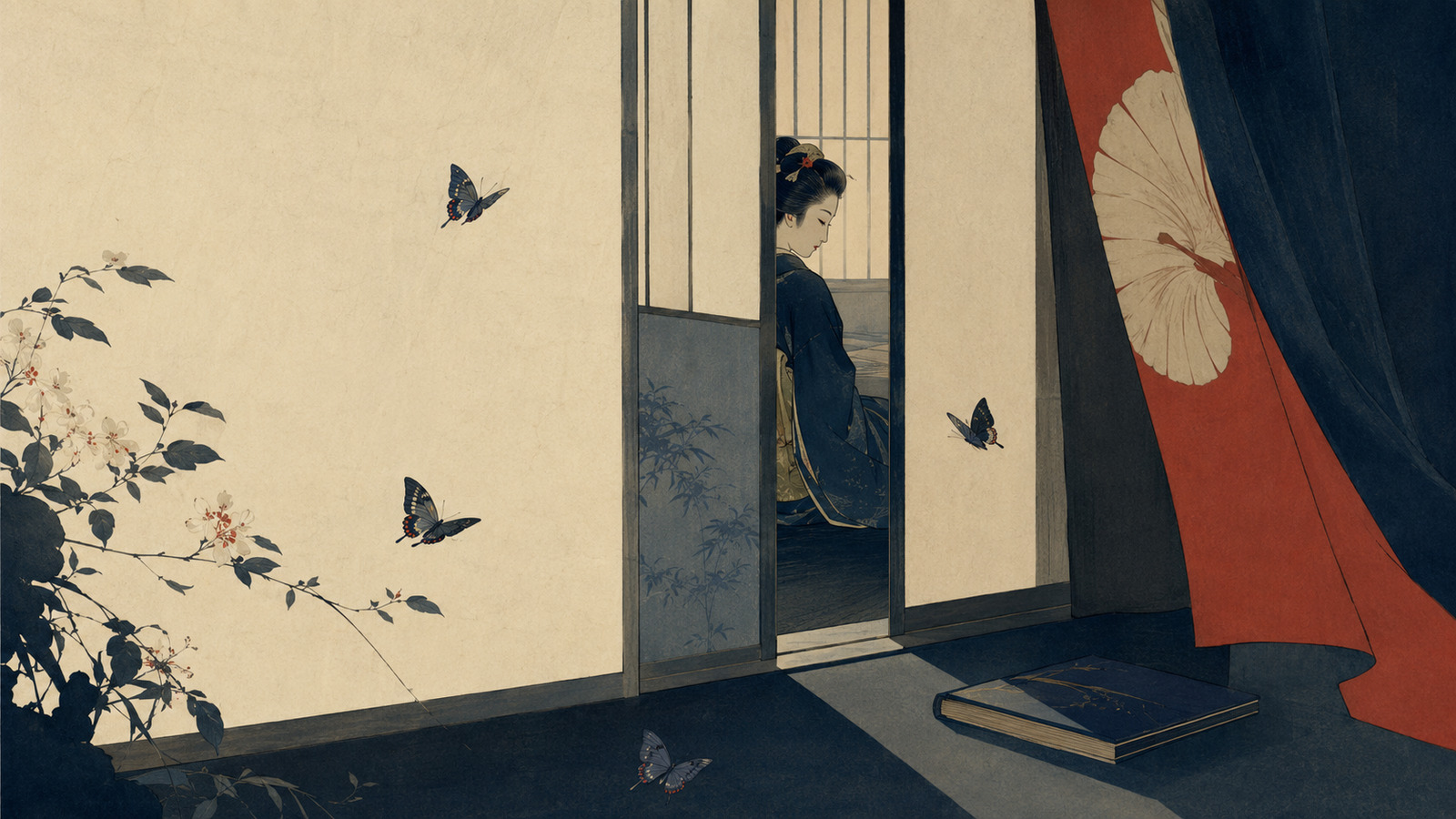
Japan.co.jp’s hero image is an AI-assisted editorial illustration inspired by Settai’s compositional vocabulary. It is not a work by Komura Settai, a reconstruction of a specific picture, or an object in the museum exhibition. The distinction matters especially in an article about an artist whose work was inseparable from the technologies that reproduced it.
The illustration places an elegant woman behind a partially opened screen and surrounds her with a book, theatrical curtain, butterflies and foliage. Those elements point to Settai’s fields—the designed volume, the stage, the butterfly flight of Nihonbashi, the patterned natural world—while the blocked view and open ground try to preserve his economy of revelation. No signature or museum attribution is added. “Inspired” names a conversation with historical principles, not authorship by the historical artist.
That editorial boundary does not solve every argument about generative imagery. It does establish the minimum honest frame: disclose the process, avoid counterfeit provenance, do not pass a synthetic image off as a recovered work, and send readers toward the originals and the institutions that care for them. Settai’s lesson is not a preset of thin lines, beautiful women and black rectangles. It is the harder discipline of understanding a story, a surface and an audience together.
The Quiet Image That Survives the Noise
Settai died young in a country moving toward total war, and much of the mass culture he served was physically fragile. Yet his images remain startlingly contemporary. Their asymmetry feels cinematic. Their cropping anticipates the camera. Their empty space survives the small screen. Their serial intelligence belongs to the feed, even as their slowness resists it.
Most of all, they refuse the false choice between tradition and technology. Settai learned from handscrolls, ukiyo-e, classical costume and Noh masks, then carried those lessons into newspaper presses, cosmetics advertising, electric theaters and motion pictures. He did not protect Japanese beauty by sealing it away. He gave it new containers.
The word “secret” finally names an ethic of attention. Not everything must be centered. Not every emotion needs a labeled face. An image can trust a door, a pause, a black basin of reflected stars. It can leave enough unsaid that the viewer crosses the remaining distance.
On July 24, as a lecture considers Settai at the entrance to Japan’s age of mass culture, his work offers a precise challenge to our own: circulation is inevitable; noise is optional. Beauty may travel farthest when it does not shout.
Research notes and primary sources
- The Museum of Modern Art, Saitama — “Komura Settai in Perspective: A Secret Sense of Beauty”: official dates, works, events, ticket information and the exhibition’s roughly 700 works and documents.
- The Museum of Modern Art, Saitama — “Three Artists Around Komura Settai”: curator Mao Kikuchi’s account of Nihonbashi, Osen, Blue Willow, Star Festival and Settai’s film work.
- Shiseido Art House — “Dreaming of Edo: The Works of KOMURA Settai”: official biography, Shiseido tenure, typeface legacy and 2026 exhibition record.
- Shiseido Gallery — “Shiseido and Art”: Design Department history, Settai’s collaboration with Sue Yabe, Ginza and major illustration and stage projects.
- Chiyoda City / Hibiya Library & Museum — “Reproductive Artist Komura Settai”: book-design debut, printed-page practice and the development of the “Settai style.”
- MOMAS Collection — Plan of Stage Setting for Ippongatana Dohyoiri: official object record, production history and stage-design practice.
- Art Platform Japan — Komura Settai artist record: standardized dates, names and bibliography.
- Tokyo National Research Institute for Cultural Properties — 1940 obituary record: contemporary career summary and lists of stage and newspaper illustration projects.
Editorial method: Historical claims were checked against museum, institutional and corporate archival records. Interpretive passages are Japan.co.jp’s visual analysis. Exhibition details are current as of July 23, 2026, Japan time; visitors should confirm the museum’s page before travel.
