Six days after Georges Seurat’s unfinished Circus went on display at the Salon des Indépendants in March 1891, the painter was dead. He had fallen ill only three days earlier. The probable cause was diphtheria; his young son would die weeks later. Seurat was 31. On the canvas he left behind, a horsewoman curves through a ring, an acrobat springs, a clown opens the scene and rows of spectators sit in severe geometric order. The subject is velocity. The method is patience.
Every passage had been organized through small, deliberate touches of color. The rising lines, orange-yellow dominance, blue counterweights and dark painted border were intended to produce an emotion of gaiety. Yet the painting also held two worlds apart: the circus ring spun in arcs and spirals while the audience remained fixed in a grid. Seurat was not merely describing a spectacle. He was testing whether line, hue and adjacency could generate a psychological result.
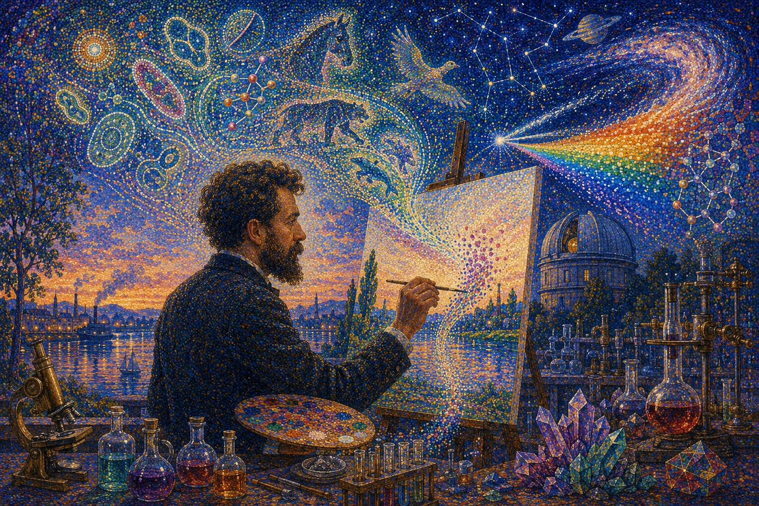
That unfinished experiment is the beginning of Japan.co.jp’s art choice for the July 26 university edition. “Georges Seurat–inspired scientific pointillism” is more than a decorative filter placed over research news. It provides a structural analogy. A cell, mutation, bacterium, electrical signal or bit is meaningful alone, but science advances when many such units are arranged into an interpretable pattern. A pointillist picture works by the same double demand: inspect the marks, then step back.
The analogy should not be pushed into myth. Seurat did not paint genes, algorithms or microbiomes, and his method was not a preview of digital pixels. He was a 19th-century Parisian artist working with physical pigments, contemporary optical theory, academic composition and the social landscape of the industrial Seine. Precisely because the history is specific, it offers a better guide than the vague instruction to “make it dotted.”
The dots came after the discipline
Seurat began conventionally. Born into a financially secure Paris family in 1859, he trained under Henri Lehmann, a pupil of Ingres, at the École des Beaux-Arts. He drew from plaster casts and models, studied old masters at the Louvre and absorbed an academic belief in preparation, contour and large composition. His later revolution did not discard this order. It redirected it toward modern life.
That is why his figures can feel at once contemporary and ancient. Factory workers, bourgeois promenaders, café performers and circus spectators stand like forms in an Egyptian procession or a Greek frieze. Seurat wanted modern people to possess the stability traditionally reserved for history painting. He did not paint the city as a blur of passing sensation. He stopped it, measured it and rebuilt it.
His drawings reveal another Seurat, one who needs no color at all. Using dense Conté crayon on textured paper, he allowed the grain to catch or refuse black, creating velvety silhouettes, uncertain edges and light that seems to emerge from the sheet. More than 500 drawings are associated with his brief career. They refute the idea that his art was a mechanical recipe of colored dots. He could construct a world from tonal dust as powerfully as from complementary pigments.
The studio procedure was equally far from instant. For La Grande Jatte, Seurat made landscape observations, figure drawings, small oil panels and increasingly complete compositional studies. Trees shifted. Figures appeared, disappeared and changed scale. An informal riverside became a stage whose verticals, horizontals and diagonals controlled every body. The finished surface may shimmer, but the architecture beneath it is firm.
Chevreul’s problem began with a tapestry
The science behind Seurat’s color began partly with a complaint from textile workers. Michel-Eugène Chevreul, a chemist and director of dyeing at the Gobelins tapestry manufactory, investigated why some colors appeared weak or incorrect. The dye was not always at fault. A color changed in perception according to the color beside it. A gray next to a red could appear greenish; complementary hues could intensify one another. Chevreul formalized his law of simultaneous color contrast in an 1839 treatise.
Seurat encountered a broader 19th-century world of color research. American physicist Ogden Rood’s Modern Chromatics, published in 1879, distinguished properties such as hue, luminosity and purity and discussed the difference between mixing colored light and mixing material pigments. Charles Henry proposed mathematical and psychological relationships among directions, colors and emotions. Hermann von Helmholtz’s physiological optics formed part of the larger intellectual atmosphere in which sight could be analyzed as a physical and perceptual process.
Seurat did not simply transfer laboratory laws to canvas. He selected, combined and sometimes overstated them in the service of art. His method separated colors into nearby strokes or points rather than blending all pigments on the palette. At the right distance, the viewer would perceive a livelier relationship—a “mixture” completed through looking. Complementary accents could make an edge vibrate. A halo of opposing color could sharpen a body against its surroundings.
The movement’s vocabulary records useful distinctions. Divisionism names the separation of color into component touches. Pointillism describes the use of point-like marks. The two overlap but are not identical: a Divisionist surface can use dashes, blocks or mosaics rather than uniform dots. Seurat also used terms connected to chromoluminarism—the ambition to organize color and light. The critic Félix Fénéon supplied the larger historical name, Neo-Impressionism, after the movement’s explosive public appearance in 1886.
| Year | Work or event | What changed |
|---|---|---|
| 1839 | Chevreul publishes his law of simultaneous color contrast. | Color is understood as relational: a neighbor can change what the eye perceives. |
| 1879 | Rood publishes Modern Chromatics. | Optics, pigment, luminosity and purity become tools available to artists. |
| 1883–84 | Seurat plans and paints Bathers at Asnières. | Modern workers receive the scale and stillness of monumental academic art. |
| 1884 | The Salon rejects Bathers. | Seurat exhibits with the independent artists and helps build an alternative system. |
| 1884–86 | A Sunday on La Grande Jatte develops through many studies and revisions. | Separated color becomes the organizing method of a monumental social scene. |
| 1886 | The work appears at the eighth and final Impressionist exhibition. | Fénéon names Neo-Impressionism; ridicule and recognition arrive together. |
| 1888–89 | Seurat adds a multicolored painted border to La Grande Jatte. | The edge and white outer frame become parts of the perceptual system. |
| 1891 | Circus is shown unfinished; Seurat dies days later. | A seven-year mature career becomes an unexpectedly complete legacy. |
Asnières: modern life on the scale of history
Seurat’s first major statement was not yet a fully pointillist painting. Bathers at Asnières, made in 1883–84 before he turned 25, shows men and boys resting beside the Seine northwest of central Paris. Factory chimneys and a railway bridge line the distance. Clothing, boots and posture suggest that several figures belong to the working or lower-middle classes. Across the water, a top-hatted man and parasol-carrying woman pass in a boat.
The canvas is approximately two by three meters, a scale associated with history, religion and myth. Seurat gave it to anonymous modern workers at rest. He surveyed the location in outdoor sketches, drew individual bodies and assembled the final scene in the studio. The figures do not chat, swim vigorously or acknowledge the viewer. They are present together and psychologically apart, held inside hazy light.
The official Salon rejected the painting in 1884. Seurat showed it instead with the newly formed Société des Artistes Indépendants, whose exhibitions had no jury and no prizes. Rejection became institutional freedom. The experience also introduced him to Paul Signac, who would become the movement’s energetic advocate and extend divided color into a more expansive, mosaic-like language.
Parts of Bathers were reworked after Seurat developed his later method, but its marks vary widely: broad strokes in water, flecks in sky and grass, smooth bodies, small complementary touches. This variety matters to the Japan.co.jp series. “Seurat-inspired” should preserve an image’s hierarchy. A molecular field may require dense points; a human face needs calmer structure; a climate landscape may open into long bands. The aim is not to cover every surface with identical confetti.
The Sunday that broke with Impressionism
On the opposite side of the river, Seurat built his defining picture. A Sunday on La Grande Jatte—1884 presents more than 40 people in a park on an island in the Seine. Soldiers, children, couples, nurses, boaters, workers and the bourgeoisie occupy the same field without forming one community. A fashionable woman walks a monkey. Profiles repeat. Parasols become circles and triangles. The river moves, but the people seem pinned in ceremonial time.
The title preserves 1884, when the project began, but the enormous canvas was developed through 1886. The Art Institute of Chicago records an initial layer of small horizontal strokes in complementary colors followed by the more famous point-like touches. Studies show that the “final” composition was not discovered at once. Seurat generated and discarded possibilities. The picture is not the product of a single algorithm; it is the record of repeated judgment.
At the last Impressionist exhibition in 1886, the work produced mockery, laughter and scandal. Its deliberate regularity challenged the spontaneity associated with Impressionism. Yet it also took Impressionism’s interest in contemporary life, colored shadow and optical sensation and made those concerns systematic. Fénéon recognized that this was not a late variant of the older movement but something new.
Seurat later extended the canvas and added its border of blue, orange and red points, responding to colors inside the image. He preferred a light or white outer frame. The painting therefore did not end at the last figure or tree. Color negotiated the passage from depicted park to painted edge, from painted edge to white frame and from frame to gallery wall. The display environment entered the experiment.
What the eye actually does
The familiar explanation says red and blue dots “mix in the eye” to become purple. It is useful, but incomplete. Pigments on canvas reflect and absorb light; they do not become additive light sources like red, green and blue subpixels on a screen. Dot size, viewing distance, illumination, pigment reflectance and the contrast between neighbors all affect the result.
Modern perceptual research argues that pointillist “optical mixture” is often better described as a mental or perceptual blend. The colored touches remain available as texture even while the brain organizes them into a larger region. In a strong Seurat, the viewer does not merely lose the points inside a smooth new hue. One feels both levels at once: the material event of the marks and the represented light of skin, grass, sky or water.
That double state is why the technique has survived the scientific theories that helped generate it. Some 19th-century claims about luminosity were too simple. Seurat’s choices were not laboratory demonstrations. Yet simultaneous contrast, spatial averaging, edge perception and context-dependent color remain real fields of study. The paintings work because they exceed their explanation.
The gap between intention and material also produced an unexpected experiment in time. Seurat used zinc yellow in La Grande Jatte. The pigment began darkening even during his life, changing combinations in which it participated. Art Institute microscopy identified zinc potassium chromate as the unstable material. Color scientists later modeled how the picture may have appeared before the yellow shifted. A painting conceived from color science became, more than a century later, an object of conservation science.
Why these dots belong to this university edition
The July 26 edition moves from intracellular structures to planetary climate, from fish laterality to cryptographic equations. Ordinarily, such breadth can make an edition look like a miscellaneous collection. Scientific pointillism gives the stories a shared visual proposition: knowledge emerges from units that interact across scale.
In medicine, a point can become an iPS-derived immune cell, a lysosome, a molecule strengthening the HGF repair signal, a neuron or a rare viral mutation. The dot makes the microscopic visible without pretending to be a clinical photograph. In ecology, points can become microbial communities around a sea cucumber, scales flying from a fish attack, a flock intercepted by a bat, crop patches used by a bear or pollen-like traces of an ancient Arctic climate.
In computing and engineering, the point changes identity again: an EEG sample, a data node, a term in a multivariate equation, a heat-carrying mode in a thermoelectric material, a company in a national startup network. In the story about women in Japanese science, the point becomes a person whose contribution can be isolated or connected by institutions. The metaphor is not that people are interchangeable particles. It is that a system’s larger image depends on whether individual talent remains visible and linked.
| Story field | The “point” can represent | What the full image reveals |
|---|---|---|
| iPS immunotherapy and rare retinal disease | Immune cells, organoids, lysosomes and intracellular traffic | How patient-derived models connect a molecular defect to a possible treatment. |
| Muscle repair and brain blood flow | Signaling molecules, vessels, electrodes and time-series samples | How biological meaning changes with interaction and analytical method. |
| Pregnancy support and child development | People, relationships and protective social contacts | How a developmental outcome belongs to a social system, not one isolated reaction. |
| Delta mutations and cryptography | Nucleotides, rare substitutions, variables and equations | How unusual configurations can alter an evolutionary or computational problem. |
| Sea cucumbers, fish, bats and bears | Microbes, scales, flight paths, observations and crop locations | How behavior becomes intelligible through repeated field evidence. |
| Cretaceous climate and thermoelectricity | Grid cells, energy carriers, tilt angles and modeled conditions | How many local interactions produce climate or heat transport at another scale. |
| University startups and women in science | Companies, founders, students, researchers and career transitions | How institutions either connect individual capability or allow the pattern to break. |
A humane distance for sensitive science
Several stories concern cancer, inherited blindness, pregnancy and aging. Literal medical imagery can become invasive, frightening or grotesque. Generic smiling-stock photography moves in the opposite direction and erases the science. Pointillist abstraction offers a middle distance. It can show an immune cell approaching tumor tissue, a lysosome failing inside a retinal cell or a repair signal spreading through muscle while preserving color, dignity and interpretive space.
This is an editorial advantage, not a claim of diagnostic accuracy. The illustrations must not be mistaken for microscopy, pathology or the researchers’ actual experimental output. Captions and alt text should identify them as newsroom illustrations. The article must carry the evidentiary burden; the image carries orientation, mood and a memorable conceptual map.
Seurat’s restraint helps. His most powerful figures are often still, frontal or in profile. Emotion comes through arrangement and color rather than anatomical distortion. For medical stories, that composure prevents spectacle. Brightness can communicate discovery without turning illness into entertainment.
Not a filter: an editorial method
The AI Newsroom’s use of a historical artist begins with article context. The subject, institution, biological mechanism, location, scale and ethical sensitivity determine the composition. Only then does the chosen historical language shape color, mark and rhythm. If every article receives the same dotted overlay after the fact, the visual system has failed.
Each image in this edition therefore needs two readings. At thumbnail scale, the hero should communicate one clear subject: an eye, a muscle, a bat in pursuit, a bear beside crops, a dinosaur-era Arctic or a scientist facing a field of data. At full size, the separated marks should reveal a second story of cells, microbes, mutations, vectors or networks. The movement between scales is the point.
- Lead with the article. The research mechanism decides the imagery; style does not replace reporting.
- Use points as information. Their density, color and direction should explain scale, flow, probability or connection.
- Preserve hierarchy. A focal subject must remain legible before the reader studies the surface.
- Separate evidence from illustration. The artwork is interpretive and must never masquerade as experimental data.
- Protect human dignity. Medical and social subjects should avoid gore, caricature and false emotional claims.
- Name the influence. “Georges Seurat–inspired” describes a contemporary newsroom work; it does not present a lost Seurat or copy one canvas.
The word “inspired” is important. The images borrow a public historical vocabulary—divided color, complementary contrast, colored halos, monumental calm and the relation between part and whole. They do not reproduce La Grande Jatte figure for figure. They also add things Seurat never had: molecular diagrams, data structures, ultraviolet palettes, astronomical imagery and a cinematic depth made for a modern screen.
The imaginary studio in today’s hero
The art-choice hero openly announces its fiction. An imagined Seurat stands with brush and palette before a canvas at twilight. A microscope rests to the left; test tubes, flasks, crystals and an optical instrument occupy the right. Above him, dotted forms become a cell, molecular bonds, a fish, sea cucumber, bat, bear, dinosaur, constellation, galaxy and splitting spectrum.
No such studio existed. The anachronism is the argument. Seurat’s 19th-century desire to connect creation and scientific analysis has been carried into a 21st-century research landscape. The observatory dome and laboratory glassware turn color theory outward—from the physiology of seeing toward the scales at which universities now investigate life, computation, climate and the universe.
The rainbow crossing the upper right is especially appropriate. It is both scientific object and painter’s palette: a continuous spectrum represented through discrete colored marks. At the center, the blank canvas receives the points. Around it, the world supplies evidence. The painter is less a solitary genius commanding nature than a translator standing between instruments and perception.
The movement after Seurat
Seurat’s death did not end the method. Signac became its theorist and ambassador, loosening the tiny point into broader mosaic-like touches. Camille and Lucien Pissarro briefly adopted the system. In Belgium, Théo van Rysselberghe carried divided color into portraits and social scenes. Henri-Edmond Cross opened the marks and intensified the Mediterranean palette. Vincent van Gogh absorbed the value of separated, contrasting strokes without becoming a doctrinaire Neo-Impressionist.
Through Signac and Cross, Divisionism helped prepare the saturated freedom of Fauvism. Italian Divisionists adapted separated color to spiritual, rural and political subjects; their dynamic lines would contribute to the visual conditions from which Futurism emerged. In 1904, Matisse worked near Signac at Saint-Tropez and painted Luxe, calme et volupté in divided touches. Seurat’s controlled system became one route toward color released from local realism.
The influence also traveled beyond paint. Halftone printing, photographic grain, television, digital mosaics and pixel art make it tempting to call every image built from units “pointillist.” The comparison can illuminate, but the media differ. A screen emits additive RGB light in a regular grid. Ink and paint absorb and reflect light from irregular material surfaces. Seurat varied the size, direction, layering and neighborhood of his marks. His picture is not a low-resolution file awaiting the correct viewing distance.
Contemporary computing researchers have nevertheless found his method fertile. Japanese work published in 2013 modeled optical mixture, complementary contrast and halo effects for non-photorealistic rendering. Other algorithms analyze the color distributions of Seurat’s paintings and distribute points through blue-noise sampling. These projects make the connection between pointillism and AI literal—but they also show why imitation requires choices about perception, not merely a “dot” texture.
Seurat in Japan
Japanese audiences encounter Seurat inside a much older circuit of exchange. Ukiyo-e had helped European artists rethink cropping, flat color and composition in the 19th century. European modernism then entered Japan through exhibitions, reproductions, study abroad and the development of yōga, Western-style painting. That history is not a simple round trip in which one nation gives and another returns. Artists select, misunderstand, translate and transform.
Japan’s museums continue to place Neo-Impressionism inside the history of modern color. The Pola Museum of Art in Hakone has exhibited Seurat, Signac and the passage from Pointillism toward Fauvism under the idea of color that sparks, glitters and shines. Such exhibitions matter because a reproduction often smooths away the core experience. The work changes as a viewer approaches and retreats. Surface and image compete in real space.
The Japan.co.jp edition adds another turn to that exchange. A French method shaped partly by industrial chemistry and optics becomes a visual framework for Japanese university research, generated through contemporary AI and published on digital screens. The chain is neither pure nor neutral. It should be made visible. Naming Seurat, explaining the transformation and linking the art to specific reporting turns influence into editorial context rather than anonymous decoration.
Where the scientific metaphor must stop
Seurat’s reputation as a “scientific painter” can become a cage. He was not a machine executing equations. His selection of a monkey, a slouch, a silent interval or a yellow accent cannot be derived from Chevreul. Humor, sexuality, class, fashion and alienation move through La Grande Jatte. The lonely darkness of his drawings has no need for a color wheel.
Likewise, science is not simply the assembly of neutral dots. Observations are designed, instruments have limits, categories are chosen and institutions decide which questions receive money. A compelling pattern may be wrong. An outlier may overturn the picture. The pointillist metaphor is most honest when it keeps the marks visible—when consensus does not erase uncertainty.
That is also a warning for AI imagery. A visually coherent illustration can make a speculative mechanism feel proven. Beauty supplies confidence faster than a methods section can qualify it. The solution is not to make science art dull. It is to keep the roles clear: research establishes what is known; journalism states the limits; art helps the reader enter the question.
From one point to a field of knowledge
Seurat’s mature career lasted barely seven years. He produced a small number of monumental canvases, luminous coastal scenes, urban entertainments, hundreds of drawings and a method that other artists immediately changed. He did not live to see La Grande Jatte become an icon in Chicago, its unstable yellow studied under a microscope, its former colors reconstructed by computation or its logic echoed in a musical about making art.
What survived was not a recipe. It was a question about where an image exists. Is it in the pigment, in the interval between pigments, in the light, in the retina, in the brain or in the social knowledge a viewer brings? The answer is all of them, unequally and at once.
Japan’s university edition asks the same question of knowledge. Is cancer immunotherapy in the engineered cell, the patient-derived tissue, the mouse study or the clinical future not yet tested? Is an animal behavior in one attack or hundreds of observations? Is a climate in one warm day or a model connecting geography, axial tilt and centuries? Is equality in one successful scientist or the system that allows thousands to advance?
Scientific pointillism does not solve those questions. It gives them a visible form. Every point insists on specificity. Every contrast insists on relationship. Every image requires distance before the whole appears.
That is why Seurat, who died in 1891, is today’s choice. His art is colorful enough to unify a newspaper edition, abstract enough to treat vulnerable subjects with dignity and rigorous enough to remind us that seeing is an act of construction. Up close: a cell, a mutation, a student, a signal. From across the room: a living system, a history, a scientific world.
Primary sources and further reading
“Pointillism” and “Divisionism” are related but not interchangeable. This report uses “scientific pointillism” for Japan.co.jp’s contemporary illustrative system and distinguishes it from Seurat’s physical materials, historical works and evolving technique.
- Art Institute of Chicago, A Sunday on La Grande Jatte—1884
- Art Institute of Chicago, Seurat and the Making of La Grande Jatte
- Art Institute of Chicago, more than 70 studies and the Seine paintings
- Art Institute of Chicago, Seurat’s painted borders and frames
- Art Institute of Chicago, microscopy and the changing zinc-yellow pigment
- National Gallery, London, Bathers at Asnières
- National Gallery, Seurat’s training, drawings and structured modern art
- National Gallery, The Rainbow study for Bathers
- Metropolitan Museum of Art, Seurat and Neo-Impressionism
- Metropolitan Museum of Art, study for La Grande Jatte
- Metropolitan Museum of Art, Seurat’s Conté drawing for Poseuses
- Musée d’Orsay, Circus and Divisionist theory
- Musée d’Orsay, Seurat’s final illness and the unfinished Circus
- Museum of Modern Art, Grandcamp, Evening and Divisionism
- Museum of Modern Art, definition of Pointillism
- Museum of Modern Art, Félix Fénéon and the Neo-Impressionists
- Museum of Modern Art, Chevreul, complementary color and Neo-Impressionist harmony
- Koenderink, van Doorn and Gegenfurtner, “Area Dominates Edge in Pointillistic Colour,” 2018
- Berns and colleagues, digital reconstruction of La Grande Jatte’s color, 2006
- Sugita and Takahashi, computer-generated Pointillism based on Seurat’s color theory, 2013
- Wu and colleagues, computational Pointillism based on Seurat’s color composition, 2013
- Pola Museum of Art, Pointillism and Fauvism in Japan
- National Gallery, Bridget Riley’s modern response to Seurat
- Art Institute of Chicago, Sondheim’s musical analogy to Seurat’s color
