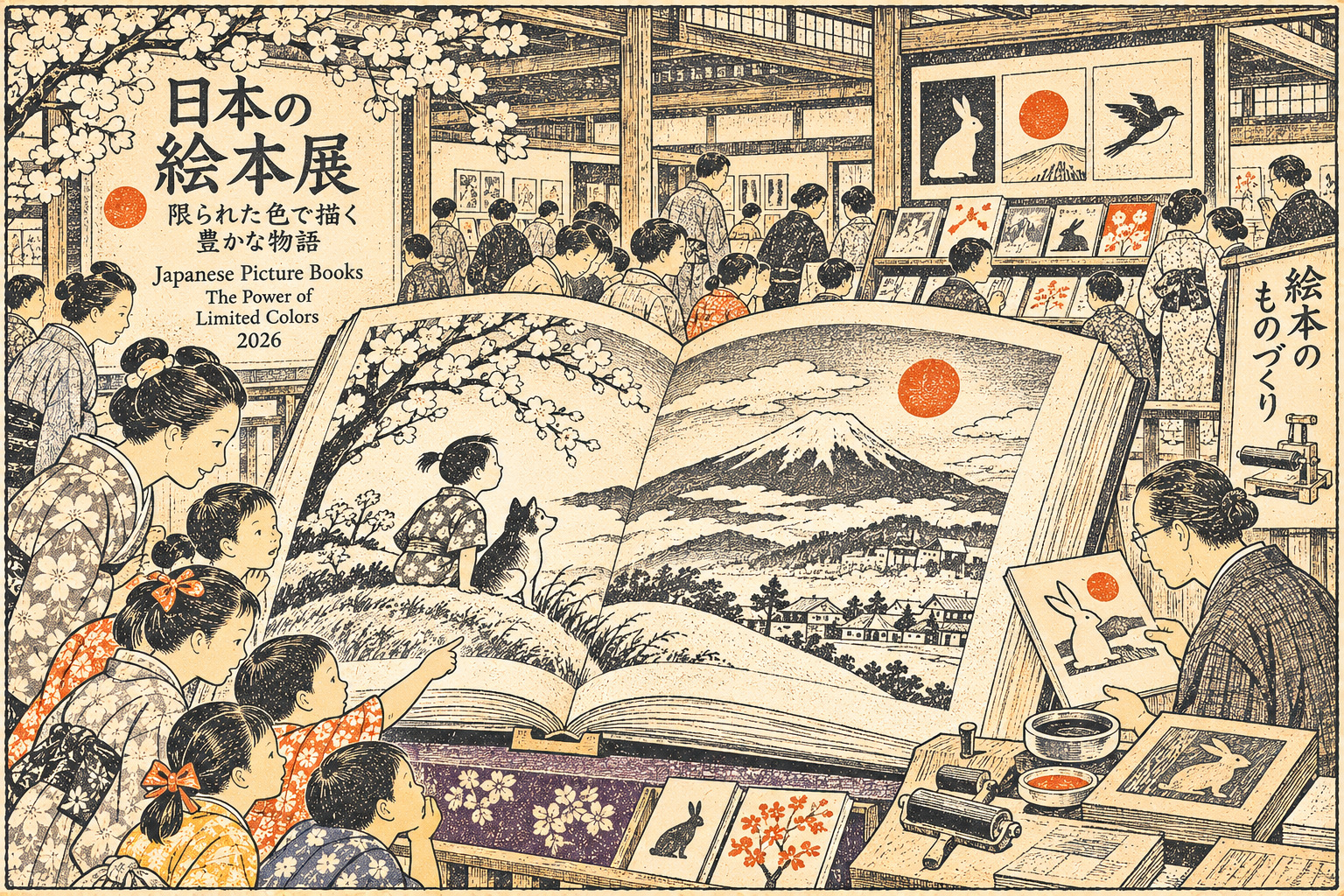
- What happens when a picture book gives up its rainbow?
- An exhibition about artists—and what their choices do to readers
- A red umbrella, and the power of the lone accent
- Miyako Akiko’s storm: gray can carry weather
- The longer history: ink, print blocks and the economics of reproduction
- World picture books, seen through Japanese editions
- Fear, silence and movement: what the missing colors can do
- For infants, contrast has another role
- Why the library matters as much as the exhibition
- An open gallery, and a question for tomorrow’s illustrators
What happens when a picture book gives up its rainbow?
A red umbrella moving through a mostly restrained world can command an entire page. A black line can make a forest feel deeper than a thousand printed colors. In a gallery in Tokyo’s Ueno district, picture books are being examined not for how much color they contain, but for how much meaning their artists manage to build without it.
“Picture Books with Limited Coloration,” an exhibition at the National Diet Library’s International Library of Children’s Literature, brings together works using monochrome or a very small palette. It opened October 6, 2026, and its first installment runs until December 20. A new selection will replace it from January 19 through April 18, 2027. The most interesting question is neither whether black-and-white books are cheaper to print nor whether they are more traditional. It is how reduction becomes a method of storytelling.
The exhibition’s Japanese title, 「色の引き算―白・黒・いろいろ―」, describes the subtraction of color. The wordplay matters: fewer pigments do not mean fewer possibilities. This report is based on the library’s published miniature guide, complete exhibit checklist and accompanying announcements; JAPAN.co.jp has not independently inspected every object in the gallery.
An exhibition about artists—and what their choices do to readers
The library structures its presentation around an introductory section, the makers and the effects of reduction. Its introductory examples investigate different worlds possible in black, white and gray. A section on artists includes Wanda Gág, Marie Hall Ets, Garth Williams, Jirō Takidaira, Gabrielle Vincent, Chris Van Allsburg and contemporary Japanese picture-book creators. The effects section addresses fear and sadness, abstraction, kinetic movement, encounter, introspection, contrast, nostalgia and fantasy.
That organization resists an easy assumption that limited color is one unified style. A densely shaded pencil drawing, a stark silhouette, photographic grayscale and a nearly empty page use subtraction for different purposes. Some call attention to a gesture; others make the surrounding world uncertain or give readers room to imagine what cannot be shown.
Crucially, the exhibition is international. It is not a claim that Japan invented monochrome picture books. Rather, the curators use holdings from many publishing traditions to illuminate techniques that Japanese artists, editors and readers have also made their own.
A red umbrella, and the power of the lone accent
One of the first-period examples is Daihachi Ota’s 1975 picture book Kasa (The Umbrella), published by Bunken Shuppan. Against subdued pictorial surroundings, the umbrella supplies a concentrated colored motif. The visual argument is simple but powerful: the smaller the area of emphasis, the less visual competition it may face.
This is not a general law of perception, and the work’s emotional effect depends on composition, page progression and the artist’s decisions. The point is editorial. A two-page spread contains a finite amount of attention. The illustrator can distribute that attention across many details, or give it a place to settle.
With color held back, rhythm moves to the foreground. Repeated shapes, blank spaces, the difference between a close view and a distant one, and the turn of a page can become as significant as a brightly printed surface.
Miyako Akiko’s storm: gray can carry weather
The first-period selection also includes Taifū ga Kuru (A Typhoon Is Coming), created by Akiko Miyakoshi and published by BL Shuppan in 2009. The library cites it as an example of using a restricted palette, rather than a demonstration that every picture-book story must be reduced to only two inks.
Storms are unusually well suited to questions about light. The sky can lose definition; familiar rooms can feel uncertain; the border between what is seen and what is feared can narrow. In monochrome or near-monochrome art, a reader may notice the gradations of darkness and the direction of a gaze before noticing decorative detail.
Miyakoshi also appears in the library’s artist section through her 2010 work Mori no Oku no Ochakai e. The curatorial pairing suggests a useful way to explore an illustrator’s visual language across books, without assuming that a single technique accounts for an entire career.
The longer history: ink, print blocks and the economics of reproduction
Japanese picture books did not begin with contemporary four-color offset printing. Japan has long traditions of ink drawing, woodblock publishing and illustrated narrative. The precise relationship between any modern children’s illustrator and a particular Edo-period artist must be demonstrated, not assumed. Yet those earlier traditions help explain why line, negative space, printed texture and carefully organized black shapes remain intelligible visual resources.
In older reproduction systems, additional colors required separate operations or more complicated registration. Modern publishers also make choices about paper, ink, print run, bindings, proofs and press processes. A limited palette can affect production economics, but it does not follow that every monochrome book is inexpensive: fine grayscale reproduction, unusual paper, tactile finishes or short print runs can be costly.
It is therefore more accurate to treat cost and artistic choice as overlapping questions. Sometimes the limitation comes from manufacturing. Sometimes an artist deliberately selects it. Sometimes a constraint inherited from one medium becomes an expressive vocabulary in another.
World picture books, seen through Japanese editions
The library’s first-period checklist includes Japanese-language editions of influential international works. Wanda Gág’s Hyakumanbiki no Neko (Millions of Cats), translated by Momoko Ishii, sits alongside Marie Hall Ets’s Mori no Naka (In the Forest), translated by Ruriko Masaki, and Russell Hoban’s Oyasuminasai Frances, illustrated by Garth Williams and translated by Kyōko Matsuoka.
Another arresting inclusion is Kuro wa Ōsama, the Japanese edition of The Black Book of Colors, by Menena Cottin and Rosana Faría, translated by Kazumi Uno and published by Thousand Books in 2019. Its presence broadens the exhibition’s question beyond conventional page decoration toward how color may be suggested or imagined through different sensory experiences.
Translations are part of the history, not a footnote. Editors, publishers and translators made these books available to generations of Japanese readers. Their work also shaped the categories through which children’s books from overseas entered Japan’s libraries and households.
Fear, silence and movement: what the missing colors can do
The curators’ second chapter examines effects rather than national schools. Works exploring war, anxiety and loss use darkness in ways that may unsettle a reader. Others use stark lines to abstract a problem and invite interpretation. In the dynamic category, composition and contrast make movement legible even without a saturated palette.
The first-period list includes The Missing Piece by Shel Silverstein in Japanese, and works by Thierry Dedieu and Shaun Tan. Those titles should not be lumped together as a single aesthetic. The exhibition instead encourages close reading: what does a page ask the eye to follow? Which details are concealed? Does silence come from empty space, reduced contrast, or the sequence of images?
This is also why a page with only black and white can be emotionally loud, while a muted one can feel profoundly quiet. Palette is one decision among composition, typography, pacing and material presentation.
For infants, contrast has another role
The mini-guide points to books for babies as a separate application of reduction. It notes that early visual development helps explain the use of high-contrast black-and-white shapes, which can be easier for very young infants to distinguish than some subtle color distinctions.
This is a useful design principle, not a claim that all babies respond identically, that color is unnecessary for development, or that a particular book has been clinically proven superior. Some creators observe children directly and refine shapes or page interactions in response, according to the library’s guide.
The difference between an artistic effect and a developmental hypothesis deserves attention. The same high-contrast dot or animal silhouette may serve a child’s visual engagement and an adult illustrator’s experiments in abstraction—but those are not identical justifications.
Why the library matters as much as the exhibition
The exhibition occupies the third-floor Museum in the Brick Building of the International Library of Children’s Literature, at 12-49 Uenokōen, Taitō Ward. The building began life as the Imperial Library in 1906, was expanded in 1929, and later transformed into the National Diet Library’s specialist institution for children’s literature. A partial opening followed in 2000 and a full opening in 2002; the Arch Building was completed in 2015.
This long institutional timeline matters because picture books are fragile cultural evidence. Editions change; formats are redesigned; reproductions can flatten paper textures; and exhibitions cannot present everything simultaneously. Preserving books as objects allows later generations to examine how words, images, paper and printing worked together.
The curators make that preservation visible by changing the entire selection between the exhibition’s two periods. A book specifically marked for the second period should not be advertised as available to see on November 7 simply because its cover appears in the publicity material.
An open gallery, and a question for tomorrow’s illustrators
The first period runs through December 20, 2026; the second runs January 19–April 18, 2027. Admission is free, with listed opening hours of 9:30 a.m. to 5 p.m. The library is closed on Mondays, national holidays and the third Wednesday of each month. A related lecture on monochrome expression in picture books is scheduled for November 15 with Hideyuki Kōsokabe, director of Baika’s Children’s Literature and Picture Book Center; the official site says advance registration has closed. A gallery talk is listed for December 6.
Parents might go to see how a child responds to a nearly colorless spread. Designers may study where the visual emphasis falls. Publishers can compare the expressive results of very different print and illustration approaches. The library’s precise catalogue lets readers follow these interests beyond the visit.
In a media world overflowing with high-definition color, a simple page can still hold attention. Sometimes a picture book offers its greatest gift not by showing everything, but by helping the reader discover what remains when most of the color is gone.
Sources and reporting method
Documentary research using the International Library of Children’s Literature’s exhibition guide, detailed checklist and institutional history. Display-period assignments follow the library’s own records.
- International Library of Children’s Literature: official exhibition page
- Official exhibition mini-guide, published October 6, 2026
- Official full exhibition checklist and first/second period distinctions
- National Diet Library: August 25 exhibition announcement
- ILCL official English exhibition guide
- ILCL history: Imperial Library to children’s library
- ILCL architecture and building history
- ILCL September 24 newsletter: exhibition and lecture details
- ILCL exhibition: lecture and gallery talk details
- Taito City cultural information: official venue listing