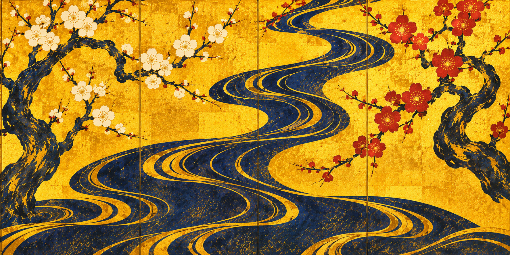
The artist behind the gold
Ogata Korin belongs to that small class of artists whose work feels instantly recognizable even when one cannot yet name it. A gold-leaf ground. A bold asymmetry. Natural forms flattened into patterns without losing their force. A curve of water that reads at once as river, design and rhythm. Korin’s pictures look ceremonial, but they never feel static. Their restraint is active. Their silence is charged.
For JAPAN.co.jp’s November 12, 2026 edition, Korin is an especially apt Art Choice because his language moves easily between worlds. It can absorb a semiconductor wafer, a climbing wall, a flood barrier or a handloom without collapsing into gimmick. The reason is simple: Korin was never merely an illustrator of flowers or scenery. He was an architect of attention. He organized a surface so that one form could dominate while all surrounding elements intensified it. That discipline is exactly what a coherent editorial image system needs.
| Artist | Ogata Korin (尾形光琳) |
|---|---|
| Lifespan | 1658–1716 |
| Period | Edo period |
| Movement | Rinpa school |
| Fields | Painting, lacquer design, textile design, ceramics decoration |
| Featured works here | Red and White Plum Blossoms, Irises, Rough Waves |
A merchant household, not a court atelier
Korin was born in Kyoto as the second son of the prosperous Kariganeya drapery house, a merchant family serving elite customers. That background matters. He was formed not in a formal court workshop but in an environment saturated with cloth, color, pattern and taste. Textile design was not peripheral to his imagination; it was part of the air he breathed. This helps explain why his paintings so often feel as if they stand at the edge between picture and object, image and surface.
The biographies preserved by museum scholarship emphasize that Korin’s world included classical literature, Noh, calligraphy and the refined visual culture of the old capital. Yet merchant wealth also gave him access to a distinctly urban sophistication—one less bound by inherited rules than by the pleasure of selection, refinement and display. Korin’s art has aristocratic elegance, but it also possesses the clean decision-making of a designer who knows that luxury depends on omission as much as abundance.
How Korin made “Rinpa” look inevitable
The term “Rinpa” was applied later, but Korin became so central to the tradition that his very name helped define it. The school’s genealogy begins earlier, especially with Hon’ami Koetsu and Tawaraya Sotatsu, whose fusion of classical themes, decorative surfaces and daring compositions provided a crucial precedent. Korin studied Sotatsu closely and sometimes worked through motifs already charged with literary or pictorial history.
What makes Korin different is the hard edge of his compositional intelligence. He strips away the anecdotal. He reduces. He heightens intervals. In his best screens, empty gold ground is not background filler; it is structure. The pause between forms matters as much as the forms themselves. Seen this way, Korin’s art is not old because it survives in museums. It feels contemporary because it still answers contemporary visual questions: What deserves emphasis? How much is enough? How can pattern and narrative coexist?
Curating three landmark screens
This feature centers three images that together form a compact introduction to Korin’s genius. Red and White Plum Blossoms offers a late, distilled meditation on asymmetry and flow. Irises demonstrates the astonishing power of repetition and variation on a gold field. Rough Waves, painted in a more compressed two-panel format, turns the sea into both force and pattern. Taken together, the three works show that Korin was not a one-theme artist. He was a master of pictorial concentration.
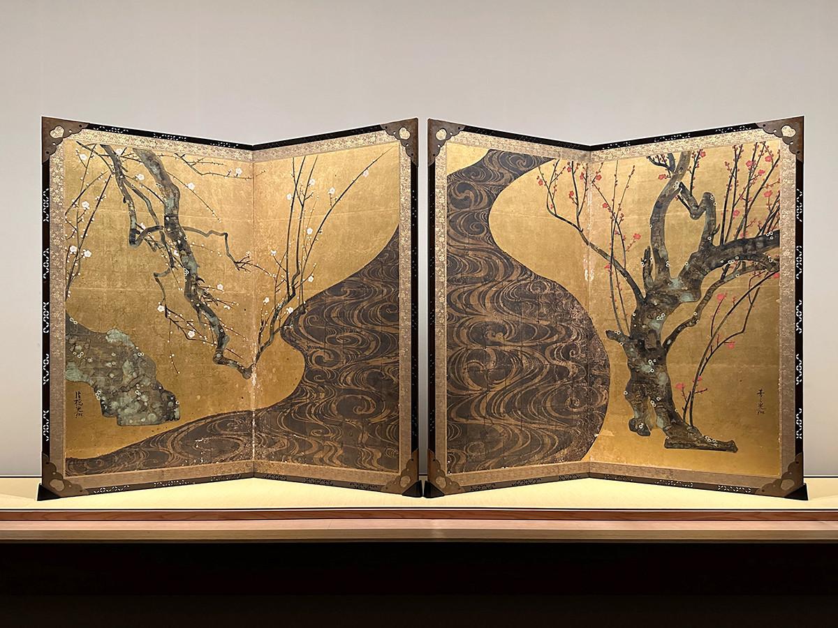
National Treasure. Late masterpiece whose dark river binds two unequal trees into one tension-filled whole.
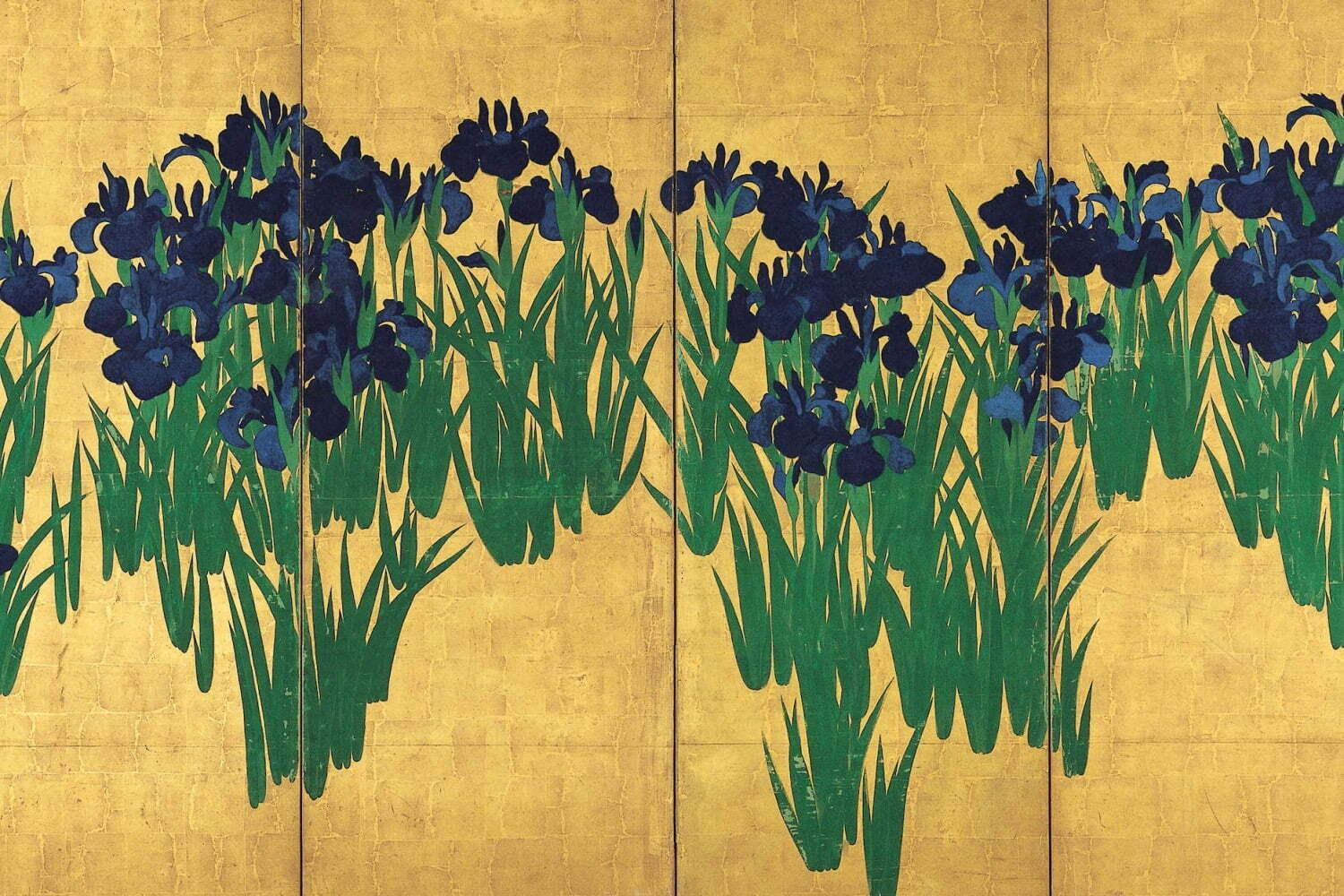
National Treasure. Repetition, rhythm and a near-abstract command of floral form on a gold ground.
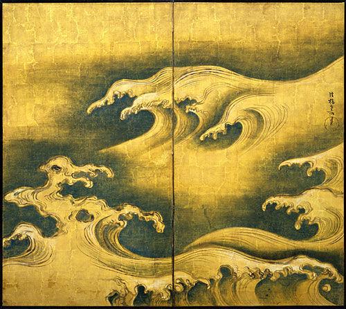
Metropolitan Museum work in which sea energy becomes decorative architecture.
Red and White Plum Blossoms
Image used in this story: JAPAN.co.jp. Original work in MOA Museum of Art collection.
Few paintings in Japanese art are as immediately legible and as inexhaustibly strange as Red and White Plum Blossoms. The composition seems simple enough: one white-blossoming tree at left, one red-blossoming tree at right, and a stream between them. But the psychological and formal drama depends on imbalance. The white tree is partially withheld, as though the picture continues beyond the frame. The red tree expands with muscular presence. Between them the river twists in a widening S-curve, simultaneously dividing and connecting the pair.
MOA Museum of Art’s collection note underscores features long prized by viewers: the so-called “Korin plum” petals with no enclosing outline, the placement of buds, the tarashikomi effects in the trunks, and the unmatched treatment of water ripples. Modern scientific examination cited by the museum also suggests the use of silver on the stream area, with darkening over time helping to create the painting’s famous near-black current. The screen therefore carries both design brilliance and material history. It is an image of nature, but also an image of how surfaces age.
Irises
Image used in this story: JAPAN.co.jp. Original work in the Nezu Museum collection.
If Red and White Plum Blossoms is a drama of opposition, Irises is a triumph of recurrence. Clumps of blossoms rise across the gold ground in a pattern that seems effortless and exacting at the same time. The Nezu Museum notes the relationship to the famous Yatsuhashi episode in The Tales of Ise, but Korin eliminates narrative incident almost entirely. No traveler is present. No bridge interrupts the screen here. Literary memory survives as atmosphere and structure rather than illustration.
This is a key lesson in how Korin works. He does not reject reference; he compresses it. What remains is an image that can be read as decorative abundance from afar and subtle variation up close. The saturated blues and greens are crucial. They convert repetition into pulse. Each clump of irises echoes the others, but no single cluster collapses the screen into monotony. The picture becomes a field of poised differences—one of the reasons it feels surprisingly close to modern graphic design.
Rough Waves
Image used in this story: JAPAN.co.jp. Original work associated with The Metropolitan Museum of Art collection.
Rough Waves reveals Korin in a different register: more compressed, more forceful, almost severe. There is no reassuring shoreline. The image is all surge and crest. Waves rise diagonally with claw-like foam, turning the sea into a system of sweeping contours. Here the gold ground does not simply enrich the scene; it removes ordinary depth cues and pushes the picture toward abstraction.
What matters most is the balance between menace and order. The sea is violent, but the screen is exquisitely controlled. That tension is central to Korin’s achievement. He can reduce the world to a few essential forms without draining it of emotion. In this sense Rough Waves is not an exception to his floral screens but a confirmation of their logic. Water, like flowers or tree trunks, becomes a problem of rhythm, spacing and accent.
Painting, textile, lacquer, design
It is misleading to speak of Korin only as a painter. His importance also rests on how easily his design intelligence moved across media. He worked with lacquer, influenced textiles, and collaborated within a broader material culture in which motifs were expected to travel. The continuing use of the phrase “Korin style” in design history points to this portability. His motifs are recognizable, but more important still is the way he composed them: emphatic, elegant, economical.
That portability is one reason Korin continues to resonate so strongly in editorial culture. A Korin-inspired visual system can hold together a collection of otherwise unrelated stories because his art was never tied to one narrow subject matter. It is a method of pictorial organization. Gold can frame science. A wave line can express infrastructure. A cluster of repeating forms can suggest statistics, flowers or crowds. The translation works because the underlying intelligence is structural, not merely ornamental.
Why Korin fits this edition
The November 12 JAPAN.co.jp lineup ranges from semiconductor materials and neurovascular biology to flood preparation, sports, handlooms and conservation. At first glance that variety might argue for a loose visual approach. In practice, it argues for the opposite. Korin offers a disciplined way to make difference legible inside unity. One focal point per image. A restrained supporting field. Selective gold backgrounds. Curving decorative rhythms that bind without overwhelming.
That is why Korin’s language adapts especially well to this edition’s stories. A crystal can be treated like a jewel-like blossom. An emergency bridge can hold the compositional authority of a screen-divider across water. A table-tennis ball or a skateboarder’s arc can become an event within a controlled decorative field. The result is not imitation of an old master but an editorial conversation with him.
How to look again
To look at Korin well, it helps to suspend the habit of asking first what a work “shows.” Ask instead how it organizes seeing. Where does the eye land? What is omitted? How does gold behave—not as luxury alone, but as light, silence and spatial ambiguity? Why do repeated motifs never feel merely mechanical? These questions open the pictures back up.
Korin’s art has endured because it proves that decoration is not the opposite of seriousness. Pattern can think. Surface can carry history. A screen can be at once literary, material, abstract and sensual. That is the larger argument of this Art Choice feature. Korin was not simply a great painter of a past era. He remains a living grammar for how Japanese visual culture can turn discipline into beauty.
Primary and reference sources
- MOA Museum of Art, collection page for Red and White Plum Blossoms
- MOA Museum of Art, exhibition page for National Treasure Red and White Plum Blossoms
- Nezu Museum, collection page for Irises (燕子花図)
- Nezu Museum, special exhibition page on National Treasure Irises and Japanese design
- The Metropolitan Museum of Art, exhibition page listing Rough Waves
- The Metropolitan Museum of Art Bulletin, Twelve Japanese Screens (official museum publication)
- The Metropolitan Museum of Art, essay on Art of the Edo Period